In this era of design, there are a vast number of amazing tools available. This handbook focuses on Figma. It will walk you through the whole Figma interface, at the same time it provides step-by-step instructions on how you can utilize the features provided by Figma in the best way possible. If you’re our Pro user you’ll get access to the asset files that you can use as a reference.
Design Tools
With the availability of so many design tools, it’s easy to get overwhelmed when it comes to select the best one that fulfills all our needs. Here, I’d like to mention that there’s no such thing called “the best” design tool. Every tool has its own set of advantages and features that makes it stand out, but we can easily search for a tool that works best for us. Mentioned below are some of the amazing design tools available to us.
Figma
Figma is called the collaborative interface design tool. And it stands out for its collaboration feature. It gives users the ability to share a design file with multiple team members and get instant feedback from each other via comments. These days most of the other design tools have also implemented the collaboration feature but Figma is the one that first brought this to the table.
Figma also provides a lot of useful resources, plugins, and techniques that make your workflow smoother.

Why use Figma?
Only a few years ago, in 2016, Figma came out as the first design tool that utilized the power and accessibility of the Web while promising the same powerful features you’d expect from a native app. They surprised everyone with their real-time collaboration feature. Designers were ecstatic to finally be able to share their designs with their co-workers and clients with zero friction, and see multiple mouse pointers drawing shapes simultaneously. It was like magic.
We’ve come a long way since. Figma has set the bar to the highest level by continuously improving and implementing new features. Today, everything exists on the Web, and Figma makes full use of it by bringing everything together for designers and developers.
Let’s take a look at some of the special features that make Figma stand out.
Vector Network
Figma introduced a powerful new way to design vectors. Instead of connecting paths one to one, you can create web-like connections, making the whole process of creating shapes more flexible.

Styles
In Figma, most of the foundation elements are set in the Styles, which contains Colors (including gradients and images), Text, and even Effects. You can make them readily available as a Library. As you design, you can set these styles in your Inspector, for things like Text, Fill, Stroke, and Effects.

Components
Components are building blocks for any design project. Theses are collections of elements put together in a reusable way, such as buttons, forms, navigations, cards, cells, and overlays. Component elements like text content, colors, and images can be customized in the Inspector. A button component can be duplicated many times, with different content and styles.
Additionally, you can have Components within Components, allowing you to customize even the most complex groups of elements, like icons, states, and complex themes. In Figma, it’s very easy to add different design elements as Component and publish them as customizable design assets.

Variants
Variants work slightly differently from components as they have a different naming system to organize everything. It’s very important to keep in mind that only use variants when necessary if not stick to components.
It’s best to use variants when dealing with multiple versions of similar components that share the same properties, such as state, size, color, etc. Also, when having two distinct variations like a toggle on/off.


Team Library
Imagine Abstract, Google Docs and Sketch in a single tool. Imagine a more cohesive and smoother experience. That’s Figma. Team Libraries allow you to share your components, styles and assets across your whole team. You can enable and disable these libraries by clicking the ON/OFF toggle anytime you want.

Auto Layout
Auto layout is a feature that lets you create designs that grow to fill or shrink to fit, and reflow as their contents change. This makes it possible to adapt to the changing needs of your work and helps ensure that your designs are consistent across the various screen sizes they will appear on. It’s important that you know about these!
- Parents are frames that contain elements and objects of your design
- Children are the elements and objects inside the Auto Layout frame
PARENT
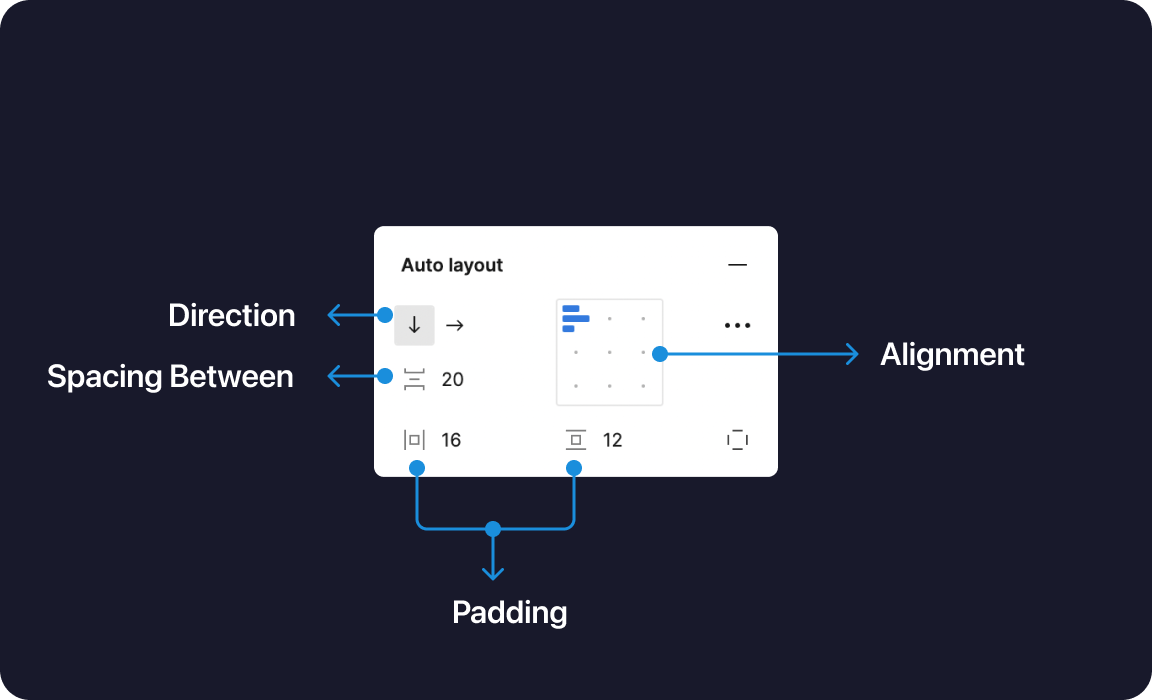
The parent has four properties. Understanding these properties is essential. It will help you understand how your layout works and help you implement Auto Layout in the best way!
- Direction: allows your design layout either to be in Columns (Horizontal) or Rows (Vertical)
- Padding: determines the whitespace around your objects (Children)
- Spacing: controls the spacing between your objects
- Resizing: Lets you have a dynamic or fixed width

CHILDREN
The Child layout has very few and less complex properties compared to the parent! These properties are essentially alignment and positioning controls (based on the Parent direction).
- Alignment – align objects along one axis
- Absolute position – easily position items within auto layout frames using precise controls.
- Resizing – Lets you have a dynamic or fixed width

Constraints
Constraints in Figma are the same as Sketch. They allow you to set distances from the parent container. It also enables you to scale or align elements.

Real-Time Collaboration
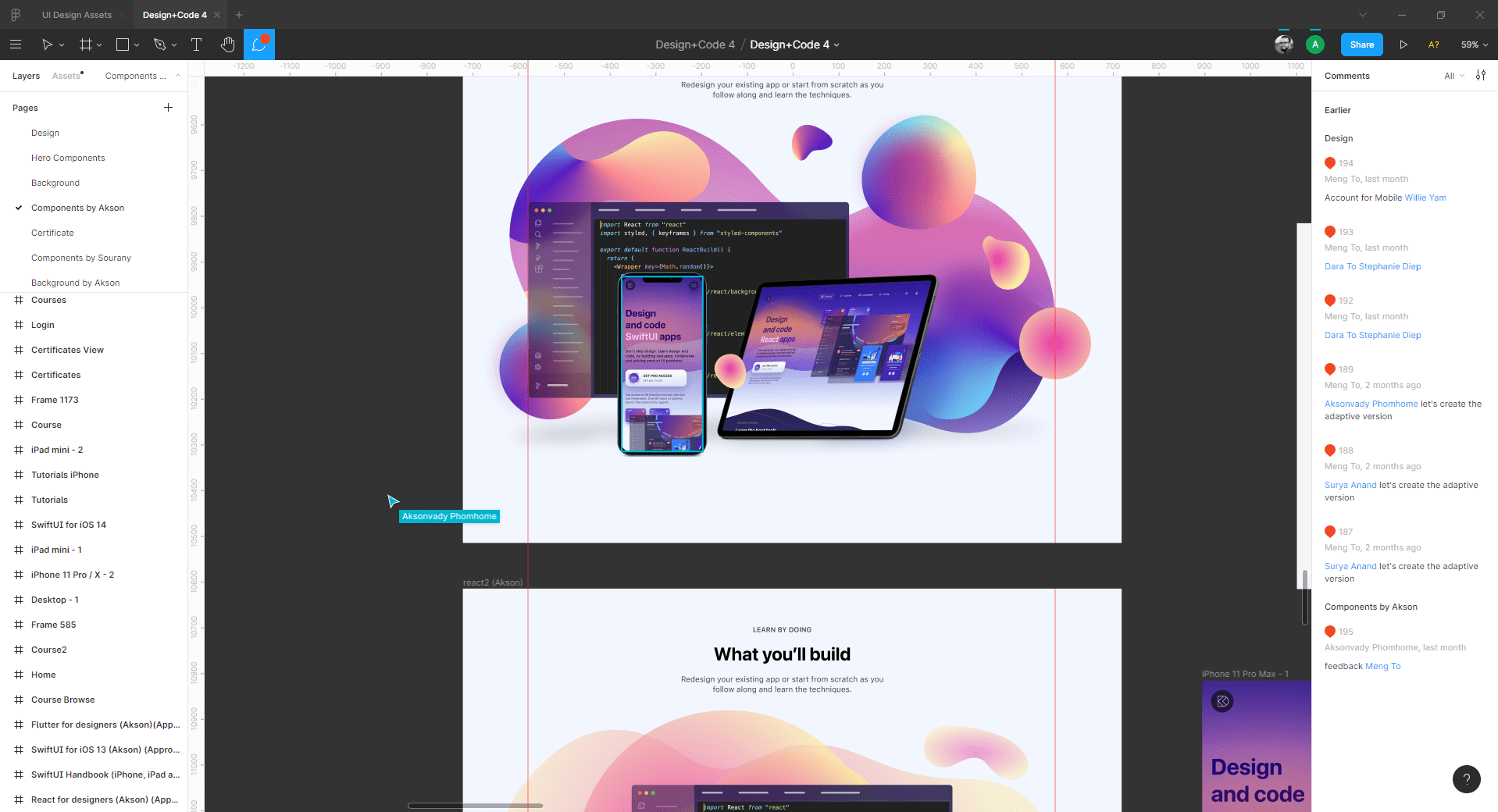
Figma truly is the Google docs of design tools. Once you start collaborating with fellow designers, developers, and clients in real-time on a design project, you’ll never want to go back. You can share your design with anyone and they can watch your progress, comment, and even participate as you bring your pixels to life.
Version Control
In Figma, everything you do is automatically saved in history for free. You can also manually commit (Command + Option + S) versions to keep things in a neat timeline. You don’t have to think about branches because real-time collaboration allows you to ensure that nobody is stepping on each other’s toes. It’s actually a relief to not compare this too much to Git because Figma has made the whole process way less complex than Git.

Live Embeds
You can embed your Figma Frames in your Website by getting the iFrames HTML code. This allows you to get live access to your designs.

Prototype
Prototyping is an important process of design. Creating a prototype helps your engineers understand how the interactions and animations should work in the final product. Figma makes it super simple to create prototypes using transitions without downloading a third-party app.
Prototype faster with Figma. Animate transitions with ease, add micro-interactions to your flow, and use smart-animate to quickly create interactions that look great on any device.

Inspect
Any document in Figma can be shared with anyone. More importantly, developers can come in and inspect design elements to get the color properties, sizes, and distances. They can select any asset and export it to PNG, SVG, or in code using Swift, Java, or CSS.
More generally, invited people can be given permission to view or to edit. This means that you can include virtually anyone in your team, including product managers, clients, and any person via a link.

KEYBOARD SHORTCUTS
The shortcuts in Figma are very similar to Sketch. Some key differences that are quite important to know:
- Command + Option + G creates a Frame for selected elements. A Frame is like an Artboard.
- Control + G to enable / disable Grid.
- K for Scale, which allows you to scale elements on the fly.
- C for Commenting. Comments are embedded in Figma directly instead of having to go through a different space.
You can open the Figma Keyboard Shortcuts by clicking the Menu bar, then going to Help and Account > Keyboard Shortcuts or you can press a shortcut Ctrl+Shift+? on your keyboard.

Find more Keyboard shortcuts organized in a friendly format at shortcuts.design.
PERFORMANCE
While most tools today focus on the hype train of new features, Figma simply focuses on a solid workflow with a performance that is unmatched by its peers. This is one of the main reasons why I switched from Photoshop in the first place. For me, Figma is as fast as you can go in a design tool.
When you work 8 hours a day on a tool, every second you save counts.
Every drag of a button and every text edit feels buttery smooth at 60 frames per second. Zooming in and out is without lag.
CROSS-PLATFORM
What sets Figma apart is its collaborative and always accessible nature. Barriers such as requiring a Mac or downloading a large app is a thing of the past. Thanks to this, anyone can design and anyone can view your design, while you design. As someone who has used this daily, I cannot overstate how game-changing this is. No longer is your team relying on a third-party tool, or an increasingly complex and fragmented set of plugins, Figma simply has everything from the start. Since a lot of developers work on Windows machines, this is truly essential to keeping your team in sync. Any developer can receive a link from you, inspect the design, and get the colors, fonts, and even CSS, Swift, and SVG Code.

Figma Mobile App
Preview your designs on any device. Use the Figma iOS or Android app to prototype interactions that mirror how users might interact with your designs, then share those prototypes anywhere.

How to view your prototypes from the Figma mobile app:
- Sign in to the Figma mobile app.
- Use the Recent or Search tabs to find the file or prototype you want to view.
- Tap the file or prototype to open it. From the file, press to present the prototype.

Figma Plugins
Plugins are specialized tools designed to help you use Figma to its full potential. They’re made by talented designers and developers who are eager to share their passion with the greater design community. From image assets to embedding maps into your designs, plugins make it easy to add life and personality to your designs.
- You can switch your account to the community by clicking on home.

Sketch VS Figma
Nowadays, design tools are not vastly different from each other. The layout is similar and you’ll find the same essential features such as components, libraries, and developer handoff.
While Sketch is rich in plugins like Craft, Abstract, and Zeplin, Figma has all those tools embedded into it at the start. On top of that, while Sketch requires macOS, Figma works seamlessly with Mac, Windows, and Linux devices. Also, you can run the Figma editor directly in your browser.

IMPORTING FROM SKETCH
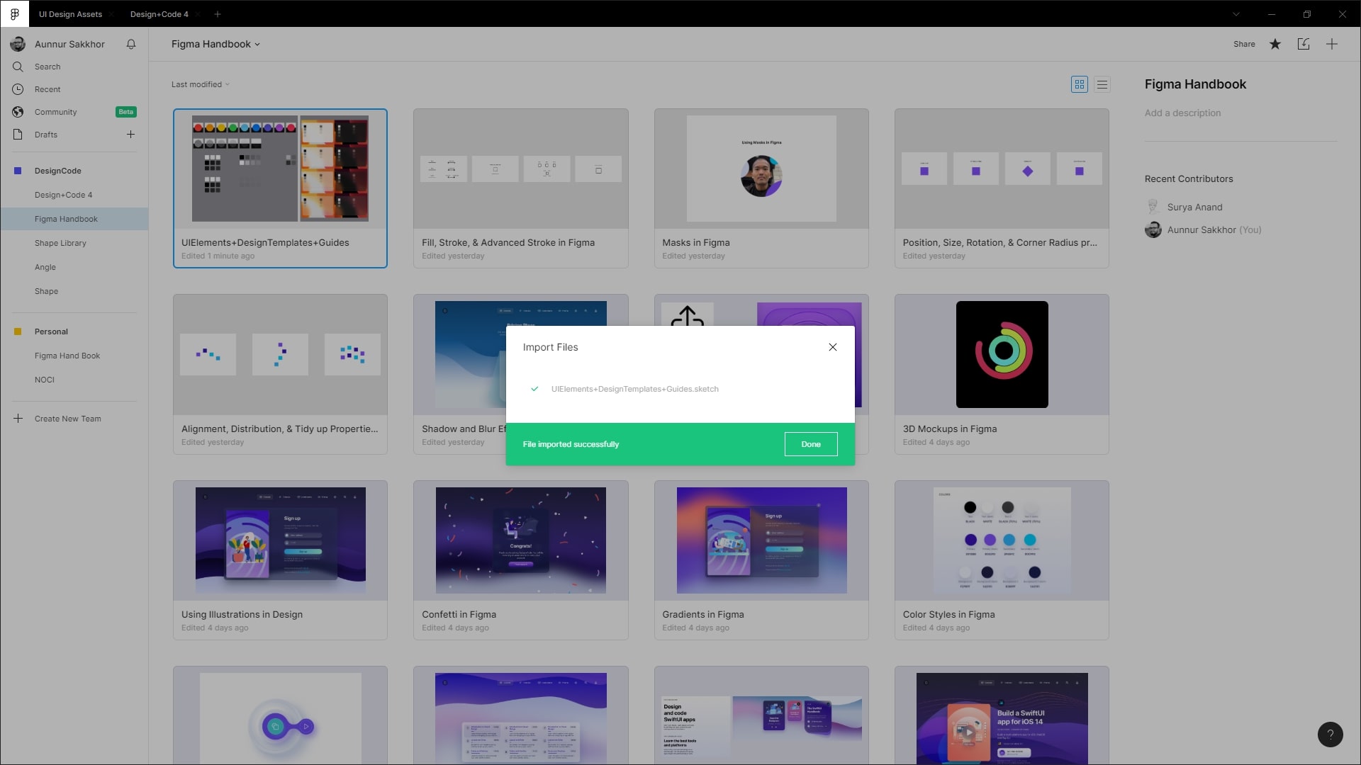
Figma treats your Sketch files as first-class citizens. It is so good at importing that even an intricate and massive Library file like Angle can be imported with 95% accuracy. All the layers and symbols are kept intact.
Getting Started
To get started, let’s head over to figma.com and sign up for a free account.

You can either use Figma directly from your browser or you can download the desktop app from the Downloads page. A specialty of Figma that you already know is Cross-Platform. It works with Mac, Windows, and also Linux devices. Download the Figma app based on your OS.

Conclusion
Expressing your creativity and design skills doesn’t require any fixed tool. You’d pick one tool for your work, some of your other friends will choose some other tools. But when you’re in a team, and all of your team members can work on the same page, that is a nice addition overall. Figma would be a great choice for your team, even for your personal uses. It has tons of features, and resources that will help speed up your workflow.
The Editor in Figma
Getting Started
Once you’ve created an account, you’ll be redirected to the Figma dashboard which contains the details as well as different tabs. This is where you can create new files, import files, go through your recent files or search through the existing ones.

The Editor
Most of the modern design tools, especially the UI design tools look almost the same. This is so that the user doesn’t feel overwhelmed while working on different tools or while migrating from one tool to another. The editor is where you end up once you create a new file.

Toolbar
The first section we’ll talk about is the toolbar. It has tons of options. Let’s go through those options one by one. Starting from the left:
- The hamburger menu gives you access to a lot of different options such as Preferences, Plugins, Libraries, Account settings, Different Options, and Customizations.

- Next up is the select tool which gives you two options – Move and Scale.

- The frame tool allows you to create new artboards. You can either create a custom or select from one of the default options on the right panel. This tool also gives you access to the slice tool, which allows you to specify the region you’d like to export.

- The shape tools give you the ability to create basic pre-defined shapes.

- The pen tool allows you to create custom shapes using vector anchor points. The pencil tool is also available in the Pen tool dropdown.

- The type tool is what you’ll use to add text elements to your design.

- Hand tool comes in handy when you want to move around in your design file without activating hover lines, selecting elements, or accidentally moving the same.
- Now, let’s move on to the Comment tool which gives the user the ability to add comments throughout the design file, view said comments, and reply to the same.

- On the right side, we’ve user profile avatars which allow you to see who is viewing the file at any point in time.

- Right next to it is the Share button which provides you with a link or an embed code that you can share. It also opens up share settings.

- The play button allows you to view the prototype, if you’ve any.

- Lastly, you’ve the zoom settings as well as other options such as grids, rulers, outlines, etc.

File & Project Names
- The middle of the Toolbar contains the name of the file, which is ‘Untitled’ by default. Simply click on it to edit.
- The project name, which is ‘Draft’ by default contains the particular file. You can change the project name to move the file to another project.

Panel
There are two panels located on either side of the editor.
- Layers Panel: the panel to the left is the Layers panel. It contains Layers, Assets and Pages that have been added to the file.
- Properties Panel: the one on the right side is the Properties panel. Here, you can customize the Frame Size, Positions, Colors, Strokes, and Effects. You can also view the code of an element here.

Pages
When you’re working on a huge design project you may need to put different design elements in different places, not just in a single page. You can create multiple pages in Figma and put similar elements in a single page.

Assets
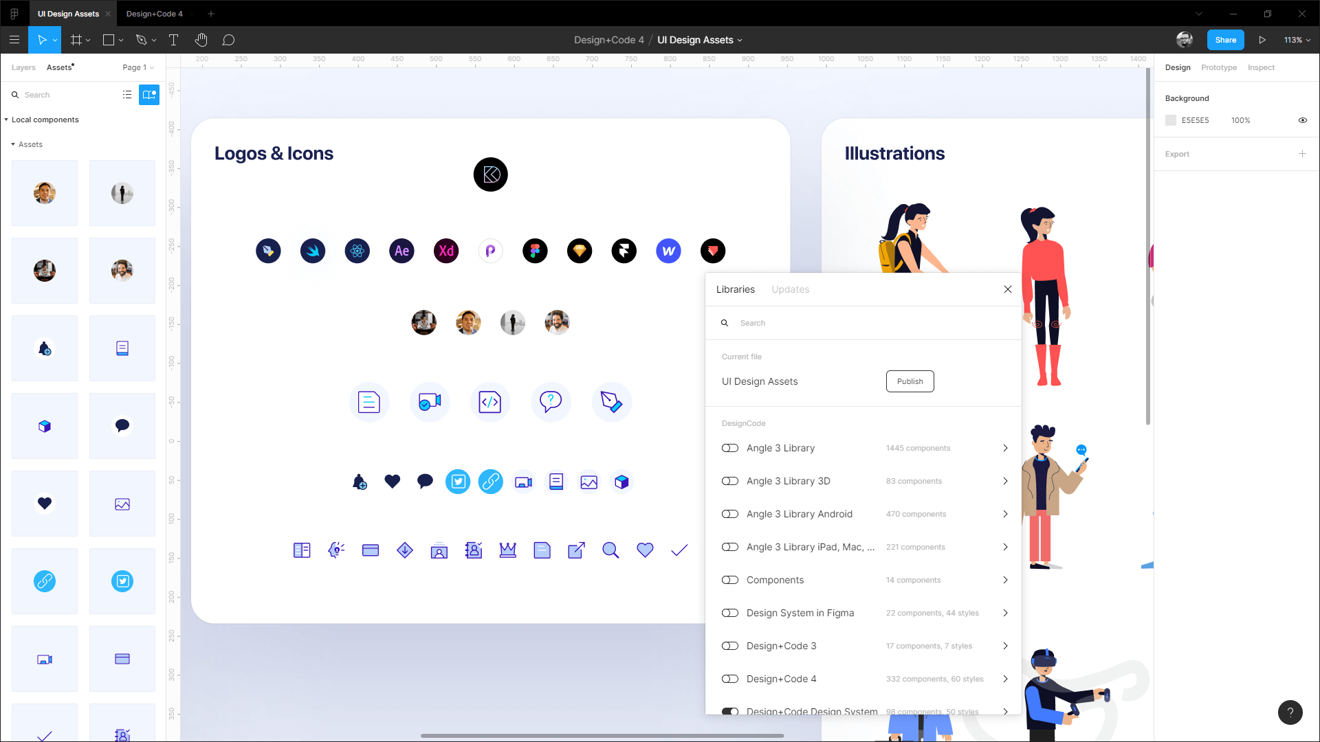
On the left side of the Figma editor, there’s the Assets panel. Assets are the elements you save as Components. It can include buttons, forms, navigations, cards, cells, and overlays. Assets are extremely handy when it comes to re-using design elements.
Conclusion
Figma is a fully web-based design tool, which can be run in your browser without sacrificing any of its functionalities. It is one of the most common choices when it comes to interface design tools. Outside of some of the useful features, such as real-time collaboration, auto layout, Figma has so many plugins and resources that can save a lot of time for our design process.
Basic Tools
Frame
The frame tool is what allows you to create frames on the canvas. You can nest frames inside each other as well. Let’s start by adding a frame.
- To create a frame, either click on the Frame tool in the toolbar or press one of the following keys – F or A

- Once you click on the frame tool, you can either choose one of the preset devices from the Properties panel or draw a custom one on the canvas

Grids
Grids are essential to understanding the negative spacing when you’re designing for iOS, Android and Web. For mobile, it’s common to use an 8-point grid. For Web, it’s a little less about spacing and more about division, like the 960 grid. It’s good to have some grid in place, like the default 10-point grid. This ensures that all the elements fall on clean pixels, avoiding half pixels as much as possible.

Shape Tools
Next up are the Shape tools. You can access all the basic ones via the Shape tools in the toolbar. The shapes available include – Rectangle, Line, Arrow, Ellipse, Polygon and Star. To insert a shape, do the following:
- Click the Shape tools option and select your preferred shape

- Here, we’ll be adding a rectangle but you can add any shape you’d like

Alignment
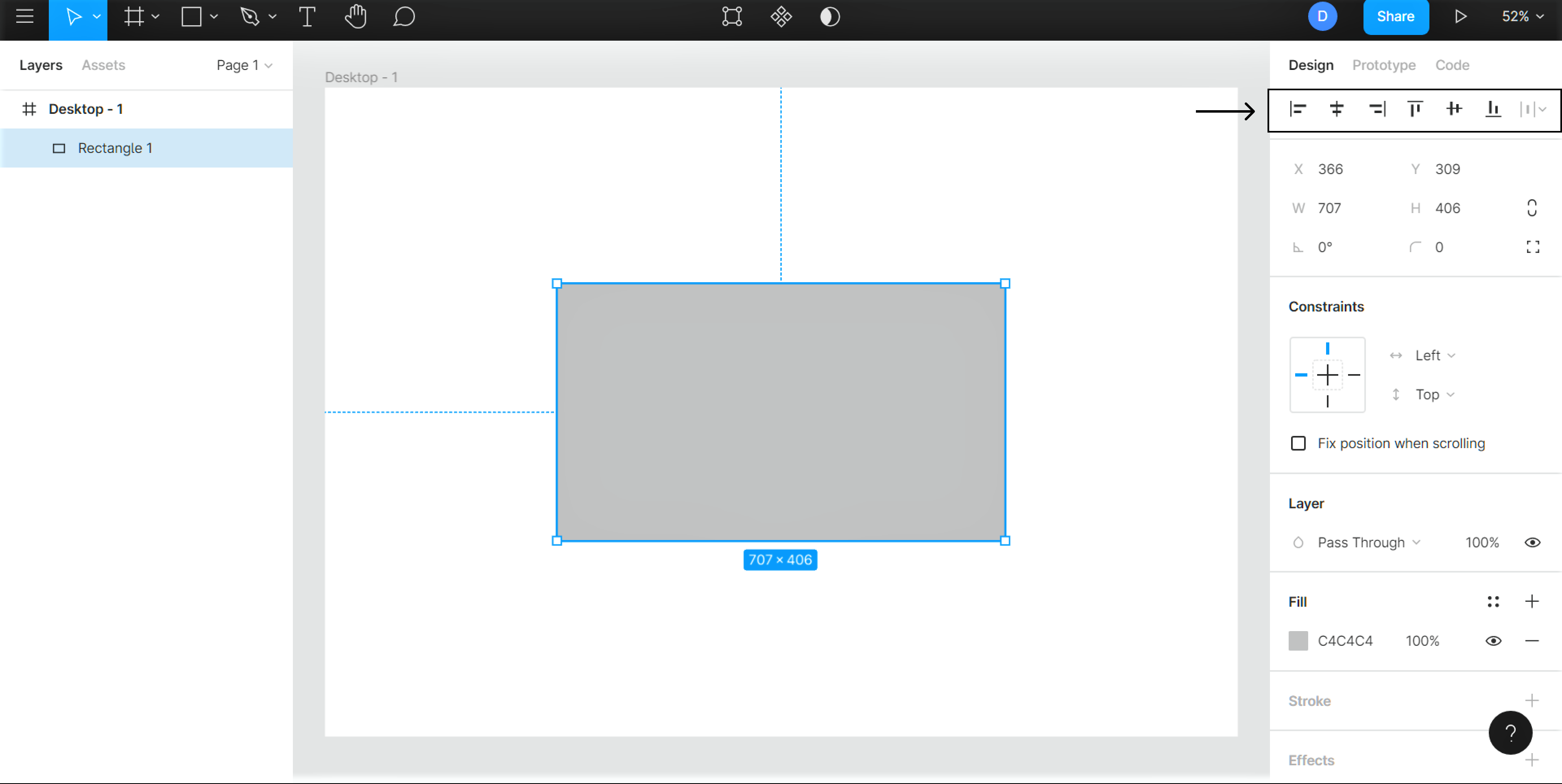
The top of Properties panel contains various alignment options. Provided below is the list of all the options as well as their keyboard shortcuts:
- Align Left (Alt + A)
- Align Horizontal Centers (Alt + H)
- Align Right (Alt + D)
- Align Top (Alt + W)
- Align Vertical Centers (Alt + V)
- Align Bottom (Alt + S)
Resize
You can resize any layer by selecting it and then, dragging the corners. Hold Shift to keep the same aspect ratio and hold Option to resize from center in order to keep the same alignment. Alternatively, you can change the ‘W’ (width) and ‘H’ (height) values in the properties panel. Make sure to click the Constraint Proportions option so that it scales proportionately.

Image
In Figma, images can be edited on the fly after importing. You can control settings like Exposure, Contrast, Saturation and much more without having to leave the design tool.

Color Picker
Click on the Fill to start customizing the background. As with most design tools, you can change the color by clicking the color on the wheel or via the eyedropper tool. Alternatively, you can input the HEX code or choose from one of the preset colors. The opacity value can also be changed from here.

Gradients
Figma also gives you the option of replacing the solid colors with gradients. There are multiple gradient options. You can find the gradient options in the color picker. You can play around with different combinations of colors, the opacity as well as the direction of the gradient!

Conclusion
Learning about the basic tools is important, especially if you’re new to a platform, as it makes the learning curve much easier so you’ll be able to grasp any new techniques quickly because you’ve understood the basics.
Working with Position, Size, Rotation, & Corner Radius properties
Downloads
To follow this tutorial, you can download the source file, which will help you compare your progress.
Position
In any design project, whatever you place an element in your frame or artboard, it will fall into a position. Position properties consist of the X-axis and Y-axis. In Figma, these are located after the Alignment properties at the top-right corner of the Properties panel.
You can select and move an object to change the position it holds, or you can input X and Y values to change the position more precisely. Also, hovering over the X and Y input field, you can scrabble through the right or left to move the object to the X or Y-axis.
Let’s see how scrabbling works. Press ‘R’ on your keyboard or select the Rectangle tool from the Tool panel, and create a rectangle on your canvas. Make sure the Move tool is selected.
- Hover over the X input field, then scrabble to the right to move the object to the right (plus X-axis) of the canvas.
- Hover over the X input field, then scrabble to the left to move the object to the left (minus X-axis) of the canvas.
- Hover over the Y input field, then scrabble to the right to move the object to the bottom (plus Y-axis) of the canvas.
- Hover over the Y input field, then scrabble to the left to move the object to the top (minus Y-axis) of the canvas.

Size
Size properties consist of Width (W) and Height (H). These are located after the Position properties at the top of the Properties panel. You can select an object and drag the corner areas to increase or decrease the size, or you can input width and height values (in Pixel) to change the size more precisely. Also, hovering over the Width (W) and Height (H) input field, you can scrabble through right or left to increase or decrease the size.
To understand it better, press ‘R’ on your keyboard or select the Rectangle tool from the Tool panel, and create a rectangle on your canvas. Make sure the Move tool is selected.
- Hovering over the Width (W) and Height (H) input field, and scrabbling to the right will increase the size.
- Hovering over the Width (W) and Height (H) input field, and scrabbling toh the left will decrease the size.
An important thing to note is that, if Constraint Proportions is activated when you’re increasing or decreasing the size of the shape, the size will change proportionally.

Rotation
Rotation property is located after the Size (W and H) properties at the top of the Properties panel. When you place an object or create a shape on your artboard, by default the angle is set to 0°. You can change the angle at any degree you want.
After selecting an object and hovering over the corner areas you’ll see the arrow to rotate the shape. Or, you can input the value (in Degrees) to change the angle more precisely. Also, hovering over the Rotation input field, you can scrabble through the right or left to rotate the shape to the positive or negative values.
Press ‘R’ on your keyboard, or select the Rectangle tool from the Tool panel, then create a rectangle on your canvas. Make sure the Move tool is selected. Now, let’s try scrabbling.
- Hovering over the Rotation input field, and scrabbling to the right will rotate the shape to the right, and the degrees will increase to the Negative (-) values.
- Hovering over the Rotation input field, and scrabbling through the left will rotate the shape to the left, and the degrees will increase to the Positive (+) values.

Corner Radius
In this era of User Interface design, we see rounded corners everywhere – mobile applications, desktop applications, websites, browser input fields. You can set rounded corners by changing the radius of the corners. In Figma, the Corner Radius property is located after the Rotation property at the top of the Properties panel. The more you increase the value, the rounder the corners.
After selecting a shape and hovering over its areas you’ll see circlular dots on the corners. Hover over the corners, and you’ll see arrows to change the radius. You can drag to increase or decrease the radius.
Or, you can input the value (in Pixels) to change the radius more precisely. Also, hovering over the Radius input field, you can scrabble to the right or to the left to increase or decrease the corner radius of the shape.
Let’s try scrabbling to change the radius. First, press ‘R’ on your keyboard, or select the Rectangle tool from the Tool panel to create a rectangle on your canvas. By default the Corner Radius is set to 0, which means the corners are sharp-edged. Now make sure the Move tool is selected.
- Hovering over the Corner Radius input field, and scrabbling to the right will increase the radius, and make the corners rounded.
- Hovering over the Corner Radius input field, and scrabbling to the left will decrease the radius, and make the corners sharp.

Conclusion
Whenever you’ll work on any of your design projects you’ll add, subtract, customize elements every minute until you get the final result. At some point, you’ll understand that there’s nothing called ‘Final’ in design. You’ll always be improving your shapes, elements, styles, components, layers. To do so, you’ll mostly use the most important properties in Figma including the ones we discussed above.
Working with color styles on Figma
Styles in Figma allow you to specify a set of properties for elements. You can create styles for basically anything, be it Text or Color and even Effects. In this section we’ll focus on Color Styles.
Downloads
To follow this tutorial, you can download the source file, which will help you compare your progress.
Color Styles
Like Grids, Colors and Gradients can be saved as styles. This is important when it comes to reusing certain styles. Saved styles make the design process more consistent. Most designs need different colors to be used mainly for the following:
- Backgrounds
- Texts
- Buttons
- Gradients
Background Color
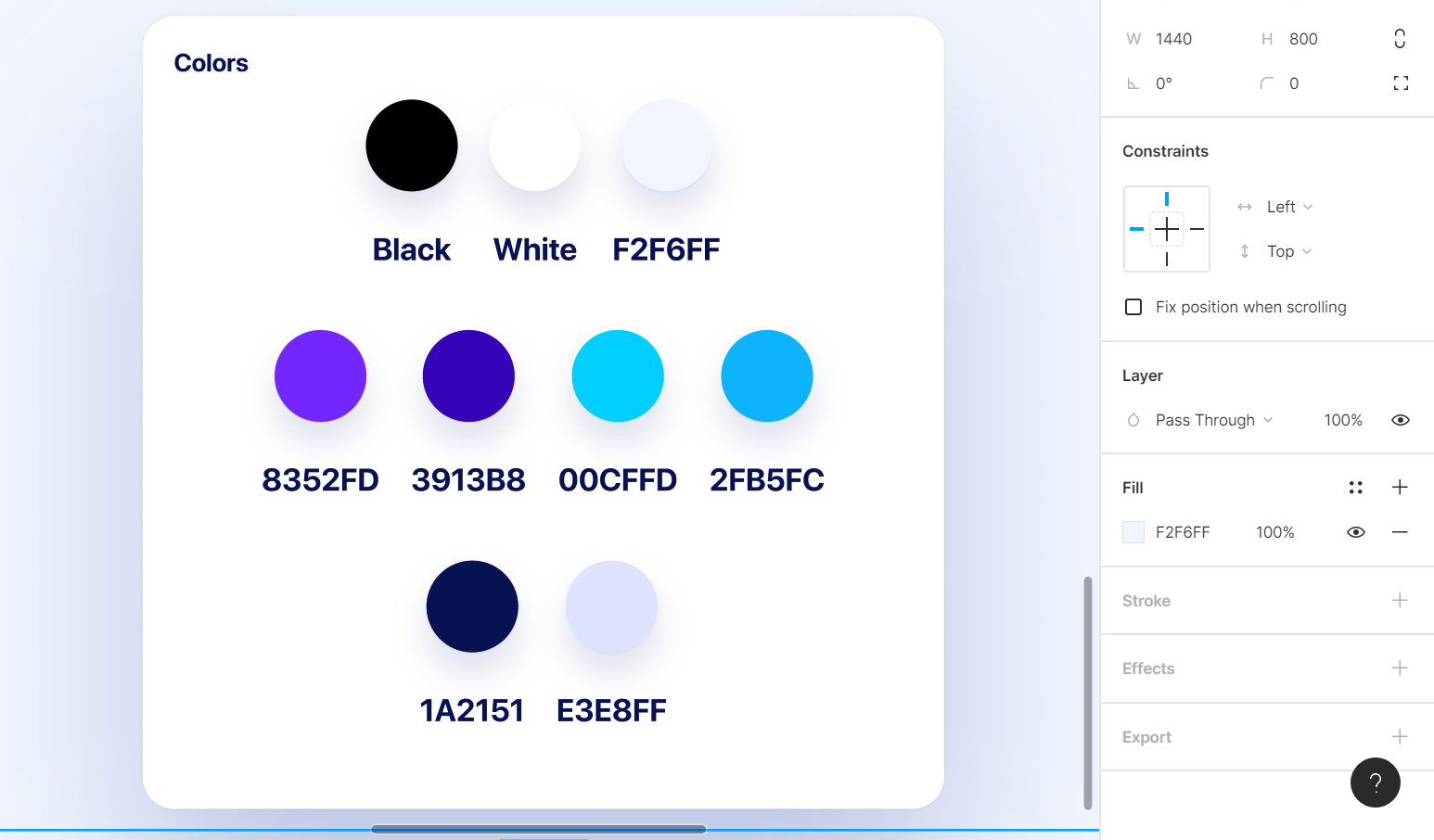
Let’s create some color styles that can be used as background colors. Keep in mind that good design needs good contrast to be legible and to command attention. To achieve this, you can use two opposite colors, like black and white, dark gray and off-white or dark blue and light blue. In our case, we’re using these two – #1A2151 and #E3E8FF.

Text Colors
Text colors can be used to structure your typographic content. For the body text, you’d start with black on white, and white on black. For extra texts such as captions and titles, you’d need a couple of other colors. Here, we’ve the following colors – black, white and #F2F6FF.

Button Colors
These colors need to draw attention. They’re used for actionable items such as buttons, links and clickable areas. They can also be used to express your branding. The colors that we use in this section are – #8352FD, #3913B8, #00CFFD and #2FB5FC.
Gradient Styles
Gradients are used for buttons and backgrounds. You can even use them for text layers in Figma. Let’s create one now!
- Create a new frame and add two rectangular shapes to it. This is where we’ll set gradients
- Next, head over to the dropdown next to Solid in Fill. Select the Linear option
- Set the direction of the gradient from top-left to bottom-right
- Set the colors to #4539CA and #DF3B3B. Make sure to have opacity for both colors set to 100%
- Repeat the same steps for the second shape. Set the colors here to – #9A00F9 and #2EE5A3. We’ve set the opacity for the first color to 70 but you can set it to your preferred value

Saving Color Styles
Now that we have all our colors, it’s time to save these styles so we can reuse the same anywhere in our style.
- Select the first text color which is black and click the ‘: :’ icon in Fill
- A list should open up, click on the ‘+’ icon at the top. In the text input, type in ‘Text’ and then, Create Style. This will add it your Local Styles

- Repeat the same process for every color we added as well as for the gradients to add all of these to your local styles

View Styles
You can view the local styles via the Style Picker which refers to the modal that opens up when you click on the ‘: :’ icon in Fill. Once it opens up, you’ll see all your local styles listed there. The added color styles are also visible in the Properties panel on the right.

Conclusion
Saving colors, gradients or effects as Styles makes our design process a breeze. By using styles, you can change or edit any colors or effects easily, and by doing so it’ll change that style for the whole design at the same time.
Using masks to clip content and compose your design in Figma
Downloads
To follow this tutorial, you can download the source file, which will help you compare your progress.

Masks
Masks allow us to show specific areas and hide the rest of an image or object. Masking is a very effective way to control the visibility of some specific areas of any layer.

Clip Content
The Hide any objects within the Frame that extend beyond the Frame’s bounds feature allows you to hide any objects that extend beyond the Frame’s bounds. This feature can be used to keep images from being cropped, for example.
Clip Content – Hide Objects Outside the Frame – You can hide any objects within the Frame that extend beyond the Frame’s bounds.
- You can find this option on the resizing property panel, which is located in the Inspector panel.

Using Masks in Figma
All the digital designing tools have the masking feature. Different tools have different ways to mask or unmask an object. But the main use case is almost the same – using a layer or shape as a container of another layer or multiple layers/objects.
Within a mask group in Figma, the bottom-most layer is considered as the mask container, and all the outside areas of the layers above the container will be cut off, we’ll only be able to see the areas which will fall inside the mask layer areas. To understand this better, let’s create something using masks.
- Place an image on your artboard.
- Select the Ellipse tool by pressing ‘O’ on your keyboard, and create a circle.
- Place the circle on top of the image, and place it right on the areas which you want to show.

- Now from the layers panel, place the Ellipse layer under the image layer.
- Select the Ellipse layer, and press Ctrl+Alt+M on your keyboard, or press the Mask icon on top of the toolbar.
- You’ll see the rest of the areas outside of the circle are hidden.

Customizing Masks
Drag the image to make it fit the proportions. Then, let’s add more shapes on top of it to customize the avatar.
An important thing to remember is that everything on the artboard on top of the mask layer will be considered to be inside the mask. So, it’s better to group (Ctrl+G) the layers after creating/customizing the mask.

Activating/deactivating Masks
After creating any masked element, you can always deactivate the mask. In our case, just select the Ellipse layer underneath, and click on the Mask icon on top of the toolbar, it will deactivate the mask. If you click on the Mask icon again, the mask will be reactivated.

Masking With Texts
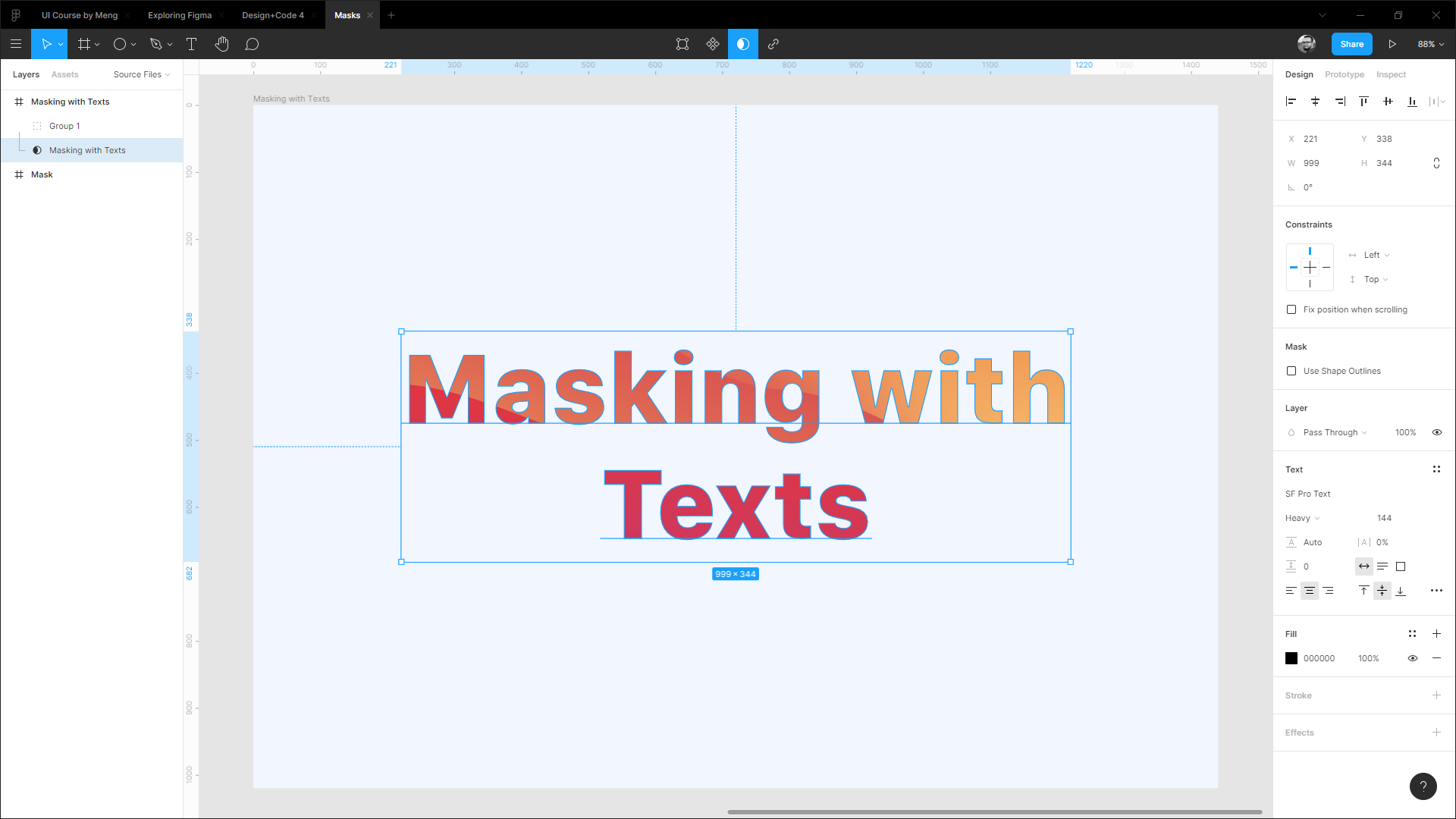
Not all the design tool supports masking directly with a text layer. You’ll need to flatten the text layer, which means making the text layer an outline shape. And you won’t be able to change/edit the text after making an outline shape.
In Figma, you can apply mask directly on a Text layer. Let’s see how it works.
- Place an image or shape on your Artboard. In this case, we made some shapes with gradients to make it look like a nice background.
- Press T on your keyboard or select the Text tool from the tool panel. Write your text on the Artboard.
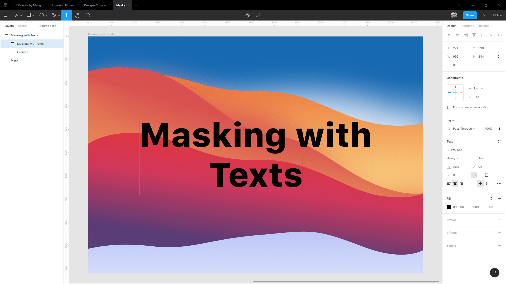
- Now from the layers panel, place the Text layer under the shape group.

- You can apply masks by any of the processes you’ve learned above. Here we’ll press the shortcut keys Ctrl+Alt+M to apply the mask.
Masking with Multiple Shapes
This objet below is a multi-shape, which means that it combines shapes to create one new shape. You can combine shapes into one shape. You do this by selecting the shapes and then clicking “Union Selection” in the shape menu.
This will create a new shape, which is a combination of the original shapes. This new shape will have an outline around it that represents the border of all the original shapes.
- To start, create a shape or import it from your existing project
- Group the combined shapes into a folder, just select all of them and right-click. Then choose “Group Selection”

- Add the photo to your frame

- Select the group folder “Pattern 1”
- Apply masks by any of the processes you’ve learned above

Remove Backgrounds in Figma
We’re going to go over how to remove the background from a photo in Figma. This is a useful skill for designers who want to create mockups of their websites and apps, but don’t have access to Photoshop or other image editing software.
This technique uses masking tools in Figma, which allow you to cut out any elements of your design and place them on top of other images or illustrations. This process can be used for many applications, but we’ll be focusing on how to use it for creating cutouts from photos.
- Add the photo to your frame
- Use the pen tool to trace around the chair
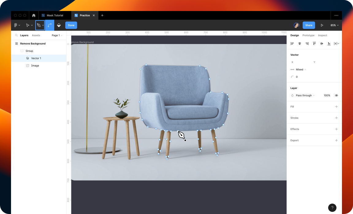
- Once you have completed the path, click on the fill tool and pick a color for your fill

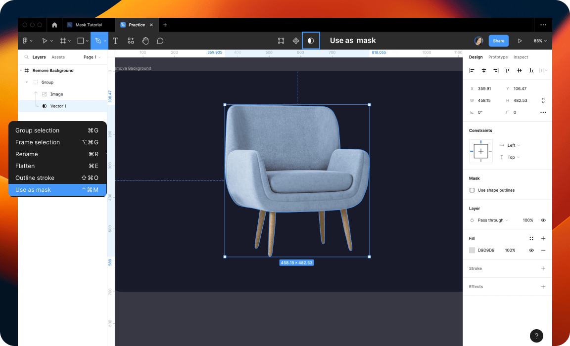
- Drag the layer “Vector 1” down below the image
- Apply masks by any of the processes you’ve learned above
Conclusion
Masking is the easiest solution to crop any portion of a layer. The main advantage of using a mask is that it’s non-destructive, we can make the masking portion visible or invisible whenever we want.
Learn to design and adapt for designs for Dark Mode with Selection Colors
Dark Mode nowadays is widely used by many as it decreases power consumption, makes it easier for people to read in low light and it reduces eye strain. Many also prefer dark mode to light mode as an aesthetic choice. However, adapting your designs for Dark Mode is more than inverting the shades.
Downloads
To follow this tutorial, you can download the source file, which will help you compare your progress.
Dark Mode Colors
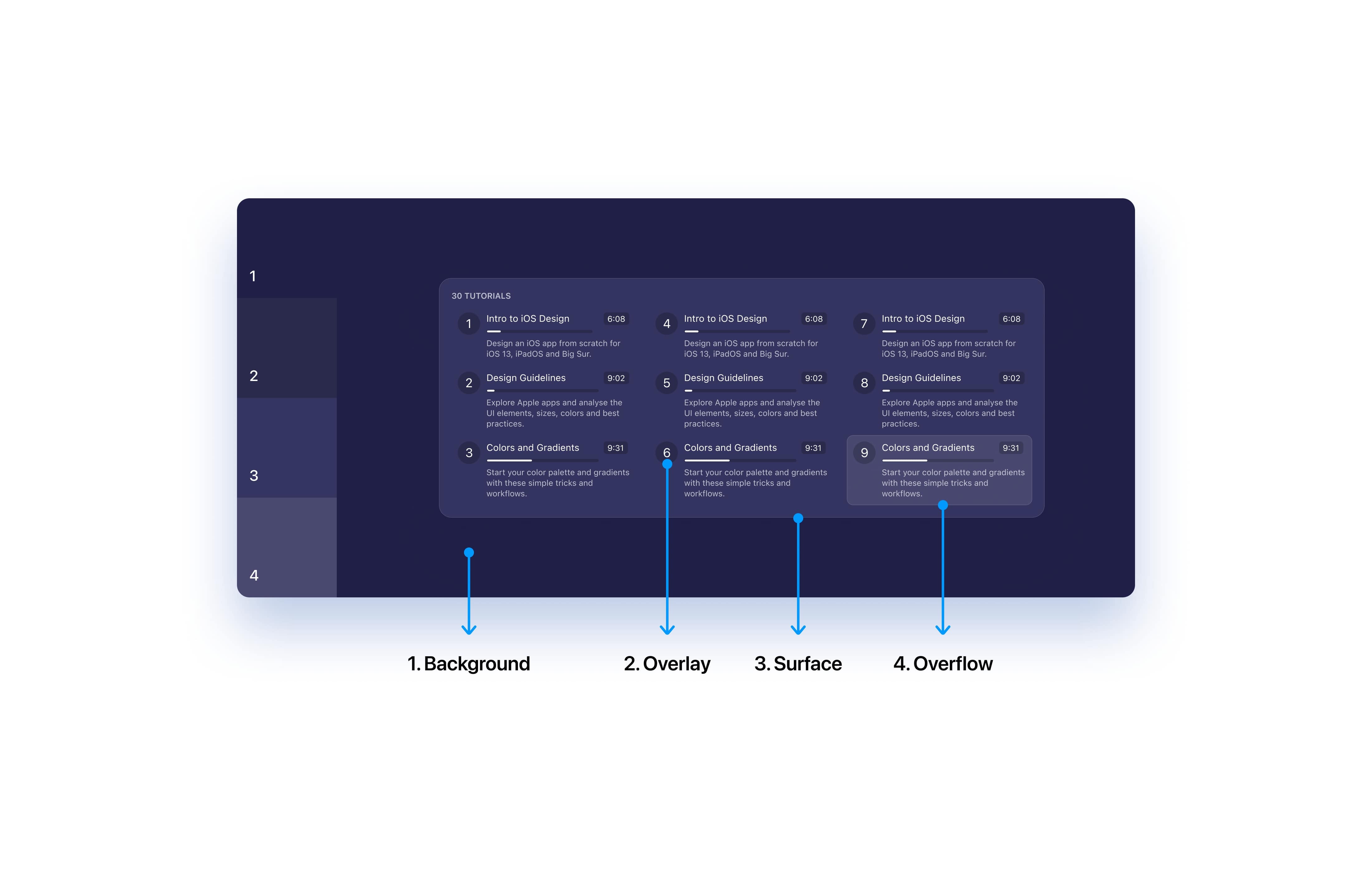
When choosing dark mode colors, use dark shades for distant elements, and light shades for closer elements as distant elements receive less light compared to the elements that appear nearer. The further the object, the darker it appears and settles more into the background.
Keeping accessibility in mind
It is also important to revisit our accents as sometimes they might not be accessible. Using the same colors as in light mode may result in some parts of your app appearing too bright. This doesn’t mean you have to change all the colors but adjust the HSB values for the best accessibility.

Interface
Avoid using true blacks as these restrict some ways of creating a balanced interface. For example, using shadows to create depth might not be an option anymore. You can have a tinting effect to blend the UI with the surroundings to create a harmonious interface.
Many enjoy using true blacks and it’s mobile friendly too.

Contrast
It’s essential that you must not give up accessibility while adapting/designing for dark mode, so always ensure a proper contrast ratio between your text and background to maintain the readability on darker backgrounds and in low light conditions.

Small Details
Details look and feel differently in light and dark mode. For example, an element using an inner shadow must use inner glow to preserve their appearance in dark mode. Design assets separately for light and dark mode when necessary.
Selection Colors
Selection Colors allow you to change the look of your design without going through the trouble of selecting each layer individually and then applying the colors to the selected layer. This is very useful when you want to design multiple theme variations of your design.

Changing Colors
As mentioned above, Selection Colors give the user the ability to change or adjust the color of elements. This can be done in two ways:
- Select an element and view or adjust individual colors in the selection

- Navigate to the Selection Colors in the Properties panel, where you can find all the colors being used in the selected element or object.

- Now let’s change the base color #FFFFFF to #373775 to adpat to dark mode.

- Awesome! Now, let’s change all the layers using #000000 to #FFFFFF using the same Selection Colors properties

- Change the Section titles which are using #4442B2 to #FFFFFF

- Great, now let’s change the opacity of the #000000 layers from 10% to 20% for better contrast and also set the background color to #1F1F47 from #F2F6FF

- Finally, let’s set the dropshadow to #0F141E from #224FA9. This brings depth to the element!

Conclusion
Dark mode brings in lots of advantages and is now widely adopted by many users. So, it’s essential to ensure that your app works well under dark mode. An important thing is to make sure that the chosen colors don’t negatively affect accessibility and readability.
We'll walk through all the different ways to use gradients in your work, as well as techniques when creating them
Gradients enable your design to leave a better impression compared to solid colors. These are mainly used for buttons and backgrounds but you can also use them for text layers. There are several types of gradients. In this tutorial, we’ll add a linear gradient.
Downloads
To follow this tutorial, you can download the source file, which will help you compare your progress.
Resources
- UI Gradients: the gradients are all free to use
- WebGradients: a free collection of 180 linear gradients
- Gradient Buttons: hundreds of CSS gradients buttons
- CoolHue: pre-made gradients collection
- Grabient: gradient colors palette
- Gradient Hunt: a free and open platform for color inspiration with thousands of trendy hand-made color gradients
- Mesh Gradients: a free mesh gradient collection
- Meshgradient: online tool for mesh gradients
- Magic Pattern: mesh gradient tool
Gradient Styles
Before applying gradients to our layers, let’s first learn about different types of gradients. Every gradient has a starting point from where the colors start before blending into other colors. There are four gradients that we can use in Figma:
- Linear: This is the most common and widely used gradient out there. In a linear gradient, the colors of the gradient blend from start color to end color in a straight line

- Radial: A radial gradient is the one in which the color has one starting point and then it emanates outwards

- Angle: In this, you can use angles to define the direction of your gradient. Starts counter clockwise and the space between the start and the end points defines the angle

- Diamond: Just like its name, this gradient creates a diamond shape from the starting point

Text Gradient
Just like you would to any shape, you can add gradients to text elements as well. Simply head over to Fill and replace the solid color with one of the gradients according to your preference.

Shape Gradient
Every gradient has a starting color point from where the color starts before blending with other colors at some point. Even though we’ll be focusing on adding a linear gradient in this tutorial, we’ve a few other options as well which we’ve covered above. Feel free to choose an gradient option. You can visit sites mentioned under Resources to use pre-made gradients in your design.

Adding Gradient
Learn to creating interesting backgrounds using Gradients.
- Draw a Circle, click on the color in Fill to open the color palette
- In the dropdown, instead of Solid, select Linear
- Using the color-picker, set the 1st gradient color to the accent color
- Set the 2nd gradient color to #FFFFFF and the opacity to 0%
- Duplicate the Circle and resize it
- Set the gradient for it in the same manner we did before. You can choose your preferred colors

Angular Gradient
Angular Gradient in Figma is a powerful design tool that helps to create unique and eye-catching visuals. It allows users to create gradients that move in an angular direction across an object. This can be used to create 3D effects, add depth to an object, and add a more dynamic look to a design. Angular Gradient in Figma is a great way to add a modern and stylish look to your designs. It’s easy to use and can be a great way to make your designs stand out from the crowd.

CREATE A BLOB WITH ANGULAR
- Open Figma and create a new frame.
- Select the “Eclipse” tool and draw an eclipse in the frame.
- Select the eclipse, click the color picker, and choose an angular gradient.
- Add 4 colors, #561BBE, #70E6FB, #FBF8B3 and #FA8792
- Now you can adjust the angle and direction of the gradient.

- Add a eclipse by click on Shape Tool then choose eclipse
- Click and drag in the blob area.
- Click the color picker in the toolbar.
- Select the Linear gradient option.
- In the gradient editor, set the colors of the gradient to #8627A4 and #8627A4.
- Set the angle of the gradient to 70 degrees.
- In the Effects panel, click on the Layer Blur, 60.

Stroke Gradient
A stroke gradient is a great way to add a unique touch to your designs in Figma. It’s a great way to make elements look more dynamic, create depth, and add a unique visual style to your designs. Here’s a step-by-step guide on how to create a stroke gradient in Figma.
- Select the object you want to apply the stroke gradient to
- Go to the Stroke section of the right-hand panel and click on the Gradient option
- You’ll be presented with a few options to customize your stroke gradient. You can choose the direction, colors, and width

- Once you’ve made your changes, click the Close button.
- You should now see your stroke gradient applied to the object

- Adjust the stroke size and color to your preference. You can also choose to add a rounded or dashed stroke line.
- If you want to add more definition to the shape, you can add a drop shadow or blur effect.

And you’re done! You’ve successfully added a stroke with fill to your design. With the Stroke with Fill feature in Figma, you can easily add texture
Mesh Gradients
Mesh Gradients are a great way to add depth and interest to your design. If you are interested in creating a stunning beautiful design using mesh gradients, this tutorial is definitely what you need!

CREATE MESH GRADIENTS
To create a mesh gradient without the plugin, we will make circles or blobs and then blur them together in a different color. The colors will then blend together to create the final gradient effect.
- Create Frame: Create a frame of 353 by 353 and Fill it with the color you want. I’m going to keep the color white.
- Create Shapes: Use Ellipse and create five circles of 180 by 180 and place them in each square corner and one in the middle.

- Fill Colors: Add a different colour for each shape.

- Edit Shapes: Go to Edit object, and play with the points and the lines to create a blob shape.

- Blur Effects: For a smooth effect, add Effects, Layer blur and set the value between 200 and 300 or until you’re happy with the effect.

Mesh Gradient Plugin
The easiest way to create mesh gradients is to use the Mesh Gradients plugin from the Figma community. It’s a brilliant tool that allows you to create a gradient image with an underlying 2d mesh and modify the vertices and edges of the mesh to get a perfect gradient.
PLUGINS FOR FIGMA
- Mesh Gradient by Gautham
- Mesh Gradient by oodesign

With this plugin, you can easily create stunning, multicolored gradients with just a few clicks. With its intuitive and user-friendly interface, you can customize your gradients with a range of different options like shape, size, color, and opacity. So, whether you’re an experienced designer or just starting out, you can easily create beautiful gradients with the Mesh Gradient Plugin. Try it today and see the difference it can make in your work!!
Conclusion
Figma’s gradient feature is a great tool for creating attractive and eye-catching visuals. It can be used to create stunning backgrounds, enhance an image, or add a pop of color to an otherwise dull design. With its easy-to-use gradients, you can quickly and easily add some extra flair to your designs. No matter what your style, Figma’s gradient feature has something for everyone and is sure to satisfy all of your design needs
Design backgrounds in Figma
Backgrounds are the layout elements that are seen and scanned first, thus bringing attention. Having a background adds more personality and sets the mood of your design, making things look more attractive. It also elevates focus on the important content by bringing depth to your design and giving users a pleasant experience.
Downloads
To follow this tutorial, you can download the source file, which will help you compare your progress.
Types of Backgrounds
There are many options available when it comes to backgrounds. It depends on your design what you want to communicate to the viewer. As you can see in the example image, different backgrounds are being used, and all convey different emotions.
- 3D: Brings a sense of Playfulness
- Illustration: Perfect for Storytelling
- Abstract Patterns: Helps in setting the vibe
- Photography: To Showcase your Products

Top left to bottom right: CarbonMade, Todoist, Stripe and Semplice
Be Aesthetically Appealing
Mainly, because a well-designed background provides a great visual perception that straight on creates a positive response in the user’s mind, keeping them engaged right at the start of the whole experience.

Using Right Colors
For colors, we sometimes tend to use competing colors that distract and feel completely unnatural. Start with a vibrant, pastel color that is Primary or Secondary. There is no wrong pick. It’s how you use it and what you choose to complement it. Focus on its utility and pleasantness.

Background Blur
It is also important not to bring too much attention to the background as the content should always be the Hero and center of attention. I suggest using a background blur, it elevates the content and keeps your background interesting as always.

Animations
Animations will make the website more engaging and make your background more dynamic but make sure not to go overboard. Add subtle animations, for example, like a parallax scroll or a gradual change in color as this could elevate your whole background up a notch with little effort.
Backgrounds in Websites
Backgrounds serve the purpose of pleasing the viewer’s eyes visually and for storytelling. They give personality to the designs and make your layout more interesting. Although, there are many use cases for backgrounds when it comes to the web.

Backgrounds in Apps
Backgrounds are perfect for using splash screens, onboarding walkthroughs, loading screens, background images or empty state placeholders in your app designs. Designing a background that perfectly goes alongside the brand can improve your design a lot.

Designing Wave Background
Creating a wave background that is adaptable for both light and dark mode.
- Draw a rectangle and set the Fill to Linear from Solid. Set the colors to #4C1AC4 and #38AAE4

- Using the Pen-tool, draw a wave pattern. Use the Bezier handles to adjust the irregular curves.

- Remove the Stroke and set the Fill to Linear. Set both colors to #FFFFFF and the transparency of the bottom color to 0%. Set the Blend-mode to Overlay

- Now, create two more different wave patterns and give a dark linear transparent gradient and set the Blend-mode to Overlay. You can also use the Get Wave Figma plugin to do this.

- Duplicate the first wave pattern and set the Fill to Linear from Solid. Set the colors to #BCC6F6 and #F2F6FF.
- Set the background color of the Frame to a darker color and match the gradient of the Rectangle for the dark mode.

- Add the necessary content to your design and play with colors to find out what fits you the best!

Using the Get Wave Plugin
If you have difficulties in creating wave patterns, don’t worry! With the help of a plugin called Get Waves, you can generates SVG wave patterns in your design file.
- Navigate to the community tab from the Dashboard and select Plugins.

- In the search input, type in ‘Get Waves‘ and select the one by Richard Zimerman. Install it by clicking on the Install button on the top right.

- Headback to our design file and hit Command + Forward Slash (⌘+/) to open the menu. Now, let’s search for Get Waves and open it!

- The first set of options are for the curve of the wave. The next two options are for deciding whether you’d like the wave to be at the top or at the bottom. You can drag the slider to set the complexity and lastly, to generate a random wave, click on the dice.
- Now let’s add the wave to our design by pressing on the “Create” button. Awesome! Now you can style and follow the exercise on creating the “Wave Background“

Note: Remember to always aim for subtle curves so that it’s easy on the eyes.
Mesh Gradient Plugin
The easiest way to create mesh gradients is to use the Mesh Gradient plugin from the Figma community. It’s a brilliant tool that allows you to create a gradient image with an underlying 2d mesh and modify the vertices and edges of the mesh to get a perfect gradient.
- Install the Mesh Gradients plugin.
- In the canvas, right-click, click on Plugins and then click on Mesh Gradients.

Mesh Gradient Usage
You will see a panel with a setting that allows you to choose the colors, the number of mesh points, and the control’s visibility. Then you can play with the points and lines until you get the mesh gradient you want.
- Colors: The color section lets you choose four colors or write the color code.
- Number of Mesh Points: Choose the number of mesh points for your gradient. You can choose 1×1, 2×2, 3×3 and 4×4 grid points. By default, it will select the 2×2 that corresponds to four color points.
- Control Visibility: Control the desired visibility by choosing None, Handles or Lines. None allows you to see anything. The handles let you see the point, and the lines let you see the point and the line at the same time.

- Editage Edges: If you want to experiment further, you can turn on the editable edges which allow you to edit the edges and curves the borders.
- Randomize: A randomization option also exists to create a mesh gradient in just one click.

Generate
When you generate, you will get a rectangle image.
Create Mesh Gradients
This time, we’ll create mesh gradients using circles or blobs and then blur them together in a different color.

Using Unsplash
Unsplash is an online community of photographers who have dedicated their time to creating images that can be used freely by anyone on the internet. The images are high quality and free for commercial use, so you can use them for your website, blog, social media or even a book cover.
You can also download the photos as desktop wallpapers, which is great if you’re looking for free images to use on your desktop! You can explore on their Website or you can download their Plugin. Unplash is the best way to save a lot of time when you’re working on your project. You can find exactly the right background for your project and use it without having to create it from scratch.
Unsplash Plugin:
- Search for Unplash on the Figma Community and click on Try it out.
- To use it, create a shape of your choice, right click, select Plugin then select Unsplash.
- On the search bar, type in your topic then click on Search.
- Choose a background image you like and select it.
- It will apply to your shape!

Unsplash Browser:
If you want to quickly find something on Unsplash, I recommend to use their site Unsplash.com. It’s easy to use and has a great search function that lets you filter by categories and other options.
- Search for Background, Abstract Wallpaper,Paint, 3D, Rendering, etc, select your image, then download photo (arrow on the bottom right).
- Drag and drop to your Design File.

Background and Design Combination
Now that you’ve chosen a background, it’s time to add your design into it! When you have a glass design, the most interesting thing is that you can see the silhouette of your background image.

Make Blob Plugin
If you’re having trouble creating blob shape patterns, don’t worry! The Make Blob Plugin can help. This plugin is a great way to create shapes faster, without having to create them from scratch. Simply randomize the shape you want to use, and then apply it into your design.
- Search for Make blob on the Figma Community and click on Try it out.

Make Blob Usage
- To use it, right click, select Plugin then select Make blob.
- Play with the Complexity number: means how many anchor points are on your vector path.
- Play with the Contrast number: means the intensity of a shape, and it’s usually expressed as a number. The higher the contrast, the sharper the curve.
- When you’re satisfied, click on Add, and it will appear as a single blob shape.
- If you click the Random button, your shape will be chosen randomly.
- If you click Bulk, your shape will be generated in groups of 3-5 blobs at a time.

Blobs Background Example
A blob background example is a demonstration of how abstract, organic shapes can be used to create a dynamic and visually interesting background for a website or app.

Blur Shape
Another interesting way how to add cool effect on your background is creating your own shape and blend it with the main background using a lot of blur. This is a really easy way to give your design a unique look.
- Create an oval with the Ellipse tool, play with the anchor point to create different shape or use Make Blob Plugin.
- Fill in the shape with vibrant color and then blur it as much as possible. The more blurred it is, the better result will be!

Conclusion
Creating backgrounds is a fairly simple process but what makes it standout is it’s personality, style and the mood it sets for the users. Use this as a base and start designing something that best suits you.
Learn to interesting techniques with Blending Modes
Blend Modes let you determine how two layers are blended with each other. This process includes taking pixels from each layer and applying calculations to them. Each pixel has a numerical representation. There are many ways to blend two layers.
Downloads
To follow this tutorial, you can download the source file, which will help you compare your progress.
Dynamic
The interesting use of Blend modes is that it makes your designs dynamic. As you can see in the example image, the changed background color does not affect the waves below. This eliminates all the nuisances caused when there’s a change in themes. Keep everything consistent!
Blending Options
Figma offers 16 blend modes that are divided into 5 categories – Normal, Darken, Lighten, Contrast, Comparative and Composite Modes.

Darken Modes
The Blend Modes in the Darken grouping will darken the layer below with varying contrast degrees. Basically, if the selected layer has white, this will not affect or darken the layers beneath, as white is a neutral color.
Lighten Modes
The Lighten and Darken blend modes are the exact opposites. Basically, the lighten modes are an inversion of the darken modes.
Contrast Modes
This mode adds contrast and brightening, or adding contrast and darkening the layers below. Contrast Blend Modes are very effective and the most used!
Comparative Modes
These modes create inversion or eliminate blending. It’s either going to invert or cancel out the colors based on the layer underneath.
Composite Modes
The blend modes in this group all have something to do with blending the color or luminosity (lightness) of a layer.
Designing a Background
Let’s learn how to create a dynamic background usign the Blend Modes.
- Start by creating a frame sized 1440×900 and drawing a Rectangle with the same dimensions as the frame. Set Fill to Linear from Solid and set the colors to – #343563 & #4926AD

- Let’s use the Get Wave plugin and generate three wave patterns. You can download the plugin via this link.

- Now, set one of the waves to a White transparent linear gradient and the other two to Black transparent linear gradient. Set fill opacity to 50%

- Select all three waves, decrease the gap between these to -240 and place them inside the Frame

- Navigate to the layer blending options and change the mode from Normal to Overlay.

- Awesome, we have done it! Now, you can bring in other elements of your design and explore more to take things further.

Conclusion
Blending modes bring vibrancy to the design and create a strong contrast between layers. There are so many things that you can do with blending modes. Take things further, have fun exploring and creating your own designs.
