Learn to design using grids, columns, rows and margins.
The grid helps you with accuracy and adaptability. It also improves the readability and hierarchy of your design. Having a grid that fits will provide a good structure and consistency to your design, as it could help you determine the placement of elements and objects which in turn will make your design responsive.
Downloads
To follow this tutorial, you can download the source file, which will help you compare your progress.
Grid System
Setting up a Grid System for your web design is good practice and very helpful when you’re designing for various screen sizes. It will help web developers match your design. There are some commonly used Grid Systems you can refer to on the web.

Uniform Grids
The uniform grid helps arrange items in an evenly-spaced set of rows and columns so that you stay consistent with your spacing and alignment across your design.

Column Grids
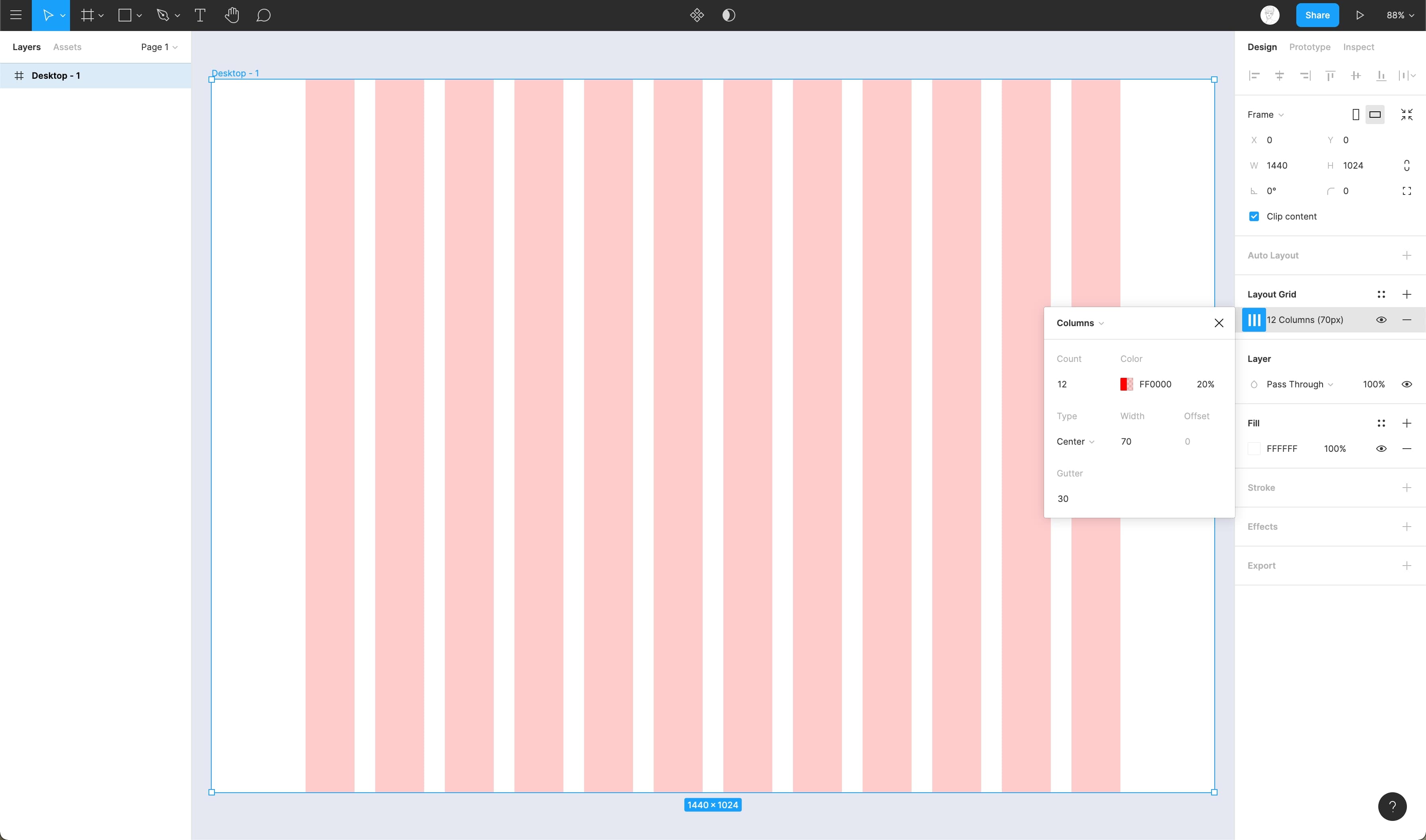
Column grids are the most used form of grid, especially for the web. These grids mostly consist of 12 columns that are evenly spaced to align elements or objects in your design with perfection. The number of the column decreases as the screen size decreases for responsiveness.
Baseline Grids
Baseline grids or Rows help you set up proper horizontal alignment and spacing for your typography or other elements of your design to rest on. These simply are just guides that help you design with consistency.

Fixed Layout
This layout contains a grid system that retains its width and position regardless of the change in screen size or orientation. This keeps all the elements of your design in a defined space.
Flexible Layout
Fluid layouts are the exact opposite of fixed as they take advantage of the available screen space. This means the grid width increases and decreases as the screen size changes but the margin and gutter width remains unchanged.
Setting up your Grid
- Navigate to Properties Panel and click on the ‘+’ icon next to Layout Grids
- By default, it’ll apply the Uniform grid. By clicking on the Grid icon, you can select between Grid, Columns and Rows from the drop-down

- Choose the Column and set the Count to 10 (depending upon how many columns you need)

- Set the Type to Center, width to 70px and finally, gutter to 30px

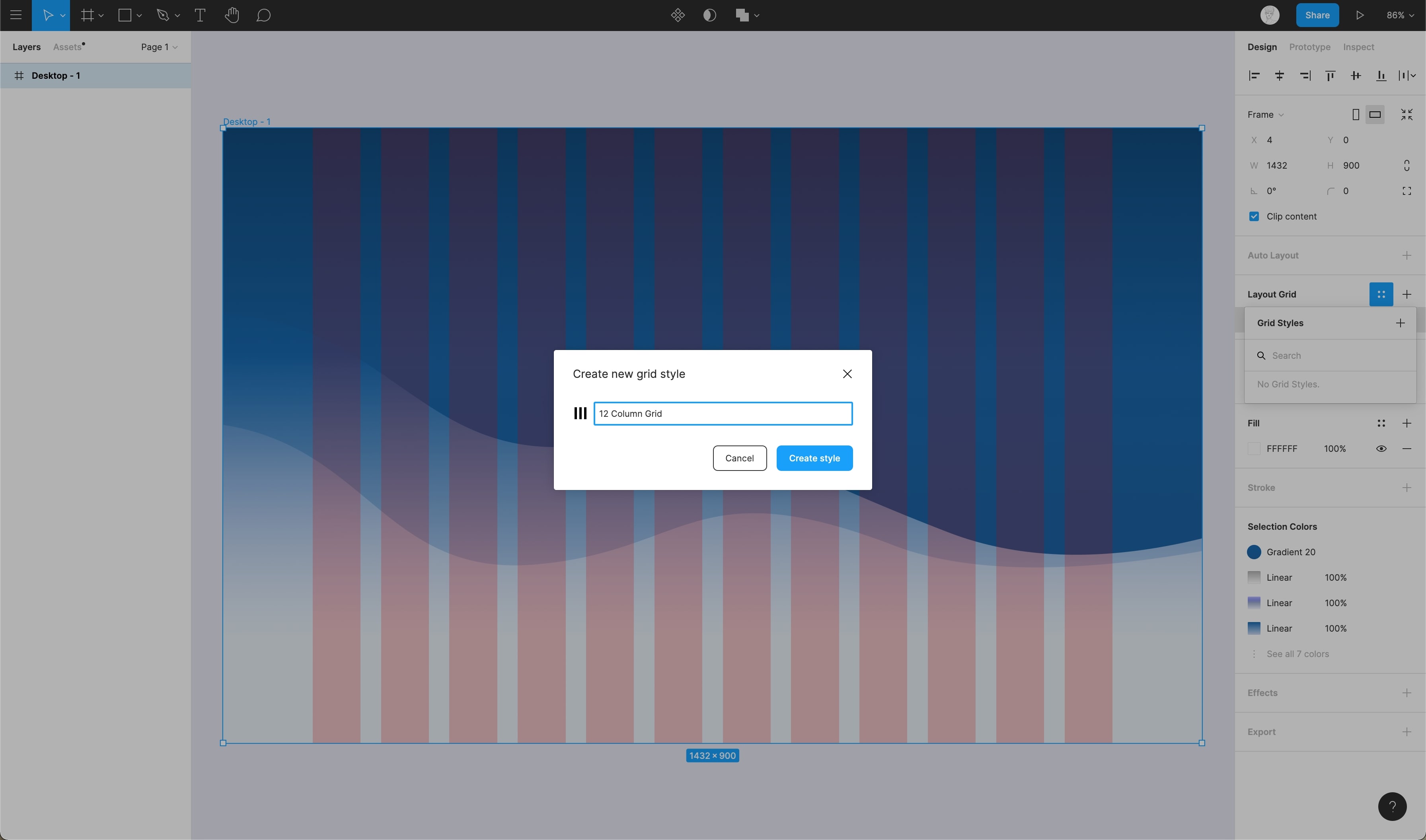
- By clicking on the ‘: :’ icon, you can create a grid style to reuse it later or add it to your design system. Remember that ultimately, you can customize your own Grid System for your design and there’s no limitation to this.
Conclusion
The layout grids, columns, rows and margins are invisible elements in the design. Using these will make your design look more balanced and have consistent negative spacing. Proper use of white space can emphasize the importance of the content.
Working with Auto Layout for responsive design.
Designing a product is more than just putting together the pieces. It’s about making sure that those pieces fit together perfectly, whether you’re designing for a website or an app. With Figma’s new auto layout feature, you can make sure that your design is both beautiful and functional in no time at all.
Downloads
To follow this tutorial, you can download the source file, which will help you compare your progress.
Auto Layout
Auto Layout has different properties compared to normal frames. When using Auto Layout, you might see a slight change in the properties panel, so it’s important that you know about these!
- Parents are frames that contain elements and objects of your design
- Children are the elements and objects inside the Auto Layout frame
Parent
The parent has four properties. Understanding these properties is essential. It will help you understand how your layout works and help you implement Auto Layout in the best way!
- Direction – allows your design layout either to be in Columns (Horizontal) or Rows (Vertical)
- Padding – determines the whitespace around your objects (Children)
- Spacing – controls the spacing between your objects
- Resizing – Lets you have a dynamic or fixed width


Children
The Child layout has very few and less complex properties compared to the parent! These properties are essentially alignment and positioning controls (based on the Parent direction).
- Alignment – align objects along one axis
- Absolute position – easily position items within auto layout frames using precise controls.
- Resizing – Lets you have a dynamic or fixed width

ALIGNMENT
Alignment is a powerful feature that allows you to control how child objects are aligned within a frame. With alignment, you can choose how your child objects are positioned and resized within the frame. You can also choose whether or not alignment settings are applied to all children or just specific ones.
- Select the auto layout frame and choose the alignment setting on the grid

ABSOLUTE POSITION CONTROL
Absolute positions are specified in a coordinate space that’s independent of the current flow stack. An Absolute positioned item can be positioned to a specific position relative to the parent frame, and ignoring the flow stack.
- To reposition an object inside an auto layout frame, select it, then go to the size properties and enable its absolute position
- When you enable absolute position for an object, the X and Y position become editable; this allows you to position it freely

ABSOLUTE POSITIONING AND CONSTRAINTS
The Absolute position item allows you to set constraints on any of its parent containers. A constraint will determine how, and how much the item responds when resizing its parent frame.

Designing with Auto Layout
Learn how to create a card using Auto Layout. We will combine what we learn along the way. By the end of this tutorial you will have a basic understanding of how auto layout works, at least as it pertains to cards on iOS.
This is a perfect example of how I replicated the card below.

- Let’s start by taking the avatar and the icon on the assets. Select the avatar and the icon then go to right panel, click on add auto layout. Select the icon you want to move. Then go to the frame panel. Click on the Absolute Position button. Move the icon and set the constraints to the center, bottom. Name this frame Avatar.

- Add the host name and house style to your card’s title bar. All you have to do is select two texts together, then click add an auto layout. Set the spacing between them as 8, name this frame Label. Afterward, select those frames together then click add an auto layout. Set the direction to Horizontal and the spacing between them as 30, and name this frame Host.

- We’re going to take our components for the details layout from the assets file. Choose Rate, Review and Super host. Select the 3 components, then click add an auto layout. Set the direction to Horizontal and the spacing between them as 20, and name this layout Details. After let’s select Host and Details layout, Then you can add to an auto layout. Set the direction to Vertical and the spacing between them as 30, and name this layout Glass Card.

- Select the location icon from the assets, then write down the address. Make sure not to add a layout inside of Glass card yet. Once these 2 are selected, click on “Add auto layout” and set the direction to horizontal and spacing between them as 12. Then name this layout Location and move it inside Glass card.

- Add Background Blur of 40 and Linear Color to #313A5B, Opacity to 0%, and Linear Color to #21273D. Set the drop shadow with Color to #000000, Opacity 30%, Y Value 10, Blur 20. Set the stroke color to #FFFFFF, 1 thickness, inside and use overlay. Change Horizontal Resizing Fixed with value 358. Set the alignment to center. Add a corner radius of 20px and Vertical Padding 24px.

- Now it’s time to add a few finishing touches.
- Select Avatar’s layer, then go to the size properties and enable its absolute position. Change the position with the following values: X Value to 0 and Y Value to -30
- Select the Details layer, and go to the Size properties. Change the Horizontal resizing to fill and the Vertical resizing to Fixed at 44 pixels
- Now, go to the advanced layout setting and select Space between as spacing mode. The next step is to set Horizontal padding to 30. Add a horizontal separator between elements, 30 pixels long and Opacity to 20%
- Select the Location layer, and change the Horizontal resizing to fill. Then set the Horizontal padding to 30

- Let’s try something more interesting with our background. Select Glass card, then go edit the linear gradient with the following values: first to #313A5B, opacity to 0%, second to 313A5B, opacity to 22%, third to #313A5B, opacity to 100%, fourth to #21273D and opacity to 100%. Position the colors like in this picture below. Move the third color above the second color

This is so exciting! We have made our card using “Auto Layout”. Now we encourage you to explore more and create something new that fits your project the best. Now that you know how it works, go ahead and make something amazing!

Conclusion
Auto Layout is by far one of the best features of Figma. This saves a huge amount of time spent on making our designs flexible, responsive and consistent. Auto Layout removes all the nuisances that are caused anytime you make changes to your layout.
Exploring vector mode to edit and customize vector shapes
Vector Mode
Vector mode makes it easier to edit existing shapes or creating new complex shapes. Press ‘R’ on your keyboard or select the Rectangle tool from the Tool panel, and create a rectangle on your canvas. Make sure the Move tool is selected. Then, press ‘Enter’ on your keyboard, or click on the Edit Object icon on top of the tool panel. This will activate the Vector Mode or Vector Edit Mode.

Editing Vector Shapes in Vector Mode
After enabling the vector mode, you can select a single point/path, or you can select all the paths at the same time and customize them as you want. After entering the Vector Mode, let’s do the following to customize the shape:
- Select and drag any of the anchor points to transform the shape
- You can press ‘Shift’ and select multiple anchor points to change these at once
- Press ‘Enter’ again or double-click anywhere on the canvas to make the changes

Creating Blob in Vector Mode
Blob shapes are added to a design to make it more visually appealing. It usually acts as a backdrop for other elements such as illustrations or texts which means that most of the time it is the lowest layer in a design. By entering Vector Mode you can create blobs using the Blend tool without the help of any plugin.
BLEND TOOL
Let’s start off by creating a shape and then, enabling the Blend tool.
- Firstly, create a rectangle. Then, press ‘Enter’ to go to the vector mode
- Next, select the Blend tool from the toolbar

CREATING BLOB
After selecting the blend tool, do the following to create a blob:
- Click on any of the anchor points. You’ll notice that the corner is transforming
- Now, click on all the remaining points to make it look like a circle
- To make it look like a blob, select the Move tool and move the shape around

Conclution
By enabling Vector Mode creating customized shapes is super simple. You can select any path/point, add different types of strokes, corners, caps, join. With vector mode, it’s super easy to add or remove a point or path. You can also add/remove color with the Paint Bucket tool after activating the Vector Mode.
Learn to use vector networks and design icons
Vector Networks
A vector network is an improvement upon vector paths. It allows you to join any two points unlike vector paths which require forming a single chain that can’t be broken. Vector networks make it very easy to create complex shapes which is especially useful while designing icons.

Paint Bucket Tool
As you Flatten shapes, Figma does shape separation, which can be useful to divide into areas. The Paint Bucket will allow you to enable or disable Fill.

Pen Tool
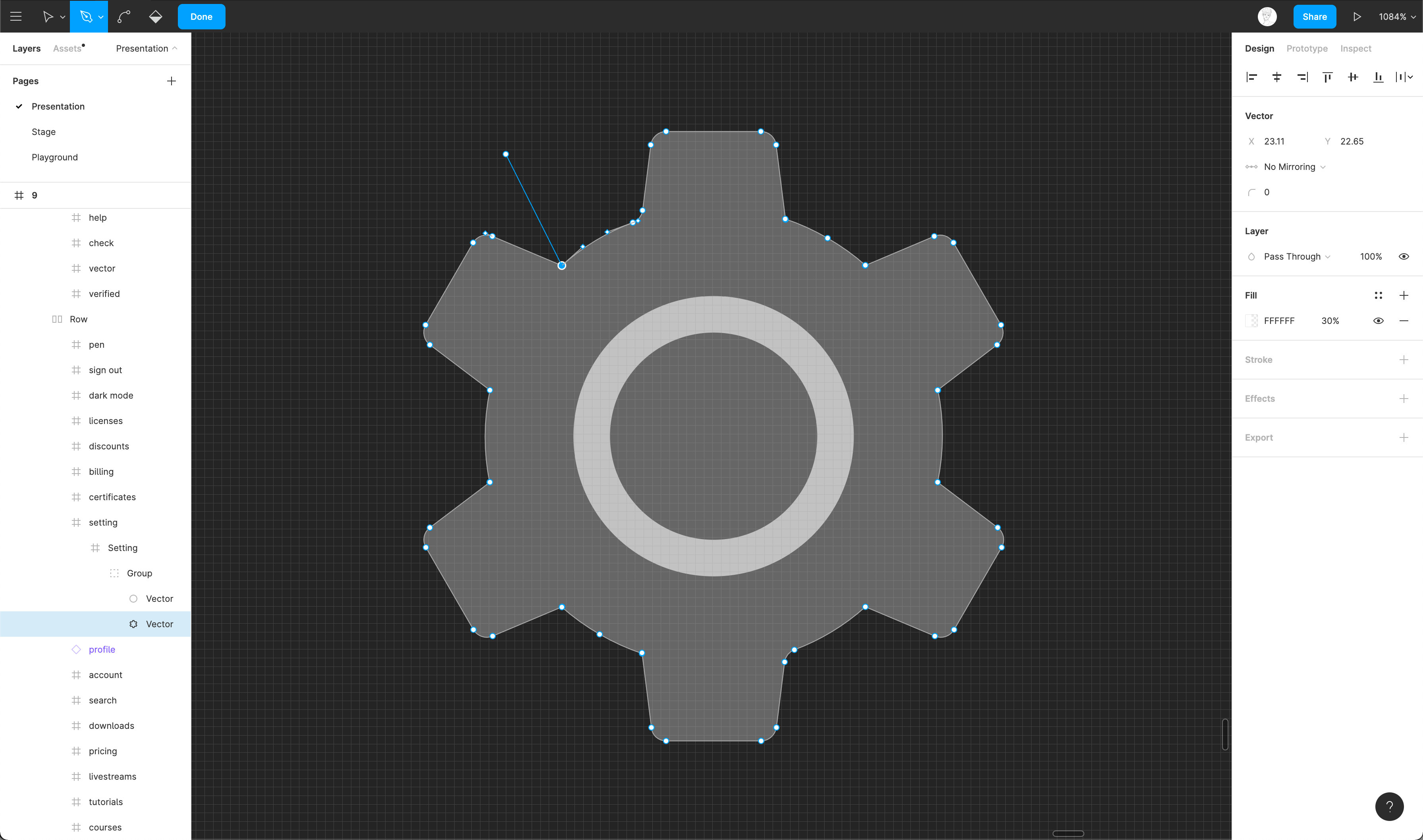
The Pen tool allows you to create new vector points or to edit existing points. You can hold click while creating a new vector point to curve your vector lines.
Bézier Curve
Vectors are composed of points, which can be curved using the Bezier Curve. At any point, you can select a vector point and edit the Bezier Curve by clicking on the endpoints.

Bend Tool
Instead of editing the bezier curves of vectors, which can be an arduous process that requires a lot of patience, you can use the Bend tool to simplify the process of morphing your shape into something interesting.

Color Wheel
Learn how to use the pen tool and vector paths to create a simple color wheel.
- Draw a Circle using the Ellipse tool
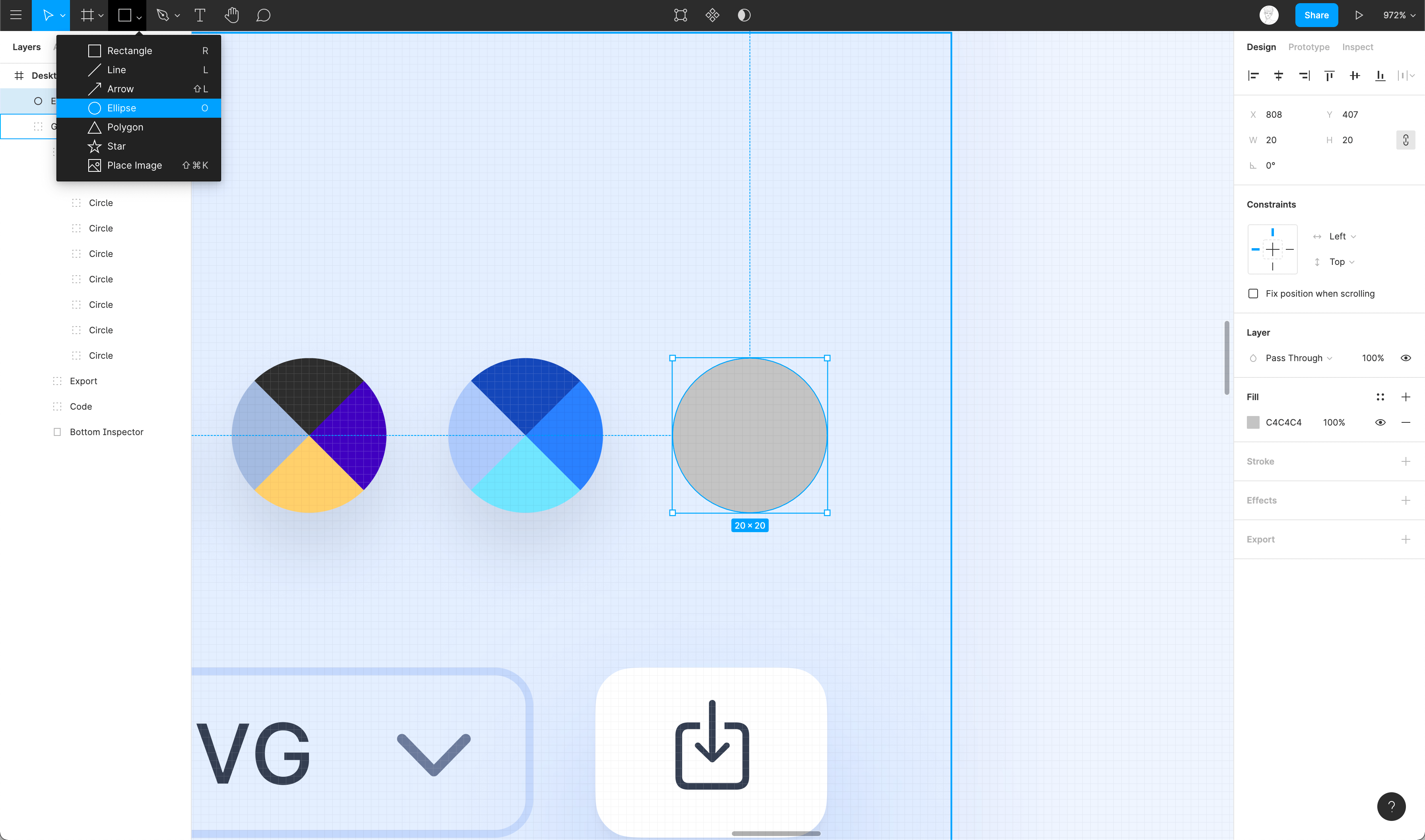
- Select the circle and press Enter on your keyboard to enter the vector mode
- Use the pen tool to join the horizontal and the vertical anchor points

- Use the paint bucket tool to remove the additional paths and then, add colors to the 4 sections by duplicating for each color slot
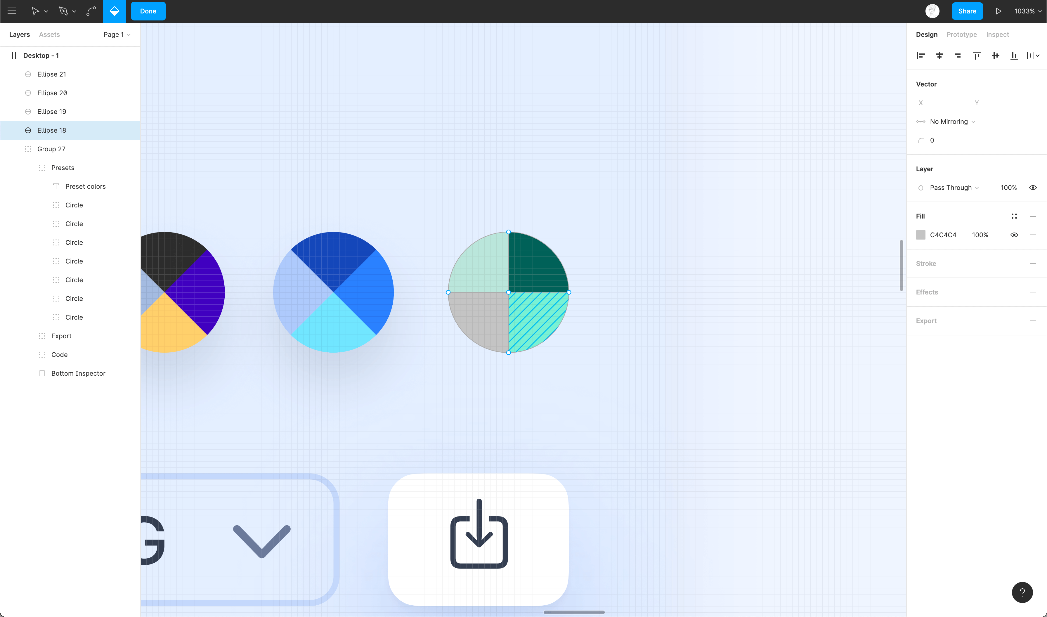
Conclusion
Vector Networks offer greater flexibility for editing the vectors. With the help of vector networks, you can create complex shapes in an easier manner. Play around with vector networks to get a clearer understanding!
Perspective Mockups
You must put the same effort into presenting your designs as you do in designing your idea. Beautifully presenting them leaves an impression on the viewers. This could be time-consuming work, but there are many resources that help make this as easy as possible!
Downloads
To follow this tutorial, you can download the source file, which will help you compare your progress.
Presentation
Presentation means everything, especially when you’re a beginner. You may not have that many real projects to showcase, so everyone will judge you based on how well you present your side-projects and experiments that sometimes might feel and look like an actual product.

Landing Page
Marketing pages often use mockups to showcase their products, which helps users understand how the product works and which platform it’s mainly for. Presenting in context creates a lot of difference in how viewers absorb your idea.

Angle
Angle is a library that provides over 1900 mockups that can be used in your design project to make it more visually pleasing. In this tutorial, we go through the process of using the Angle plugin to apply screen designs to the perspective mockups.

Perspective Mockups using Angle
Angle is a Figma plugin that lets you apply your designs to 3D perspective mockups. Let’s see how we can start using the plugin! Below are the links to the plugin and the library.
- Angle Mockups: Vector and 3D device mockups
- Angle Plugin: Figma plugin to apply perspective mockups

Why Perspective Mockups
Perspective mockups bring in a sense of naturalness. They feel more visually appealing and dynamic. Since there is a wide range of selection from Angle, it’s easy to create several interesting compositions.

Using Angle Plugin
After installing the Angle plugin. Use it as follows:
- Select the perspective layer/mockup to which you’d like to apply your design to

- Press Cmd + / and look for Angle. After you press Enter, a modal should open up

- Using the “App Design Frame” dropdown, select the Frame that has your design
- Make sure to set the Pixel Density to 2x and the Quality to Best.

Resources
You can learn more about mockups and how to make the best use of them on our “Realistic Mockup” tutorial from UI Design Handbook. Also check out the Product Mockups from Semplice which is more unique from those existing in the market right now!
Conclusion
Mockups are a way to present our designs in a more appealing way to the general audience that is essentially to designers. So it’s important to present your designs in context!
Adding 3D mockups to design
3D mockups can be used to elevate a static design. In Figma, you can add these mockups very easily using plugins such as Vectary 3D. This plugin allows you to add your chosen frame to devices as well as 3D objects. Let’s go ahead and see how we can use it!
Downloads
To follow this tutorial, you can download the source file, which will help you compare your progress.
Installing the plugin
The first step is to install the plugin through the Plugins tab in the dashboard.
- Head over to the plugins tab and click on the ‘Browse all plugins’ button
- In the search input, type in ‘vectary’ and select the one by Vectary
- Click on the ‘Install’ button at the top-right to install it

Using the plugin
To place your design inside the mockup, do the following:
- Select the frame that contains the design you’d like to add to the mockup
- Right-click and in Plugins, select Vectary 3D

- Choose your preferred mockup and click on the ‘Use Selected Frame’ button to place your design inside the mockup

- Lastly, click on ‘Save view as image’ to render the device inside your design file

Conclusion
Mockups help us present our designs in an appealing way to the viewers and especially 3D mockups, as these look and feel realistic. Also, keep in mind to present your designs in context!
Using Illustrations in Design
An illustration should not just be an aesthetic element. Illustrations are a visual way to communicate your idea. It brings a better understanding of the minds of the viewers. You must understand and use illustrations with the right context. You can also take a look at the UI design handbook to get a better idea.
Downloads
To follow this tutorial, you can download the source file, which will help you compare your progress.
Customizing
With Figma’s Selection Colors, you can easily customize an illustration without having to navigate the maze of layers and getting lost. Selection Colors offer you the ability to see colors in use and change the colors within a selection.

Illustration Libraries
Mentioned below are illustration libraries that you can use to get illustrations and add the same to your design file.
SHAPE
Shape is a huge collection of static and animated illustrations as well as icons icons, made in-house by Design+Code. With a full-blown editor, Shape lets you customize illustrations right inside your browser and export it as PNG, SVG or as a React Component.

BLUSH
With Blush you can mix-match different illustrations and create your own compositions that perfectly fit your design. As it offers a Figma Plugin you’re able to do all this magic right inside your Figma project.

Blush Plugin
The first step is installing the plugin.
- To install, navigate to Plugins ****on the left menu
- Click on “Browse all plugins” and Search for ****”Blush”. Install the one by Pablo Stanley
- You can also install the plugin using this link

Using Blush
Now that it’s installed, let’s use it!
- Press Cmd + / and look for Blush. After you press Enter, a modal should open up

- Click on a Collection that you like. Here, you can choose your preferred illustration from either Scenes or Characters. Simply click on the one you’d like to add and it’ll be added to the frame

- Blush provides a lot of customization, we encourage you to play around with different ones
Conclusion
Illustrations can be an important piece of how you present your design to the viewers. It can communicate your ideas effectively and in a visually pleasing manner, enabling users to connect more.
Using booleans to design icons
Boolean groups allow users to combine any shape or a set of layers by using any one of the following formulas – Union, Subtract, Intersect and Exclude. In this tutorial, we’ll design two icons using these formulas.
Downloads
To follow this tutorial, you can download the source file, which will help you compare your progress.
Designing Icons
Since icons are small and complex structures, it is important to design them with perfection to make them appear precise to the user’s eye. This is how you can make the best use of booleans.

Union
Union combines multiple shapes into a boolean group. If the shapes overlap, the new shape’s outer path consists of composite sublayer’s paths minus any segments that overlap. When using Union, the top layer’s style is applied to the rest of the layers below.

Subtract
Subtract will subtract a single shape or multiple shapes from the main shape (the one at the bottom). It’s important to note that all subsequent shapes will always be subtracted from the main shape. When using Subtract, the main shape’s style is applied to the rest of the shapes.
Intersect
Intersect creates a boolean group in which the shape consists only of the parts that are overlapping each other. Let’s create multiple shapes and apply the intersect selection to these. When using Intersect, the top layer’s style is applied to the rest of the layers below.
Exclude
Exclude is the exact opposite of Intersect, which means that it only shows the areas of its sublayers that do not overlap. When using Exclude, the top layer’s style is applied to the rest of the layers below.
Flatten Shape
Using booleans with multiple shapes can really make your icon complex and multi-layered. One way to simplify is to flatten everything, which combines multiple shapes into one vector and controls it as a whole, yet can control each shape individually.
Set Default Properties
The default light gray color may not be the best color to use for our icons. Every time we create new shapes, we have to change the Fill and that can be tiresome. Let’s change the Fill to black. Then, go to the menu / Edit/ Set Default Properties. Now, the next time you create a shape, it’ll be black.
Eye Icon
Let’s create an eye icon using Intersect and Subtract functions
- Create a circle sized 18*18. Align it to the center horizontally and place it at the top with a 8px gap from the bottom of the frame

- Set the color to black and duplicate the circle. Place the new circle to the bottom in such a way that the circles intersect with each other

- Select the shapes. In Boolean Groups, select Intersect Selection. Set the corner-radius to 2

- Create another circle sized 6*6 and place it at the center of the eye shape

- Again, select both the shapes and in Boolean Groups, choose Subtract Intersection

Cog Icon
let’s see how to create a cog icon using simple shapes and Boolean functions
- Create a Star polygon that’s 24×24 with 8 count, radius 2 and angle 60%. Set the color to black

- Then create a circle sized 10×10, align it to the center of the frame and use Subtract. See, it’s that simple!

Conclusion
Boolean functions are really useful when it comes to designing complex structures, using this method saves a lot of time that was before spent on manually editing the shapes to perfection.
Learn how to design icons using the tools provided by Figma
Icon Design refers to the process of creating symbols that represent something. While designing an icon, we need to keep in mind that it provides a sense of clarity. An icon can oftentimes replace text, especially on smaller screen sizes. When designing an icon, please ensure that it quickly conveys the concept behind it and isn’t confusing.
Downloads
To follow this tutorial, you can download the source file, which will help you compare your progress.
Recognizable
Icons simplify information or ideas to be easily understood by users at a glance. Icons are meant to be a visual representation of interactions that users already recognize and are familiar with. You must use the right icons in the right places without confusing users; in that instance, use labels!

As you can see in the example, the Heart icon is being used to indicate two different things, but there’s no confusion for the user because of the labels.
Stay Consistent
When designing icons, make sure each icon portrays the same look and feel to maintain consistency and to ensure that it fits perfectly into your brand. Having differences can make your app feel inconsistent and disorganised.

Styles
When it comes to icons, there are many different styles, but the popular ones are outlined (this can also be classified into light, regular and bold), fill, and color. It’ll be handy for you to have these styles as you can use it to communicate selected and deselected states.

Icon Interactions
Little details make a difference. Making your icons interactive can be delightful for the users. It can make the user experience more enjoyable specially when small details are noticed!
Grids
Setting up a grid can be very helpful while designing icons since it’s important to make them pixel-perfect. Always go with even numbers that should then scale up in even multiples (Example: 24px, 32px, 42px, etc.). Grids should only serve as a guide so don’t let that limit you.

Booleans
Icons are small and complex structures; it is important to design them with perfection to make them as precise as possible to the user’s eyes. Since Booleans use formulas to create precise forms, this will be the best method for designing icons!

App Icon
App Icon is the most valuable aspect of your app, as it’s the first thing users perceive from your app. So it is important to make your app icon beautiful and memorable so that it captivates users’ attention from the huddle of apps available.

Creating An Icon using Booleans
Learn how to design icons using vectors and shape tools.
- Create a rectangle sized 14*14, remove the fill and stroke of 1pt

- Press the Return key to go to the vector mode
- Using the Pen tool, create 2 vector points on the rectangle

- By pressing V on your keyboard hover on the line and delete it

- Set the corner radius to 2 and the Cap to round in the advanced stroke options

- Create an arrow by using the “Arrow” from the Shape tools

Creating an macOS app icon
- Draw a Frame with a Width and hight of 1024×2024

- Now let’s draw a Reactangle inside the frame with a width and hight of 824×824 and set the Fill to Linear from Solid with respective colors #BA75FF and #3913B8

- Navigate to the Effects Section in the Properties Panel and create Drop-Shadow, set the color to #000000 with 25% opacity, Blur value to 20 and the Y to 14

- Let us draw an Ellipse in with a width and hight of 680×680, align it to the center of the frame. Now remove the Fill and add a Stroke size of 78px and set the stroke Inside.

- Great now let’s style the Stroke! Set the blending Mode to Soft Light from Normal and change the Stroke color from Solid to Linear with respective colors #3913B8 #000000. and create a Drop-Shadow and set the color to #FFFFFF with 50% opacity and Y value to 5

- Duplicate the Stroke and set the width and height to 512×512 and the Stroke size to 12 and align it to the center of the Frame

- Finally let’s add the Logo to finish our macOS app icon design!

- You can export the icon as PNG and usign CloudConvert you can quickly convert your icon from PNG to ICNS which is Apple’s Icon Image format.

Additional Resources
We suggest you to look more into Apple’s Human Interface Guidelines for App Icon Design to get more understanding about designing icons for mac & ios apps.
Conclusion
Icons are a great way to save space, especially in small devices. Make sure to design icons that are simple and recognizable at a glance. Also ensure that they are legible and avoid toggling between two different styles.
Make your design more reusable by using components.
Reusability is a very important aspect of design. Not only does it save time but it also helps with making your design more consistent. In this tutorial, you’ll learn how to create reusable components.
Downloads
To follow this tutorial, you can download the source file, which will help you compare your progress.
Main Component
The first time you create a Component, it becomes a Main Component.You can edit on the fly just as you would edit any other elements. The Main Component can be distinguished by an icon with 4 diamonds while copies of the Component will have a single diamond icon. Any structural change, such as position and the actual composition of the layers will affect copies of that Component.

Property Overrides
Editing the contents of the copies won’t affect the Master Component. Overrides can affect text, images, colors, shadows, and even styles.

Nested Components
A Component can exist inside another Component. This is a powerful workflow because you want to be able to reduce the size of your Component as much as you can. There are small Components, such as Buttons and Icons, and there are big components like Cards, Overlays, and Modals.

Component Overrides
Changing the content of your Component is crucial to creating reusable elements. At the basic level, you can only change properties in the Inspectors. However, sometimes, you want to be able to change groups of elements, such as icons. The only way to do this is to create duplicates of a Component.

Component Naming
Adding a Slash to the name groups component overrides. This allows us to put similar Components together and easily find them in the drop-down menu.

Creating Components
- Component: Command + Option + K to create a Component or click on the 4 diamonds icon placed at the center of the menu bar

- Component Naming: Let’s duplicate the Logo / DesignCode Component 3 times. For all the copies, right-click to Detach Instance. Now, for each Frame, you can import a new logo and create a Component with their respective names.

Conclusion
Components are extremely flexible in Figma. These allow for a more faster and smoother workflow. Not only does it save time but it also helps with making your design more consistent. More importantly, re-usability is a very important aspect of design.
