Alignment, Distribution, & Tidy up Properties
Downloads
To follow this tutorial, you can download the source file, which will help you compare your progress.
Alignment
Alignment properties are located at the top of the properties panel. There are 6 alignments, and 3 distribution properties are available in Figma. The 6 alignment properties are:
- Align Left
- Align Horizontal Center
- Align Right
- Align Top
- Align Vertical Center
- Align Bottom
And the 3 Distribution properties are:
- Tidy Up
- Distribute Vertical Spacing
- Distribute Horizontal Spacing
You can align a single layer to the artboard by selecting the layer and clicking the properties. Or you can align a layer to another layer, or multiple layers by selecting them together and clicking the properties.

If you select a few layers and group them together, the group itself will be considered as a single layer.
Tidy up
When there are multiple objects in your artboard but they are not placed equally, then you can use Tidy up options. There are 3 kinds of Tiding up buttons.
- Horizontal
- Vertical
- Grid
Let’s see different examples to understand these better.
1. HORIZONTAL TIDY UP
If you have multiple elements, which have unequal horizontal gaps in between, you can use Horizontal tidy up to set the horizontally equal gaps between the objects.
Let’s select a few shapes which are placed horizontally. Then if you hover over the corner of the selections, you’ll see the Horizontal Tidy Up icon appears. Now click on the icon, and all the shapes will distribute equally to the horizontal line.

2. VERTICAL TIDY UP
If you have multiple elements, which have unequal vertical gaps in between, you can use Vertical tidy up to set the vertically equal gaps between the objects.
Let’s select a few shapes which are placed vertically. Then if you hover over the corner of the selections, you’ll see the Vertical Tidy Up icon appears. Now click on the icon, and all the shapes will distribute equally to the vertical line.

3. GRID TIDY UP
If you have multiple elements, which have unequal vertical and horizontal gaps in between, you can use Grid tidy up to set the equal gaps vertically and horizontally between the objects.
Let’s select a few shapes which have uneven gaps. Then if you hover over the corner of the selections, you’ll see the Grid Tidy Up icon appears. Now click on the icon, and all the shapes will distribute equally.

Conclusion
When it comes to aligning a shape to the artboard or multiple shapes to a specific shape you can either use the properties panel, also there are some specific shortcuts that you can use to speed up your workflow.
Working on union and corner radius.
Boolean operation allow users to combine shapes. There are four of these but in this tutorial we’ll be focusing on Union Selection. Then, we’ll add in a corner radius to make the design more impressive.
Downloads
To follow this tutorial, you can download the source file, which will help you compare your progress.
Boolean Operation
Let’s learn a bit more about what Union Selection does. Union allows one to merge a set of shapes together. If the objects overlap, the new shape’s outer path consists of the composite of its sublayers’ paths minus any segments that overlap. This comes in handy, especially when you’re trying to create icons.

Corner Radius
Figma has an Independent Corner control, this gives the user an ability to either set one value for all the corners or set a separate radius value for every corner. You can find this functionality in the Properties panel. In the image below, we’re simply setting the corner radius to 30.

Independent Corner Control
Let’s take a close look at the Independent Corner Control via which you can set radius for each corners separately. To open it, click on the icon next to the corner radius input field. Once you click on it, four values show up. Change these values to set a different value for each of the corners.
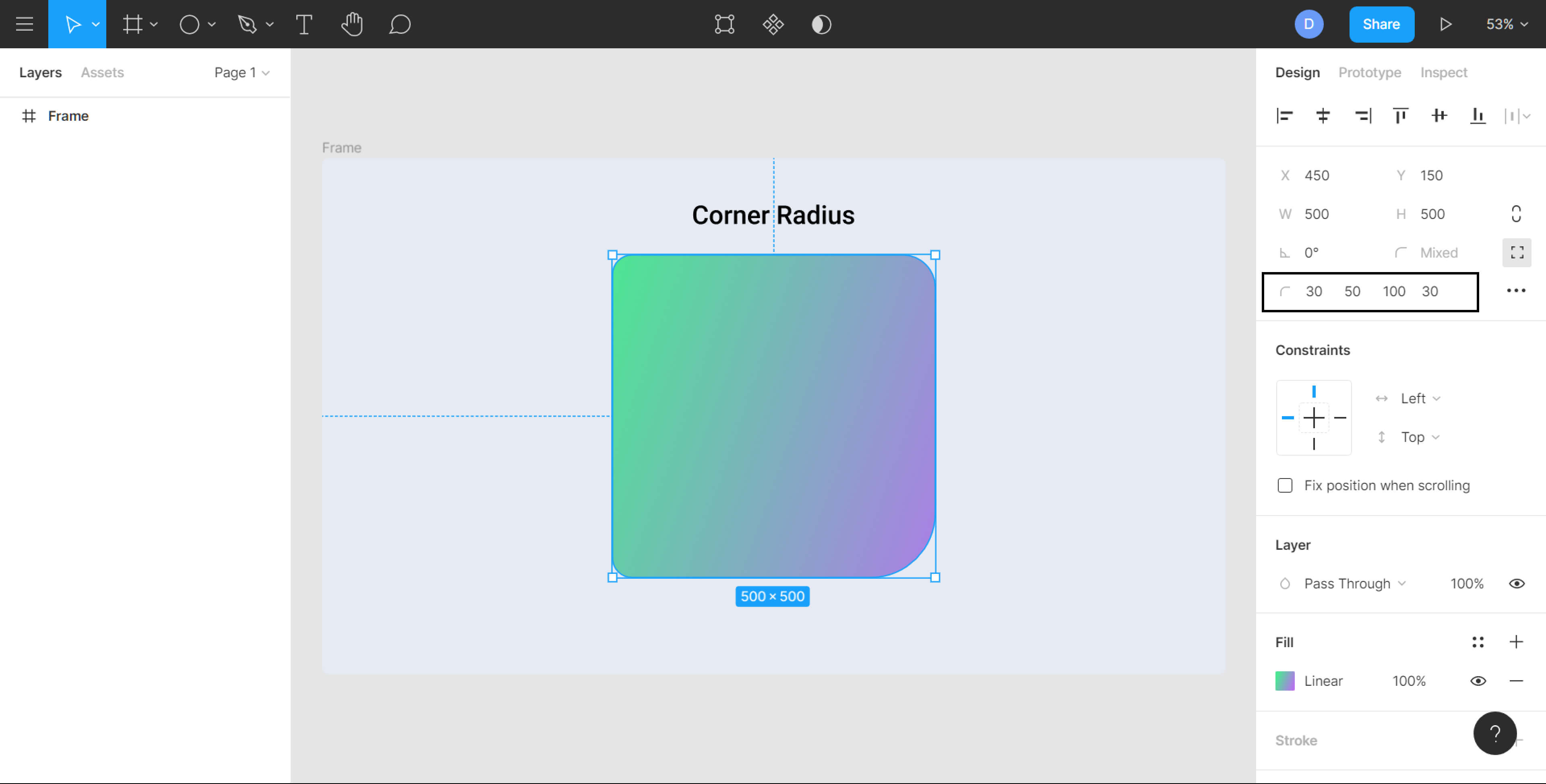
Alternate Method
You can also set corner radius directly on the canvas. All you need to do is select the shape and drag any one of the circles in the corners inwards. Keep in mind that this can not be done for frames, you can only do this for rectangles, stars, and polygons.
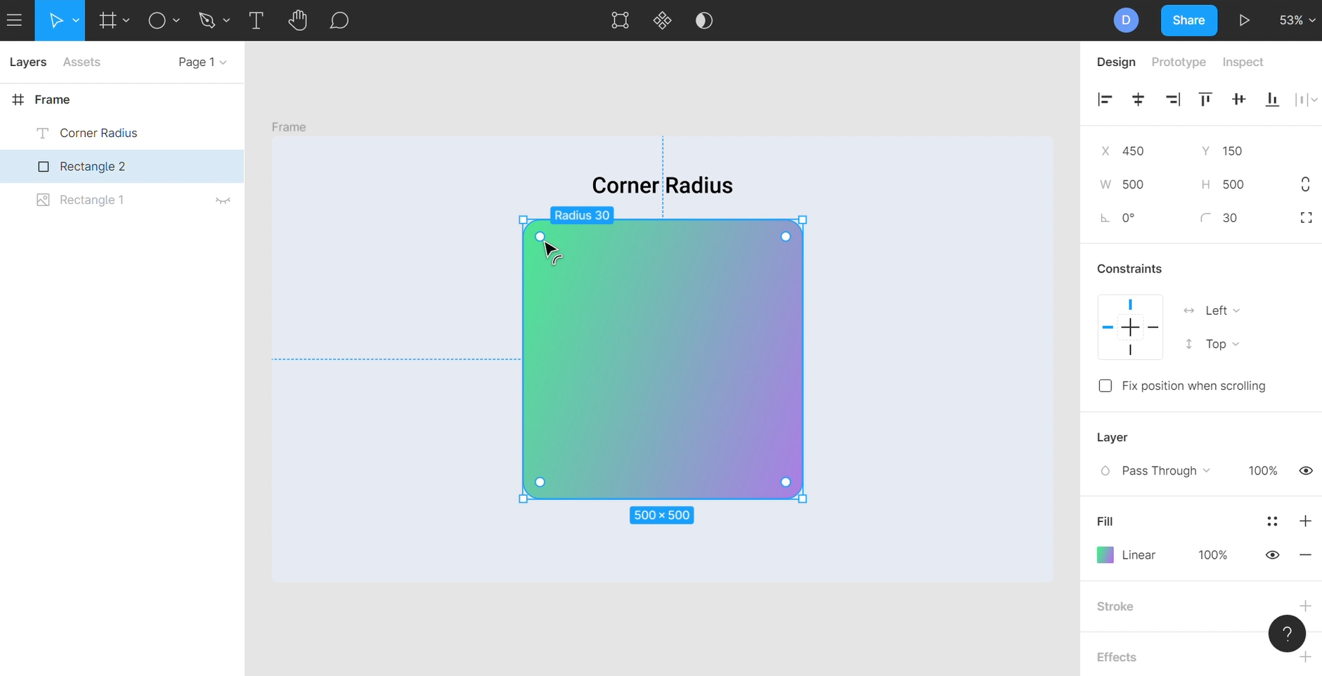
Corner Smoothing
The rounded corner in iOS looks smoother than the regularly rounded corners. To enable adding the same to the designs, Figma came up with the Corner Smoothing feature. The shapes that are created once this effect is added are commonly called ‘squircles’.

Working with Union
Learn how to creating fluid tab navigation using Union and Corner radius
- Let’s start by creating an Ellipse with a width and height of 82×82 and set the Fill Color to #6B4CF2.

- Drop-Shadow of color #6B4CF2 with 40% opacity, set the Blur value to 20 and Y, and X value to 10.

- Now Duplicate the Ellipse and space it 30px to the right, and change the width and height to 48×48.

- Draw a rectangle with a height of 12px, connecting both the Ellipses and align it to the vertical centers of those two Ellipses. Copy and paste properties from an Ellipse to the Rectangle.

- Great, Now union all three shapes together and set the corner radius to 24px

- Draw another Ellipse 50×50 and align it to the center of the Large Ellipse.

- Now let’s style the Ellipse, set the Fill Color to #44C8CF, and a white stroke with 30% opacity with a stroke size of 1.

- Duplicate the Ellipse and align it to the small purple Ellipse with a margin of 6 and remove the Fill Color.

- Next up, let’s add the icons.

- For the final part, to make this more interesting, let’s create a ripple effect using Neuemorphic styling.

Conclusion
In this section, we edited a shape using union selection and then, manipulated it further with the help of the corner radius. We urge you to play around with both these values and create different iterations of your preferred shape.
Shadow and Blur Effects
Properties like Shadow and Blur add several essences to your design, from aesthetics to bringing functionality. By adding a simple shadow, you can elevate the particular element and using blur to create depth or even interesting background effects.
Downloads
To follow this tutorial, you can download the source file, which will help you compare your progress.
Dynamic
Using a Background Blur with an opacity quickly captures the design’s look and feel. It also adapts to the changes accordingly while maintaining the consistency without needing to make any changes manually. This doesn’t happen when you use a solid color.
Translucency
Translucency and blur gives a sense of depth by enabling an element to refer to the content underneath. This also helps create a visual separation between foreground and background content and direct user’s attention to the important Information.

Contrast
Adding Blur and Drop shadow helps in creating contrast for particular elements of your design that is being disrupted by underlying objects or layers.

Elevation
Having a Drop shadow adds focus to the elements and also brings a sense of elevation in response to interactions. Shadows imply that a component is interactive as it creates a visual perception of depth and movement. For example, you can set a Drop shadow to a button to make it look clickable.

Blur Effects
- Layer Blur: Blurs the selected layer
- Background Blur: applies a blur to any layer or object below the selected layer.

Shadow Effects
- Drop Shadow: forms a shadow for the selected layers
- Inner Shadow: applies a shadow within the layer or object which is restrained within the layer’s bounds.

Designing Pricing Card
Let’s learn how to create a dynamic pricing card using Blur and Shadow Effects
- Draw a Rectangle sized 360×426. Set the fill to White and enable Independent Corners and set the values to 60px except for the top-left corner.

- Set the Fill Opacity to 30%, add a Stroke, set the color to White and opacity to 50%

- Now, let’s add a Drop Shadow. Set the color to #004B75 with an opacity of 30%, Blur value to 100 and Y to 50.

- Let’s add a Background Blur with a value of 40. Duplicate the card and set the color to #9EE1EC with 30% opacity. Move it below the White color card and align it to the top left corner.

- Awesome! We have our card setup. Now, let’s add the information and we’re done!!

Conclusion
These two properties give visual hints that help users better understand the interfaces and direct them to focus their attention to certain interactive elements. Having shadow and blur effects makes your design feel more dynamic and natural when done with perfection.
How to use images in Figma
Importing Images
There are a few different techniques you can follow to import an image in your Figma file. You can just drag and drop the image to the Figma file. You can also either press Ctrl+Shift+K on your keyboard or select the Place Image option in the shape tool.
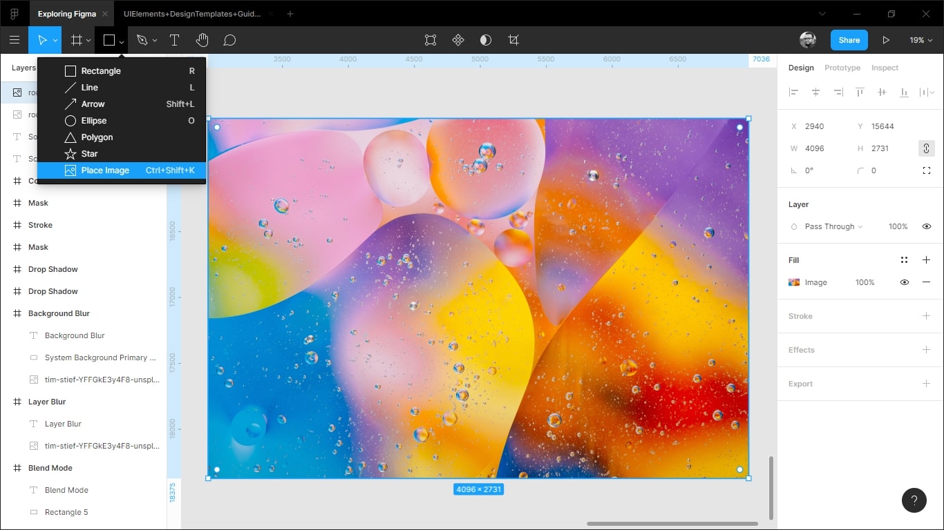
Image Formats
You can import images in any of the following formats: PNG, JPEG, GIF, TIFF or WEBP. Once an image is uploaded, it will show up in the Fill sections of the properties panel in the right.

Copying & Pasting
Importing images in Figma can be as simple as copy and pasting. All you need to do is right-click the perfect image you’ve found in your browser, select ‘Copy image’ and then, paste it in your design file in Figma. Most browsers support this feature.

Drag & Drop
Figma also allows you to drag and drop any assets you’d like to add to your design file. This is very useful when you’d like to add multiple images to the same file.

Editing/customizing images
Figma allows you to Crop, Resize, or applying filters like Exposure, Contrast, Highlight, Shadows, etc. After importing an image on the Figma canvas press Enter on your keyboard, or you can click on the Crop Image button at the top instead to open the image panel.

Conclusion
In design, you’ll see the use of images everywhere. If we don’t optimize our images correctly to use for the web, it would affect the performance of the website. So, it’s important to optimize your image correctly, and Figma allows you to do so very easily.
Fill, Stroke, & Advanced Stroke
In Figma, the Fill, Stroke, and Advanced Stroke options are used to customize the appearance of an object or text.
Downloads
To follow this tutorial, you can download the source file, which will help you compare your progress.
The Fill option determines the color or pattern that is applied to the inside of an object. The Stroke option determines the color, thickness, and style of the line that is drawn around the object. The Advanced Stroke option allows for further customization of the stroke, such as setting the corner radius and end caps.
These options can be accessed through the Properties panel on the right-hand side of the Figma interface. By using the Fill, Stroke, and Advanced Stroke options, you can create a wide range of visual effects and styles for your designs.
Fill
In the Figma editor, the color panel is named as ‘Fill’, and it’s located on the Properties Panel on the right side of the editor.
Let’s create a Rectangle shape by selecting the Rectangle tool (R). Then you’ll see the Color panel is activated and the shape is filled with gray color.

There are 4 main sections to notice on the Color panel.
- Color Value: You can input any #hex color values into the input field. Or you can click on the color icon to open the color palette to select colors manually.
- Transparency: You can increase/decrease the transparency of your shape by increasing/decreasing the percentage. 100% transparency means the shape is fully visible, and 0% means it is fully invisible.
- Activate/deactivate Fill: You can activate/deactivate your fill color by clicking the Eye icon next to the transparency value. Clicking on the Minus (-) icon will remove the fill, and clicking on the Plus (+) icon will add another fill on top of the current fill color.
- Color Style: You can save any color as a Style by clicking the four dots ‘: :’ icon, and reuse it for your next design. We talk more about Color Styles in our Color Styles in Figma chapter.

Paints in Figma
In Figma, paints can be colors, gradients, or images. The Color picker can be used to apply paints to fills and strokes.
PAINT TYPES
There are 3 types of paints you can apply to your Figma:
- Solid: This is the most basic type of paint, and it will cover the entire surface.
Gradients: choose from four different gradients:
- Linear (gradient): a progressive transition between two colors on a straight line. You can choose the angle of the line and the length
- Radial (gradient): a circle gradient where the color starts off in the center and fades out along the edge. This could be another color, or a fade to transparent.
- Diamond (gradient): is a shape with four points and a gradient between the points. The gradient can be adjusted on both the x and y axis, allowing you to create smooth transitions between colors
- Angular (gradient): a gradient clockwise. If you use the starting color and end color of the gradient, you can adjust the location of both colors in the gradient. You can also create a softer or harsher angle
- Image or GIF: a static image or animated GIF is a type of file that you can use to add images to your work.

FILL GRADIENTS
Figma’s gradient fill is a shape fill that gradually changes from one color to another across the surface of the shape. It can be a variation of one color as shown above, or a blending of two or more different colors to create stunning effects like the examples below.

ADD FILL
The Fill Tool allows you to easily add fills to your text layers, frames and any vector objects. You can even add more than one fill to a single layer. This allows you to layer gradients over images, or apply blend modes to create unique effects.
- To add a fill to a layer, you first select the layer(s) that you want to add the fill to
- Next, in the Fill section of the right sidebar, click on the + icon to add a fill to the layer

- Figma will add a default Solid fill with a hex value of C4C4C4. Click on the fill swatch to open the color picker
- From the color picker, you can select a paint type (Solid, Image or Gradient), choose a color, and apply blend modes

- Add another fill, this time linear
- You can add 3 colors to your design. The first color is black with an opacity of 0%, the second is black with an opacity of 70%, and the third is black with an opacity of 80%.

- To move the second color onto the first color, simply click and drag with your mouse.
- Add text to the image.

FILL IMAGE
You can quickly apply an image to an existing shape by tapping the color picker. You will need to have the image downloaded to your computer and uploaded
Note: Only JPEG, PNG, TIFF or HEIC images are accepted.
UPLOAD AN IMAGE
- Choose the shape you want to use from our collection of shapes, or create a new one by drawing it on the canvas.
- Click the Fill swatch in the right sidebar to open the color picker.
- To fill an image, select the Fill mode and then click on Image from the options.
- A placeholder image of black and white checks will be applied to the shape. Click the Choose image button in the preview:

REPLACE IMAGE FILLS
Replacing an image fill is easy!
If you have an image applied to a shape as a fill, you can replace it with a new image. This will keep any fill mode settings you’ve applied, including any cropping or positioning. There are a few ways to do this:
- Drag the image file you want to fill over the image preview in the Fill panel.

- Drag the image file over the Fill in the right sidebar:

**ADD VIDEO TO PROTOTYPES USING FILL**
If you’re building a prototype, then you probably want to include video. Adding video to your prototypes can help you replicate the experience your users would have in a site or app with video playback or previews.
TYPES OF VIDEO IN PROTOTYPE:
- Should be in mp4 format
- Cannot exceed 30MB in size
- Are shape fills and behave as such
- Are not currently supported in the Figma mobile app
ADD VIDEO TO ANY SHAPE
Similar to images, video can be added to any shape as a fill as long as the video matches the size of that shape.

HOW TO INSERT VIDEO
First thing, you need to upload a mp4 video format. After this, you can add them to any vector or shape.
Here’s a list of ways to add a video prototype to design files:
- Drag and drop video file from your computer into the canvas
- Create a shape and applies the video as a fill (as in the example below)
- Copy a video from another layer in the current file, or from another file
- Paste any video from your clipboard into the canvas

The gray rectangle layer is the placeholder for the video.
Stroke
By default, the Stroke panel is also deactivated, and it’s located next to the Fill panel. Click on the Plus (+) icon to add a stroke to your shape.

You can see a new color panel for stroke has appeared. You can set the color of the stroke by following same process we did for adding fill to the shape. Also, there are some other options in the next row.
- Stroke Size: You can set the stroke size by inputting any number. 1 means the stroke size is 1px all around the shape. Let’s input 2, to set the stroke width to 2px.
- Align Stroke: By default, the Align Stroke is set as Inside. Click on the drop-down icon to change the alignment to Center or Outside of the shape. Inside means that the 2px stroke is set inside all areas. Outside means the stroke will be set outside of the 100px*100px shape. Center means the stroke will be added to the borderline – 1px all over the inside areas, and 1px all over the outside areas.
- Advanced Stroke: Click on the 3 dots (…) icon to open the Advanced Stroke panel.

Advanced Stroke
There are 4 different sections in the Advanced Stroke panel. Cap, Dashes, Join and Miter Angle.
CAP
Let’s create a Line by Pressing ‘L’ on your keyboard. Press and hold Shift when dragging to make the line straight. Set the stroke width to 10px to see the differences better.
Now, open the Advanced Stroke panel by clicking the 3 dots (…) icon again and click on the drop-down menu to open different stroke Caps.
- None: By default, the Cap is set to None. When None is selected no additional style is added to the end of the line.
- Round: It creates a rounded cap on both the sides
- Square: It creates a squared cap to both sides of the end point. It looks the same as None
- Line Arrow: It makes arrows appear on both ends
- Triangle Arrow: It creates triangular arrows on both sides
You can set different types of caps by entering the Vector Mode. We describe more about Vector Mode in the Vector Mode in Figma chapter.
Select the line, and press ‘Enter’ on your keyboard. Now you can select a single point at a time, and set different types of Caps to different points.

DASHES
You can create dashed lines by inputting the dash-length and the distance between dashes. Let’s enter 20, 10 into the input field, it will create dashed lines with 20px dashes, and 10px gaps.

JOIN
Different types of Joins define how two lines of a vector shape will join with each other. Let’s create a Square with 100px width and height, input 10px stroke width, and set the Align Stroke to the Center or Outside. Changing the joins doesn’t make any difference when Inside is selected.
There are 3 types of Joins.
- Miter: By default the join is set to Miter, and it makes the corners look sharp.
- Bevel: By selecting bevel the corners look flat and cut off.
- Round: By selecting Round the corners look rounded.
You can set different types of Joins by entering the Vector mode. We describe more about Vector Mode in the Vector Mode in Figma chapter.
Select the shape, and press ‘Enter’ on your keyboard. Now you can select a single point at a time, and set different types of Joins to different points.

MITER ANGLE
Miter Angle activates when you select the Miter Join, and it changes when you set the angle to 90° or more than 90°. By doing so, the joins will look like Bevel.

Use Stroke with Fill
Using the Stroke with Fill feature in Figma is a great way to add texture and definition to your designs. This feature allows you to add a stroke to a shape or text, while keeping the same color as the fill of the shape or text. This feature is great for adding a unique touch to logos, icons, and other graphics. You can also use it to create interesting effects on shapes, such as outlining or shading. The Stroke with Fill feature makes it easy to quickly add texture and detail to your designs.
- Select the object you wish to add a stroke to. This could be a shape, text, or a combination of both.
- In the right-hand panel, choose the Stroke option and select the Stroke with Fill option.
- Adjust the stroke size and color to your preference. You can also choose to add a rounded or dashed stroke line.
- If you want to add more definition to the shape, you can add a drop shadow or blur effect.

And you’re done! You’ve successfully added a stroke with fill to your design. With the Stroke with Fill feature in Figma, you can easily add texture

Copy & Paste Property
You can copy and paste properties between layers to reuse them. You can copy fill, stroke, and text properties.
To do this, first select the layer whose properties you want to copy. Then:
- Click the Edit dropdown in the main menu bar and choose Copy Properties or right-click.

- Select the layer whose properties you want to paste into your selection, then click Edit > Paste Properties or right-click.

Conclusion
Color plays the most prominent role in every design. By using different types of strokes as patterns, you can take your design to another level. In Figma it’s super easy to add, customize and control the colors and strokes in your design project
Explore and learn about Figma's type properties
Text is the most valuable part of your design. It communicates your idea more than any other element of your design. So understanding text properties can be really helpful as it lets you regulate everything from the look and position of the text to resizing behavior and OpenType features.
Downloads
To follow this tutorial, you can download the source file, which will help you compare your progress.
Typefaces
A typeface is a set of characters of the same design. They include letters, numbers, punctuation marks and glyphs. There are thousands of typefaces available, it’s important to not mix several typefaces. This can make your design feel fragmented and clumsy, so you have to carefully curate and limit the usage to 2-3 typefaces.

Font Weight
A typeface can have many different styles or weights. For example, SF Pro comes with nine different weights and in both styles – upright and italic. Font weights can create hierarchy in your typography. Use a larger weight to highlight the most important information and smaller for the less important ones.

Download SF Fonts – https://developer.apple.com/fonts/
Font Size
This determines the scale and size of your text. Figma represents font size in density-independent pixels. Font sizes can also create hierarchy in your typography, so it’s important to pick the right sizes to focus on the right information. Make sure that your text is readable and is never below 10 pt as that would make it unreadable for many of your readers.

Line-height
Line height controls the gap between lines of text in a paragraph. The line-height should be between 120% to 145% of the font size, making the paragraph more readable. Aim for 45-90 Characters Per Line. When your line is too long, the reader will have a hard time focusing.
Letter Spacing
Letter spacing determines the space between characters. This can be helpful to set caption texts. Also, don’t confuse this with Kerning which is the process to adjust the space between two specific characters.

Paragraph spacing
Paragraph spacing sets the distance between each paragraph. This can increase or reduce the space between each paragraph. It helps the users to focus by adding regular intervals and making the text more legible as well as readable.
Resizing
The resizing property measures the given space and shrinks or grows a text layer to fit its information in a given space.
- Auto Width
- Auto Height
- Fixed Size
Alignment
This determines how you distribute the text within its confined space. Horizontal alignments align your text on the x-axis while the Vertical alignments align your text on the y-axis.
Text Styles
There are various properties that are defined in Figma text styles, such as – the font family, weight as well as size, the line height, letter spacing, text decoration, text transform and many more. We’ll create text layers for the following text elements: headings and body texts (including caption as well as small texts).

Headings Text Styles
Let’s start creating text styles now!
- In the frame, create 4 text layers. You can put the text values as Heading 1, Heading 2, Heading 3 and Heading 4
- Set the font weight for each of these to bold
- Lastly, set the font size as follows – 60px, 50px, 40px and 30px
Body Texts
Body texts are generally used for a large amount of text content. You can use these when there is more than one line of text. Below the headings, add in 5 new text layers.
- Name the first one ‘Body Intro Main Text’. Set its font to SF Pro Display, font weight to medium and size to 24
- The next one will be ‘Body Main Text’. Set the font to SF Pro Text, font weight to regular and size to 20. Also, set the line-height for this to 130
- Name the next layer ‘Medium Text’. Set the font settings the same as above but instead of 20, set the font size to 17
- The second to last one will be called ‘Caption Text’ and its font size will be 15
- The final text layer is ‘Small Text’ with a font size of 13

Type Details
You can have access to more options for your text layers if you click on the ‘⋯’ icon at the bottom-right in Text. You can play around with these. For now, let’s set the Heading 1’s Letter Case to Uppercase.

Saving Text Styles
Now that we have all our text styles, it’s time to save these so we can reuse the same anywhere in our style.
- Select the first text layer which is Heading 1 and click the ‘: :’ icon in Text
- A modal should open up, click on the ‘+’ icon at the top. In the text input, type in ‘Heading 1’ and then, Create Style. This will add it your Local Styles
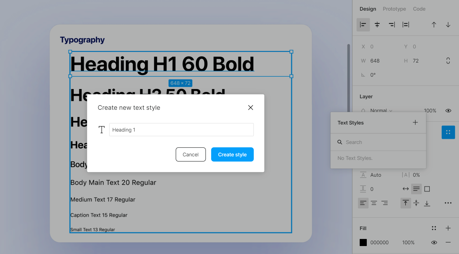
- Repeat the same process for every text layer we added to add all of these to your local styles

Conclusion
The text content represents more than 80% of your design. It’s important to learn these text properties and what they mean. This gives a good understanding of typography. Focus on its utility and always put readability first.
Google Fonts and Custom Fonts
Typography is the art and technique of arranging type to make written language legible, readable, and appealing when displayed. What that means is that your fonts can drastically change the way your app looks and feels. Your choice of fonts can convey a certain mood, or feeling. It can even cause a subconscious effect on how users read your content or interact with your navigation. In this tutorial, we’ll take a look at things related to typography.
Downloads
To follow this tutorial, you can download the source file, which will help you compare your progress.
San Francisco Fonts
The system font for Apple platforms is San Francisco which is made in-house by Apple. You can download the new fonts at this link. It’s beautiful, free and most importantly, designed for legibility. I encourage you to watch the video to understand how it affects the design for iOS.

Over the years, San Francisco has grown in parallel with an eco-system of products and experiences, providing new width styles, variants and families capable of adapting to the various needs of UI design.
Font Pairing
When it comes to creating your own font pairing, you should look for fonts that are similar in style and tone. The easiest way to do this is to start with one font, then search for another that is similar in design. For example, if you’re looking for a bold font then choose another bold font. If you’re looking for a thin font then choose another thin font. This will help ensure that your final product looks good and consistent from start to finish!
Every style is functional in its own right, but depending on the context, some will perform better than others. Combined with the regular width, we can pair other styles without using a custom font.

Variable Fonts
Variable font is a new font format that allows you to change the weight, width, and style of your fonts at any size. The advantage of using Variable Font will be like using many different fonts in one graphic. Most SF families come with a comprehensive palette of weights, spanning from Ultralight to Black, providing enough stylistic variation to create emphasis and typographic hierarchies.

Type Settings
OpenType variable fonts allow you to draw typography with very complex geometries while creating one font file, rather than hundreds. Variable fonts are calculated and accessed along one axis or several axes. A variable font needs to have at least one to be variable font. Five typical axes are included in the current OpenTypes specifications: Weight, Width, Optical size, Italic and Slant.
- To customize your font size, click on your text, select the Variable Properties, then select Variable font axes.
- The weight of a font refers to the thickness of the strokes in a typeface. If it is thin the number will be low and if heavy it will be high.
- The optical size in variable font is a useful tool to display words in a proper size and allows a designer to fine tune the weight and width of characters, allowing typography that scales without pixels and looks great at any size.

Paid Fonts
Paid fonts often deliver a much higher standard and quality than free fonts. Production of these paid fonts are the work of professional typographers and designers who wish to sell their fonts to anyone who wants permission to use them. Instagram is a great way to connect with your audience and build brand awareness. But many brands still struggle to make their marketing efforts on the platform effective. With this list of 30 fonts for social media branding, you’ll find the perfect font for your next Instagram post!

Font Family
A font family is a set of characters of the same design. They include letters, numbers, punctuation marks and glyphs. There are thousands of typefaces available, it’s important to not mix several typefaces. This can make your design feel fragmented and clumsy, so you have to carefully curate and limit the usage to 2-3 typefaces.
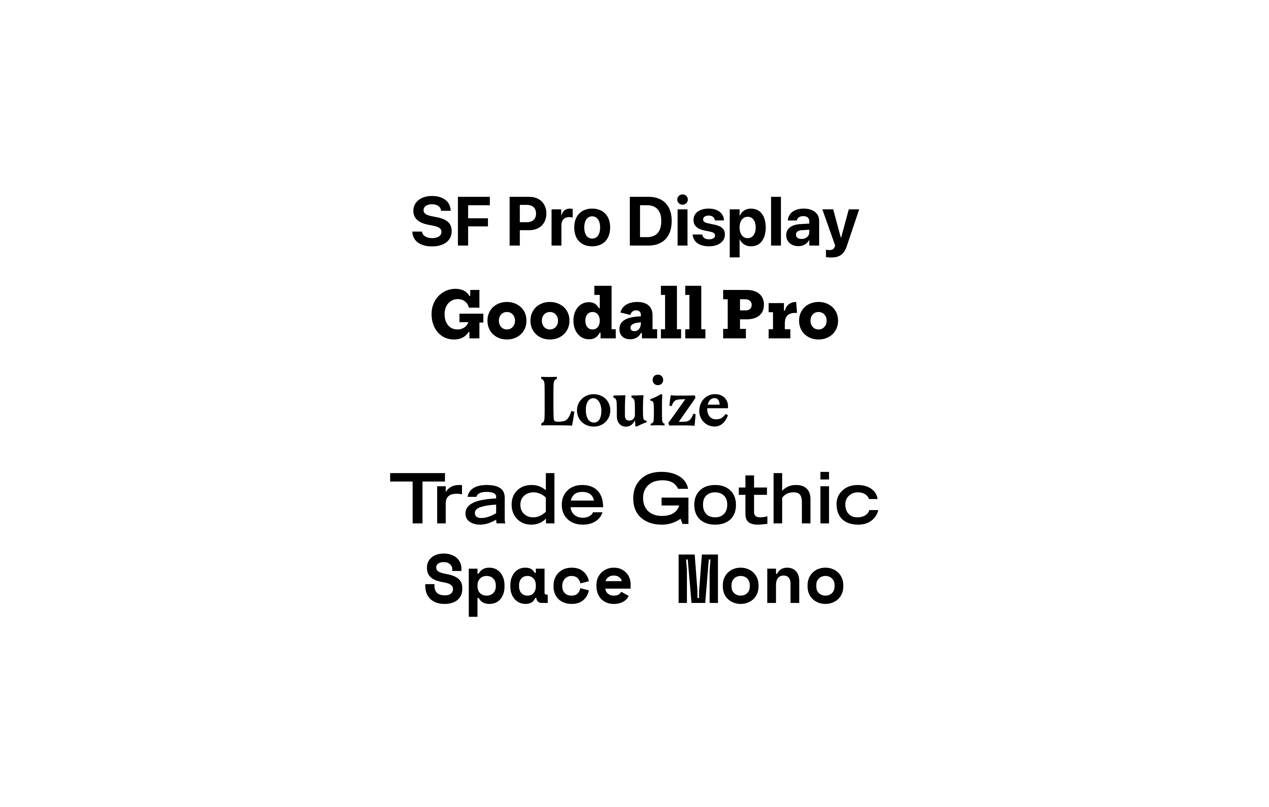
Fonts in Figma
Figma allows you to use any font that you’ve installed locally on your machine. Furthermore, you also have access to numerous Google Fonts. To see the whole catalog, head over here.
- To gain access to any of the pairing, click on Get this pairing
- Once you are taken to the webpage of that particular pairing, click on Get this file and it’ll open the file in Figma directly

Desktop App
If you’ve the desktop app for Figma installed, you can use any of the fonts that are installed on your computer. In case you don’t have the app installed, you can go to this page to install it. You can use the fonts via the font picker.

Figma Font Helper
In case you’re using Figma in the browser and you’d like to have access to all the local fonts in your browser, you’ll need to download the Figma Font Helper. Before you download it, please make sure that your browser is supported- Browser Requirements. Now, let’s install it!
- In the Figma dashboard, click on your name in the top-left
- Then, in Account Settings, head to the Fonts section
- Click the Download Installer to enable local fonts button. Alternatively, you can download it from the downloads page as well
- Once it’s done downloading, run the installer and follow the instructions

Conclusion
In this tutorial, we went over how to enable and use custom fonts and google fonts in Figma. Also try not to go overboard on picking fonts, limit the usage to 2-3 fonts, so that the design doesn’t feel fragmented and clumsy.
Accessibility
Accessibility is one of the most important factors. This makes it necessary to ensure that the text elements have a good contrast ratio. To learn more about accessibility guidelines, please head over to WCAG (Web Content AccessibilityGuidelines).
Why is accessibility important?
A design should always be accessible because otherwise you leave out a large fraction of people and don’t provide equal access to all the users. Aside from this reason, numerous countries have laws to ensure that designs are accessible, failing to do so might lead to legal repercussions.
Accessibility in Figma
Figma has tons of plugins that allow you to check how accessible your design is. These are very important as accessibility makes your applications reach a wider user base and makes all your users feel included. In the sections below, we go through the process of using Stark. Lastly, we mention the alternative plugins that you can use.
Accessibility Plugins
There are various accessibility plugins available in the plugins section of Figma. Below, we’ll discuss some of these.
STARK
Stark is an amazing tool that works seamlessly in Figma, Sketch and Adobe Xd. It assists you with checking the color contrast. It also gives its users access to a colorblind simulation which is very helpful. Furthermore, Stark recommends contrast friendly colors to make your job easier.

ABLE
Created by Sondre Kvam, Able checks the color contrast between any two objects that have been selected. It also has a color blindness simulator which you can use to test the color contrast with different types of color defeciency.

A11Y FOCUS ORDERER
A11y Focus Orderer by Microsoft is very useful for users that use the keyboard or other input devices to navigate through an application. It specifies the order according to which elements should be focused upon in the browser.

EPILEPSY BLOCKER
Epilepsy Blocker by Alex Sideris is a very useful plugin. This plugin checks whether the images and GIFs added to your application are safe for users that have epilepsy. I highly recommend you to use this plugins as there have been cases where images and GIFs have triggered seizures.

Check color contrast with Stark
Now that we’ve discussed what accessibility is, why it’s important and the plugins you can use to check how accessible your design is, it’s time to see Stark in action.
INSTALLING STARK
The first step is to install the plugin through the Plugins tab in the dashboard.
- Head over to the plugins tab and click on the ‘Browse all plugins’ button
- In the search input, type in ‘stark’ and select the one by Stark
- Click on the ‘Install’ button at the top-right to install it

USING THE PLUGIN
Once the plugin is installed. Let’s go ahead and start using it.
- In the frame, we’ve a rectangular shape and inside the shape we’ve some text element
- To check the contrast, select both the background as well as the text elements
- Then, right-click, click on Plugins < Stark < Check Contrast
- Green check marks will be shown for the tests that pass successfully and red for the ones that don’t

GRADIENT BACKGROUND CHECK
Stark currently does not allow you to check contrast when the background is a color gradient instead of a solid color. The workaround for this is to add in a rectangle and set it to a solid color that is identical to the background gradient.

Color Contrast
If you’d like to test readability without using any plugin, you can head over to the color tool provided by Material Design and then, copy the colors to Figma. The Color Tool enables you to try out different colors and test the color contrast. For accessibility’s sake, we usually want a high contrast between text and its background color.

Conclusion
There are many things to keep in mind while designing an application that is accessible to all. Investing your time in designing things that are more inclusive and accessible to users shows that you care about all your users.
Designing responsive layouts in Figma using Constraints and Auto Layout
As many people use their smartphones to view almost everything, making our design responsive is important so that it is fully functional and accessible on smaller screen sizes. Using features such as Auto Layout and Constraints in Figma makes the process so much easier.
Downloads
To follow this tutorial, you can download the source file, which will help you compare your progress.
What is Responsive Design?
Designing websites that progressively change the layout to view across multiple devices as well as screen sizes by scaling its content and elements accordingly is known as responsive design.
Breakpoints
Breakpoints are when the structure of your design changes to give the user the best possible layout in a given screen size. Defining breakpoints helps you a lot in planning the layout when designing. It’s best to start off with designing for three important breakpoints.
- 1440 for Web
- 768 for iPad
- 375 for iPhone

Flexible Layouts
Your content must adapt and fit as the screen size changes to accommodate all the necessary information. In short, your layout must stay responsive by decreasing the spacing, changing your layout from horizontal to vertical and changing the grid sizes. Try to maintain a comparable experience in all contexts. Make sure everything stays consistent.

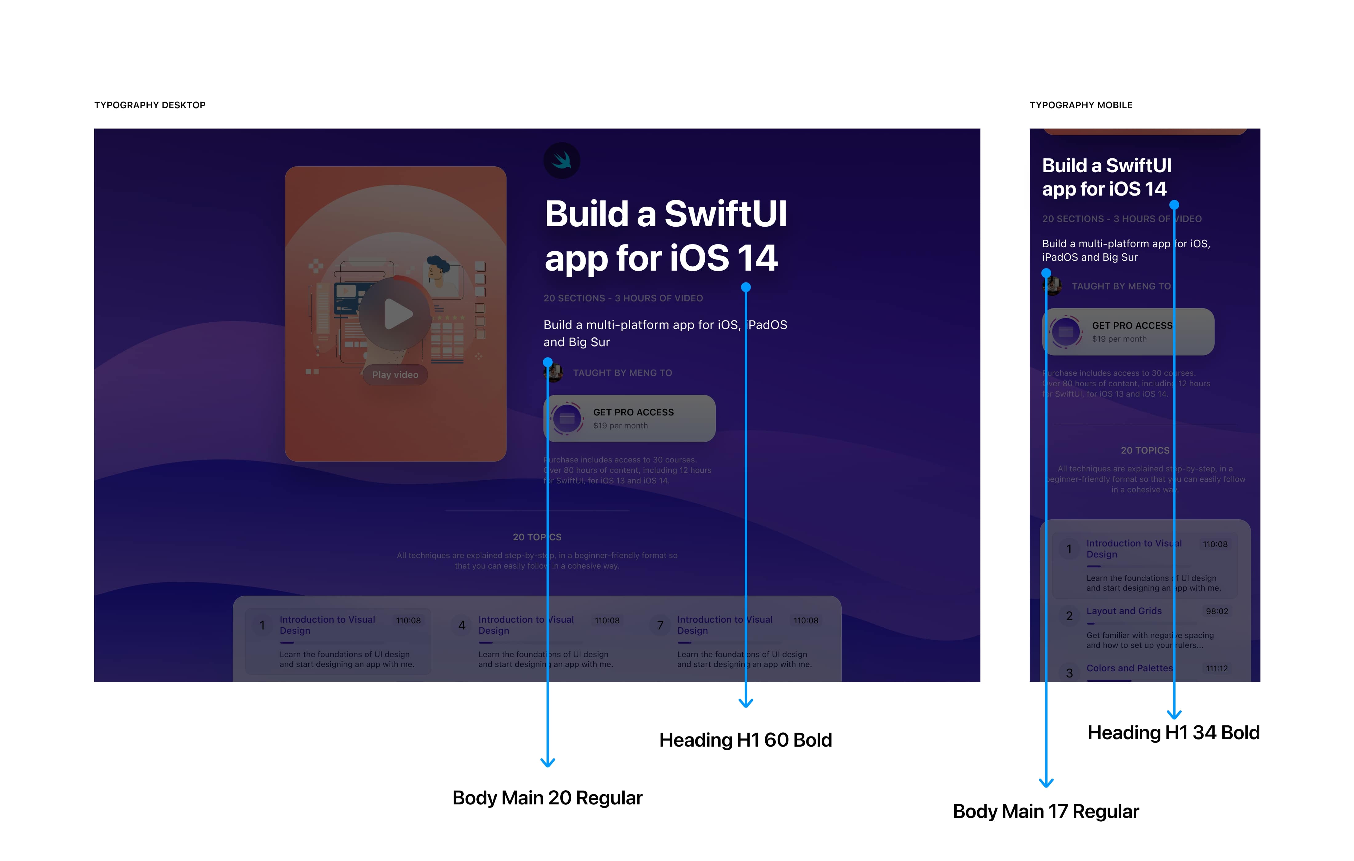
Dynamic Type
Dynamic type helps maintain and keep your type hierarchy consistent across multiple screen sizes, making it easier for users to read on smaller devices and screen sizes. If you want to learn more, please refer to Apple’s Human Interface Guidelines.
Touch Targets
It is common that we often do not precisely tap on every icon and Text Label. So, it is important that you provide more tap area for users to perform their desired action. Having a larger touch target ensures a positive user experience.
- Apple recommends a minimum target size of 44px x 44px for all controls ( Read More on Apple’s Human Interface Guidelines )
- Android suggests that touch targets should be at least 48 x 48 dp ( Read More on Material Design guidelines: Touch Targets )

Constraints
Constraints determine how elements in your design should respond as you resize their Frames. This helps you control how your designs look on different screen sizes. Working with constraints is a crucial part of the workflow as you design for so many screens. Your layout needs to be flexible enough to react to any content or screen change.

Auto Layout
Auto layout allows elements to resize automatically according to the items inside it. It automatically resizes the content according to the frame size. This means you don’t have to keep resizing the elements every time a change has been made or new items have been added. Turning your designs responsive is now a breeze as the layout changes based on the direction you choose!

How to make your design Responsive
Let’s see how to make our design responsive for iPad and iPhone by using Constraints and Auto Layout. Start by adding the Auto Layout to the “Course Hero Card” and “Information.” Set the layout to Horizontal and the Spacing Between items to 60px.

Let’s set Auto Layout combining Course Information, Section Info and Livestream Card. Set the layout to Vertical and the Spacing between items to 40px and change the name to Content.

Now, set the constraints of the Content to Center on the horizontal axis and Top on the vertical axis.
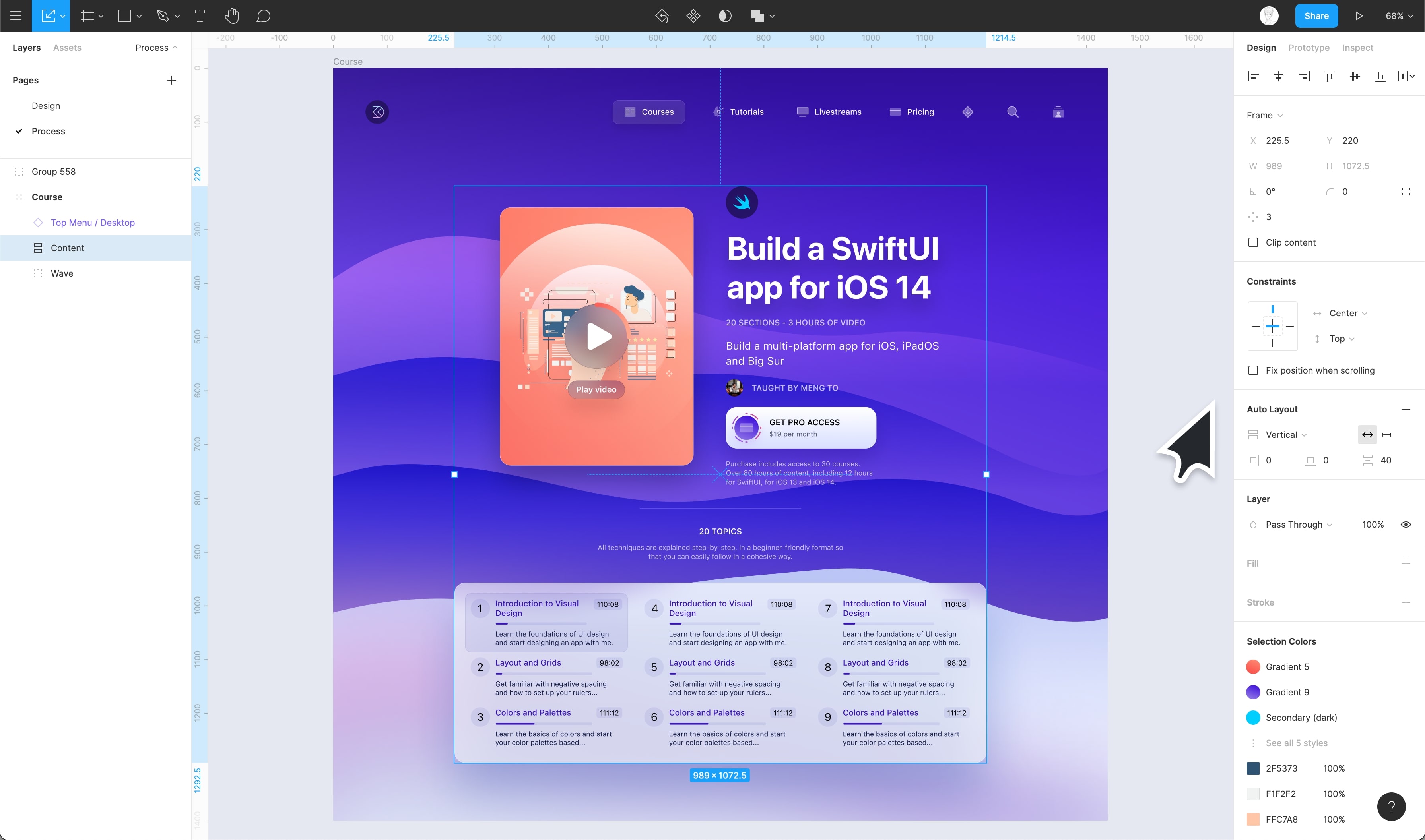
Great! Now, let’s duplicate the Frame and set the width of the Frame to 768 (iPad Mini). Let’s Navigate to the Content > Course Information > Course Hero Card and change it’s width and height to 280×400 and **set the **Spacing Between items of the Course Information to 30px.
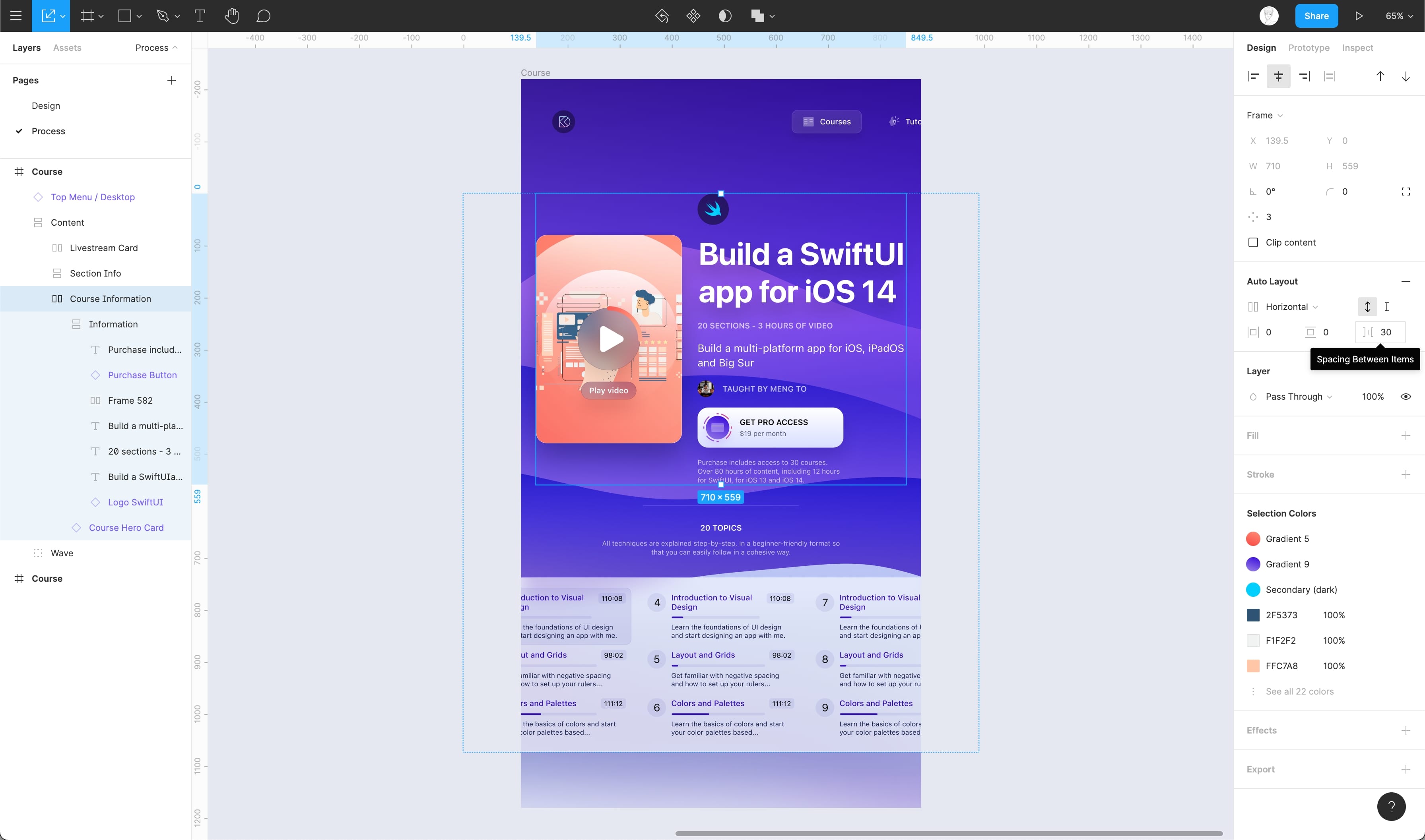
Now, change the number of columns in the Livestream Card from 3 to 2 ****by hiding a column inside Columns of the Liversteam Card. Awesome! We’ve now made our design responsive to iPad.

Moving on to the iPhone. Duplicate the Frame and set the width to 375 (iPhone 11 Pro) and set the Course Information direction from Horizontal to Vertical.

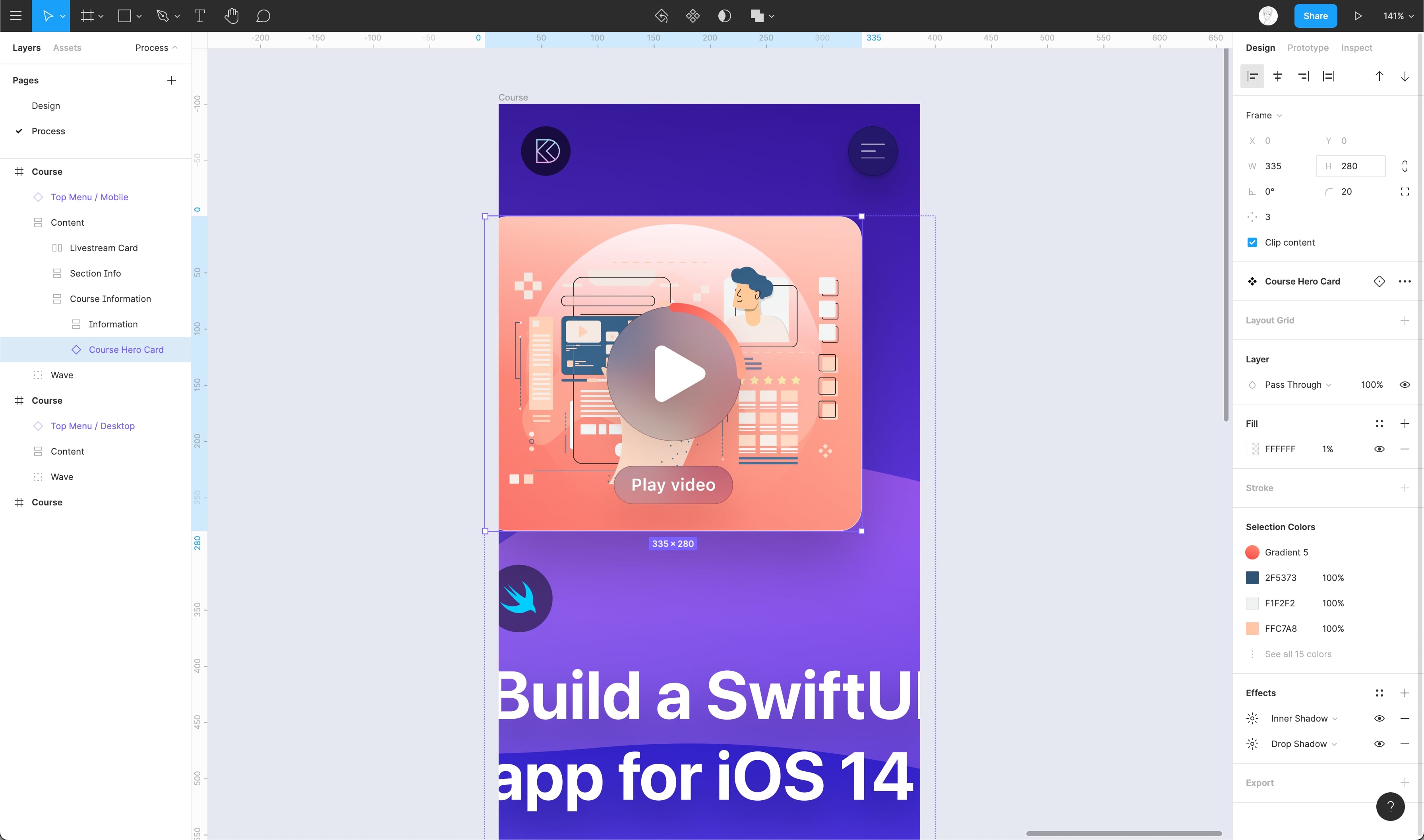
Align the Information and Course Hero Card inside the Course Information to Left. Now, let’s change the Width and Height of the Course Hero Card to 335×280
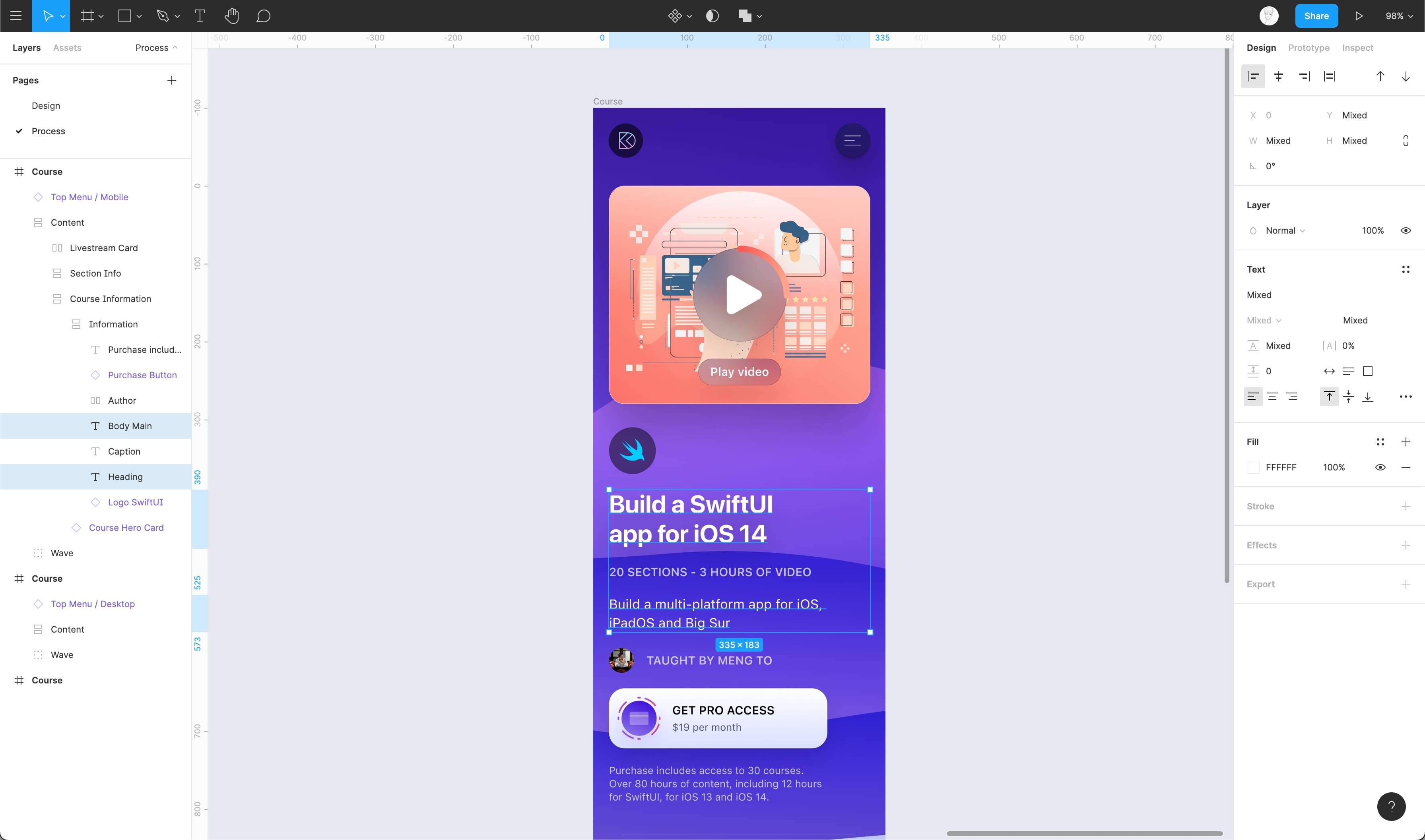
Set the Heading to 32px from 60 and the Body Main Copy to 17 from 20. Also, set it’s width to 335px.
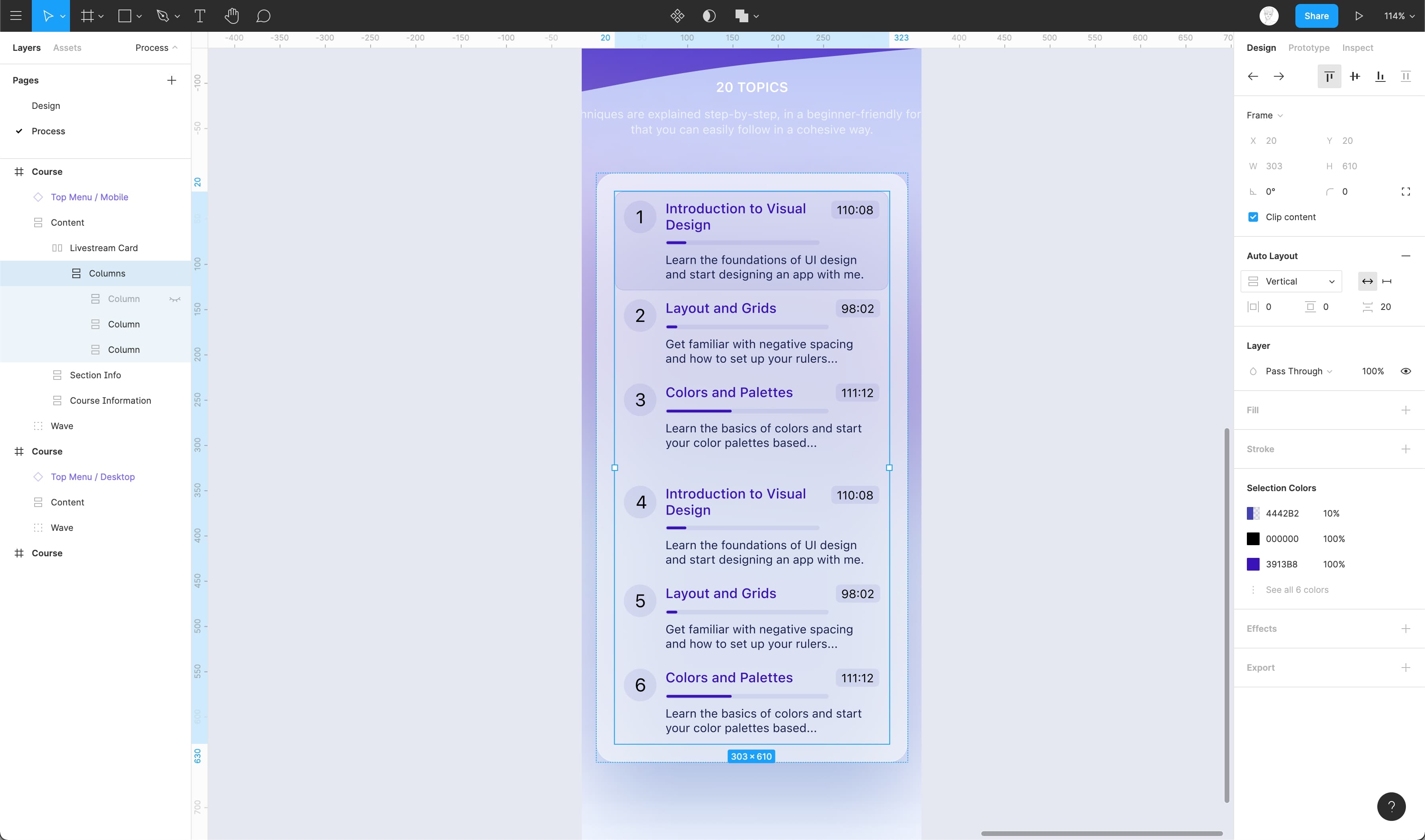
Navigate to Columns inside the Livestream Card and change the layout from Horizontal to Vertical.
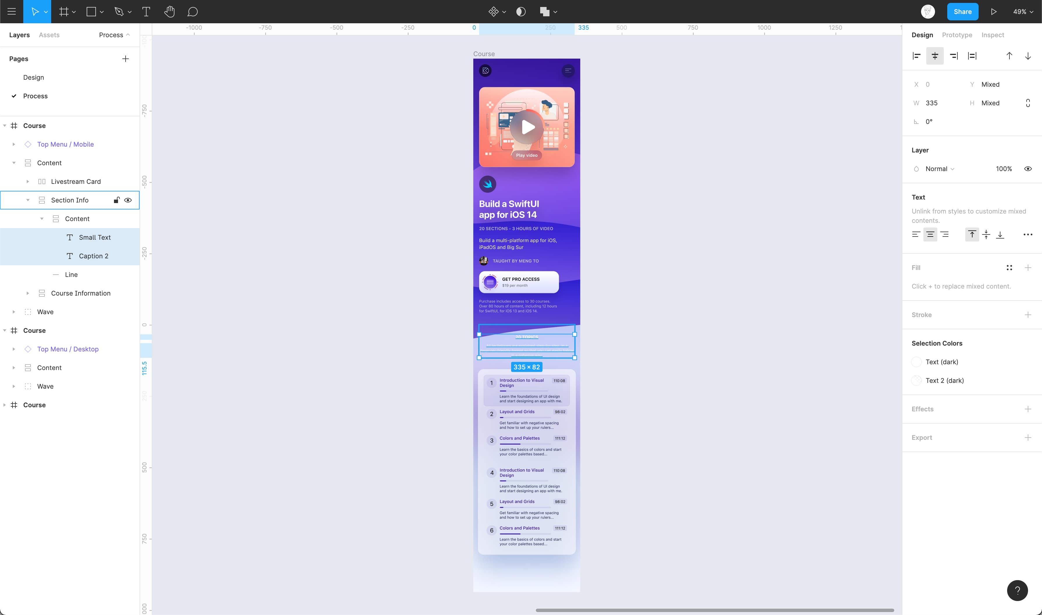
Now, set the width of the Small Text and Caption 2 inside the Section Info to 335px. Voila! We’ve completed making our design responsive for both iPad and iPhone. You can download the assets and practice what’ve exercised.
Conclusion
Responsive design is very important when it comes to web applications. Designers and developers alike should ensure that the product is fully responsive across all devices and screen resolutions. As you can see, the process is made very simple by using features like Constraints and Auto Layout offered in Figma.
Working with Constraints in Figma
Constraints
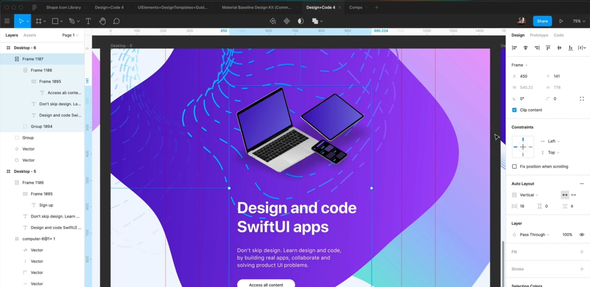
Constraints are used to make the design more flexible and adaptable across various screen sizes. These have two dimensions – vertical and horizontal. Both of these in turn have different options such as – left, right, bottom, center, scale and top & bottom. Constraints can be set for any element.
Switching Between Device
When you select the Frame, you can switch between Portrait and Landscape. This will enable you to see how the frame and its elements look when the frame size or orientation changes.

Left or Right, Top or Bottom, Center
By default, the constraint is set to a fixed distance from top and left. You can also choose to set a fixed distance from any of the other borders, or from center. This ensures that your element keeps its size while aligning itself against the borders.
Left and Right, Top and Bottom
Additionally, you can decide that the distance is fixed from Left & Right or Top & Bottom. This means that your element will resize itself while keeping a consistent distance against the borders. This is especially useful for Groups that contain flexible content, like text layers.
Setting Constraints
Let’s learn how to set constraints for when you want to center the content.
- By default the content is aligned to top-left
- To align it towards the center, click on the dash in the center under Constraints in the Properties panel
Conclusion
Constrains is a very special feature of Figma that helps to make your design Adaptive.
