Team Library - Publishing your design styles and components
Team Library is the MVP out of all the available features in Figma. This allows you to design effective, scalable design systems by reusing shared components across files, helping you to collaborate with ease! Since the tool is web-based, everything is synchronized and nothing is left out.
Downloads
To follow this tutorial, you can download the source file, which will help you compare your progress.
Styles
These are sets of properties applied to style particular elements or objects. Styles describe attributes for Color, Text, Stroke, Background Color, Effects, and Layout Grids.

Components
Components allow for a faster and smoother workflow. With this, you can create a master component and create multiple instances of it throughout the design. This is helpful when it comes to elements such as the menu, the footer, buttons as they help you to be consistent across the project.

Libraries
Components and Styles can be shared to your team via Team Library. Team Library allows you to access the saved styles across all the team files and projects. This improves efficiency and maintains consistency.

Publishing Resources to Team Library
Let’s learn how create and publish components and styles to a library. We’ll also take a look at some tips and tricks!
- Enabling Team Libraries: Click on the Team Name on the file Browser and Navigate to the Settings tab and click on Enable Libraries link.

- Enabling Libraries for a File: Navigate to the Assets Panel and click on the Book icon, Use the toggle to Enable or Disable specific libraries.

- Creating Components: Click on the Create Component button at the top-center in the menubar. The layer should be purple now. Alternatively, you can press the Option Key + Cmd + K.
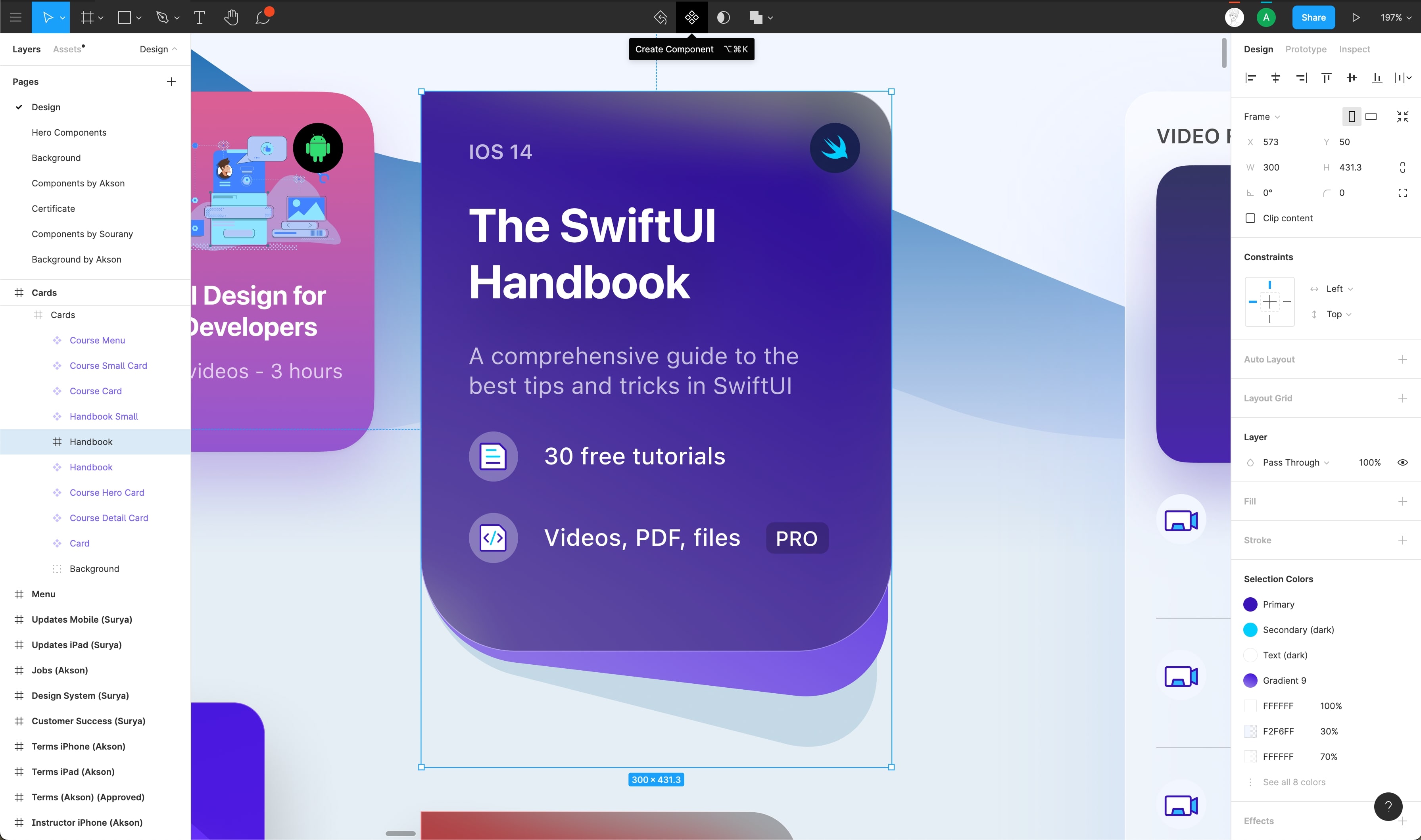
- Creating Styles: In the Properties Panel, click the Styles icon “: :” next to the property you would like to save.

Conclusion
Figma’s Team Library allows big teams to collaborate and maintain design systems efficiently and remove all the nuances involved with working as a remote team.
Working with Confetti plugin
The Confetti plugin allows you to generate confetti patterns in your design file. In this tutorial, we’ll first learn how to install it and then use it to generate confetti patterns.
Downloads
To follow this tutorial, you can download the source file, which will help you compare your progress.
Installing the plugin
The first step is to install the plugin through the plugin tabs in the dashboard.
- Head over to the plugins tab and click on the ‘Browse all plugins’ button
- In the search input, type in ‘confetti’ and select the one by Yummygum (Vince)
- Click on the ‘Install’ button at the top-right to install it

Using the plugin
Once the plugin is installed, it’s time to use it!
- Create a frame and in it, draw the shape that’d you’d like the confetti to look like. Below, we’ve a polygon but you can draw any shape you’d prefer. Additionally, set its fill to either a solid color or gradient of your choice

- Now, to create confetti patterns, you’ll need to access the plugin which you can do either via the hamburger menu in the toolbar or by right-clicking the shape

- This opens up the plugin modal. We’ll be setting both the rows as well as the columns value to 5 but feel free to play around with the values and with the different options provided

Multiple Shapes
In the above step, we only used one shape i.e. the polygon to generate a pattern. You can use multiple shapes to generate a number of patterns. Let’s go ahead and do that as well!
- Draw any shape you’d prefer, we’ll be drawing an ellipse in this example. Give it a fill value of your choice. You can also play around with the opacity. We’ve set the opacity here to 80%
- Repeat the same steps as above to generate a confetti pattern
- You can resize the generated shapes, change their positions as well as rotate the same. You can also change the fill value and the opacity

Conclusion
In this tutorial, we went over how to create confetti using the Confetti plugin, this can be a nice addition to the success state in your design.
Working with Looper Figma plugin
Looper is a Figma plugin that generates graphics that you can use in your design project. In this tutorial, we’ll learn how to install the plugin and then, use it to create shapes.
Downloads
To follow this tutorial, you can download the source file, which will help you compare your progress.
Helpful in creating backgrounds
Looper is very useful, particularly so when it comes to backgrounds. You can generate really funky and awesome background patterns for your UI. Be it a shape or a text element, Looper works seamlessly with any layer in your design project.
Install Looper
Looper is a Figma plugin for creating trippy generated graphics that works with any Vector, Shape or Text layer.
- To install navigate to Plugins ****on the left menu
- Click on “Browse all plugins” and Search for ****”Looper”
- You can also install the plugin using this link

Using Looper
It’s time to use the Looper plugin now!
- Press Cmd + / and look for Looper. After you press Enter, a modal should open up
- Set Iterations, X as well as Y to 0. Set the angle to 10 and Scale to -10 & -10
- Make sure that the opacity is set from 100 to 0. Desktop – 5 is going to have a new layer called ‘Group’ now. Select the newly added Groups layer
- Set its stroke color to Gradient 4 for better visibility. Also, change the blob fill value to Gradient 3

More Examples
Mentioned below are some really cool designs that utilize the looper plugin.
- Github: scroll down to see different iterations
- Twitter: Looper’s creator shows how to create an awesome text effect
- Dribbble: background of the form is created using Looper

Conclusion
Plugins in Figma are very helpful in improving your workflow. Looper is another amazing plugin that lets you create beautiful patterns that can be used to make your design look even more pleasing to the eyes of the users.
Creating apple watch ring in Figma
In this tutorial we’ll go through the process of creating Apple Watch rings. This involves creating progress rings. We’ll be mainly using the Arc tool for this purpose.
Downloads
To follow this tutorial, you can download the source file, which will help you compare your progress.
Arc Tool
We can create a number of shapes using the ellipse tool such as pie charts, donut shapes, rings and much more. This is achieved via the Arc tool. It takes in three value – start, sweep and ratio.
- Start: the start value specifies where the arc starts. On the shape, the start is the one that has a dot inside of it. You can move the dot around or set the value in the Properties panel
- Sweep: the sweep value defines how complete the circle is
- Ratios: this value defines how full the circle is. The higher the ratio value, the less full the circle is
Using Arc Tool
Not that we’ve a clearer idea of how the arc tool works. Let’s see how we can use it!
- Here, we’ve a frame that has three circular shapes. When you click on a circle, there’s a dot towards the right. This is the Arc tool

- You can click on the dot and move it around to get a better idea of how it works. Once you do so, some settings show up in the Properties Panel. To create a progress circle, give it a start value of 0, sweep value of 75% and ratio value of 85%
- Next, to create a pie chart, set the values to – 0, 75% and 0
- Lastly, let’s create a donut shape. Set the values to – 0, 100% and 50%

Apple Watch Rings
It’s time to apply what we’ve learnt in the above steps to create the Apple Watch Rings!
- Inside the frame, draw a circular shape that has the same width and height. Set its fill colors to #FA114F and opacity to 30%. Now, using the Arc tool, set the start value to 0, sweep to 100% and ratio to 75%. Name this layer ‘Base’

- Now that we’ve the base layer ready, let’s go ahead and create the progress circle. Duplicate the base layer and name the new layer ‘Progress’. Set its fill to #FA114F and opacity to 100%. Using the arc tool, set its start value to 75%, sweep to 84% and ratio to 75%

- Repeat the above two steps twice to create the other two layers. You can play around with the arc values as well as the colors. Here, I’ve set the color values of the two circles to – #92E82A and #1EEAEF

Conclusion
In this tutorial, we went over how to use the Arc tool to create rings. This is a very simple technique that comes in handy when trying to create progress rings for Dashboards, icons and much more.
Learn about exporting assets in Figma for implementation.
Getting production code from your design elements has always been a huge challenge for designers and developers. Figma makes it easy as everything is available right inside the tool, rather than having to create a bunch of accounts and switching back and forth between tools.
Downloads
To follow this tutorial, you can download the source file, which will help you compare your progress.
Sharing
You can share your design files with clients, co-workers, or with anyone using the public link or inviting them to your project. You have the control, which means you can invite them either with a view or edit permission. This helps a lot in getting feedback and collaborating with other designers!

Design Specs
People with an account who receive your invitation or link can view and inspect properties, sizes, and even code or assets. This is very similar to how Zeplin, Abstract, or Sympli work.

Version History
At any time, you can create a version of your design so that it’s kept in history. This is recommended whenever you need to save a bulk of changes, similar to how you’d use Git. Also, you can see the history of all the versions you’ve saved previously. Figma makes it very simple to switch back and forth between those versions to see the changes.

Export Assets
You can click on the Export button for each layer of your design to export elements or frames as a PNG, JPG, or SVG (you can also export the asset in multiple formats simultaneously) file. Once you set it up, during Inspect, people can automatically save the file.

Slices
In addition to the Export button, you can also create a custom Slice if you need to create a zone where you want to capture an image with everything merged. This is a very similar experience to creating a screenshot on the Mac.

Inspect Tab
The Inspect tab can be found at the top of the Properties panel, next to Design and Prototype. You can find all the properties written in plain code (Table) or actual languages such as CSS, Swift or Android.

Export Selection from Properties Panel
Let’s first focus on learning how to export a selected frame or a selected element via the Export option in the Properties panel.
- Select the element or frame you’d like to export
- In the Properties panel, scroll down to the Export option at the bottom and click the ‘+’ icon

- Here, you can export it as one of the following formats – PNG, JPG, SVG and PDF
- Figma also gives you the option to specify the size of the element before exporting. You can either choose one of the default ones from the dropdown or add a custom one as the input

Note: If you’re adding a custom input, make sure to add one of the following letters to the number – x (multiplier), w (width) and h (height).
Export in PNG JPG SVG and PDF
PNG (Portable Network Graphics): PNG is a lossless bitmap format that allows for the preservation of images at their original quality. It’s widely used by websites and applications where high-quality graphics are required, such as advertising and screenshots. It was created as an alternative to JPEG and GIF, so it’s frequently used for displaying transparent images.
In the first image, we can see the Frame in white. In the second image, you will notice that the Frame is transparent.

Image 1 (JPG), Image 2 (PNG)
JPG (Joint Photographic Group): JPG is a pixel-based image format. Each JPG has fixed dimensions, but the compression leads to a loss of quality and also a lower file size. For example, if an image is saved as a JPG and then re-opened and edited, filters that affect quality will not be effective. Instead, attempt to use PNG if you want an image with adjustable dimensions, transparent pixels, or any modifications beyond simple cropping.
SVG (Scalable Vector Graphics): SVG is a scalable format, which means that its graphics aren’t tied to any specific resolution. It’s also an XML-based vector graphic, which means you can make any element as large or small as you like without losing clarity.

PDF (Portable Document Format): If you’re looking for a format that’s compatible with any device, then PDFs are a great choice. They allow you to share complex and interactive layouts—and they’re compatible with any software or operating system.
With PDFs, you can render and manipulate individual elements of a design—which makes it a versatile format that’s independent of software, hardware, or operating system. Plus, it’s easy to create using Adobe Acrobat or Illustrator.

Pixel Density
Pixel density is the number of pixels per inch (PPI), which is a measurement of the resolution of a display. The higher the pixel density, the more detailed and sharp your screen will be.
iPhones and Macs both use high-resolution displays with high pixel densities, which allows them to display images and text with a high level of detail and clarity. The specific pixel density of an iPhone or Mac will vary depending on the model, but in general, they both offer high-resolution displays that are sharp and clear.
When exporting images from an iPhone or Mac, it’s important to consider the pixel density of the device you’re using. If you’re exporting an image to be used on a device with a lower pixel density, you may need to reduce the resolution of the image to ensure that it displays properly. On the other hand, if you’re exporting an image to be used on a device with a higher pixel density, you may need to increase the resolution to take advantage of the higher pixel density.
![]()
Image 1: Low-density screen displayed with density independence. Image 2: High-density screen displayed with density independence.
Export List
Figma takes note of any selection or export settings you might have applied via the Export List. With the Export List option, you can export every asset present in that list with a single click. Let’s see how we can access Export List.
- Go to the menu. Here, either search for ‘export’ in the search bar or click on File and then, Export

- A modal containing a list of all the previous exports opens up. You can export all of these by simply clicking the ‘Export’ button at the top

Copy as SVG
You also have the option to directly copy the SVG code and paste it to a file. Simply, right-click the element, select More < Copy/Paste and then, Copy as SVG. Once that’s done, you can paste the SVG code in your favorite code editor.

Export In Bulk
The best part of Figma is that you can export all of your elements in one go, instead of exporting them one by one.
- Click the Figma icon to open the menu and select File and then Export from the options. You can also use the keyboard shortcut: Shift+Command+E.
- The Export modal will show you all the selections you have Export settings for.
- Check the box next to any selection(s) you want to export.
- Click the Export button to export any selected assets.

Save Figma File
In the event that you need to manually back up your entire Figma files, you can save a local copy of a file in the .fig (Figma) or .jam (FigJam) formats. This is useful if you want to duplicate files between Figma accounts or teams, or if you want to manually back up your files. Figma doesn’t include any version history or comments when you save a local copy of a file.
- Click on the Figma icon to open the menu.
- Select File > Save local copy.
- Figma will download a copy of the file to your downloads folder.

Conclusion
Figma eliminates having to jump to different tools since it’s web-based. You’re able to share your designs with anyone with just a link and it’d open right there in the browser, installing the app is not even necessary. Figma makes us work more efficiently, it also enables us to communicate our designs better.
Working with CSS code on Figma.
Getting production code from your design elements has always been a huge challenge for designers and developers. Figma makes it easier by allowing users to export the CSS code of any particular element instantly. Below, you’ll find instructions on how to do this easily.
Export Code
The Code tab in the Properties panel allows you to inspect and export the code. Currently, Figma supports CSS, iOS and Android imports. Some of the properties you can import include color values, typography, sizes, etc. It allows two formatting styles which are Table and Code, you can simply toggle between the two.
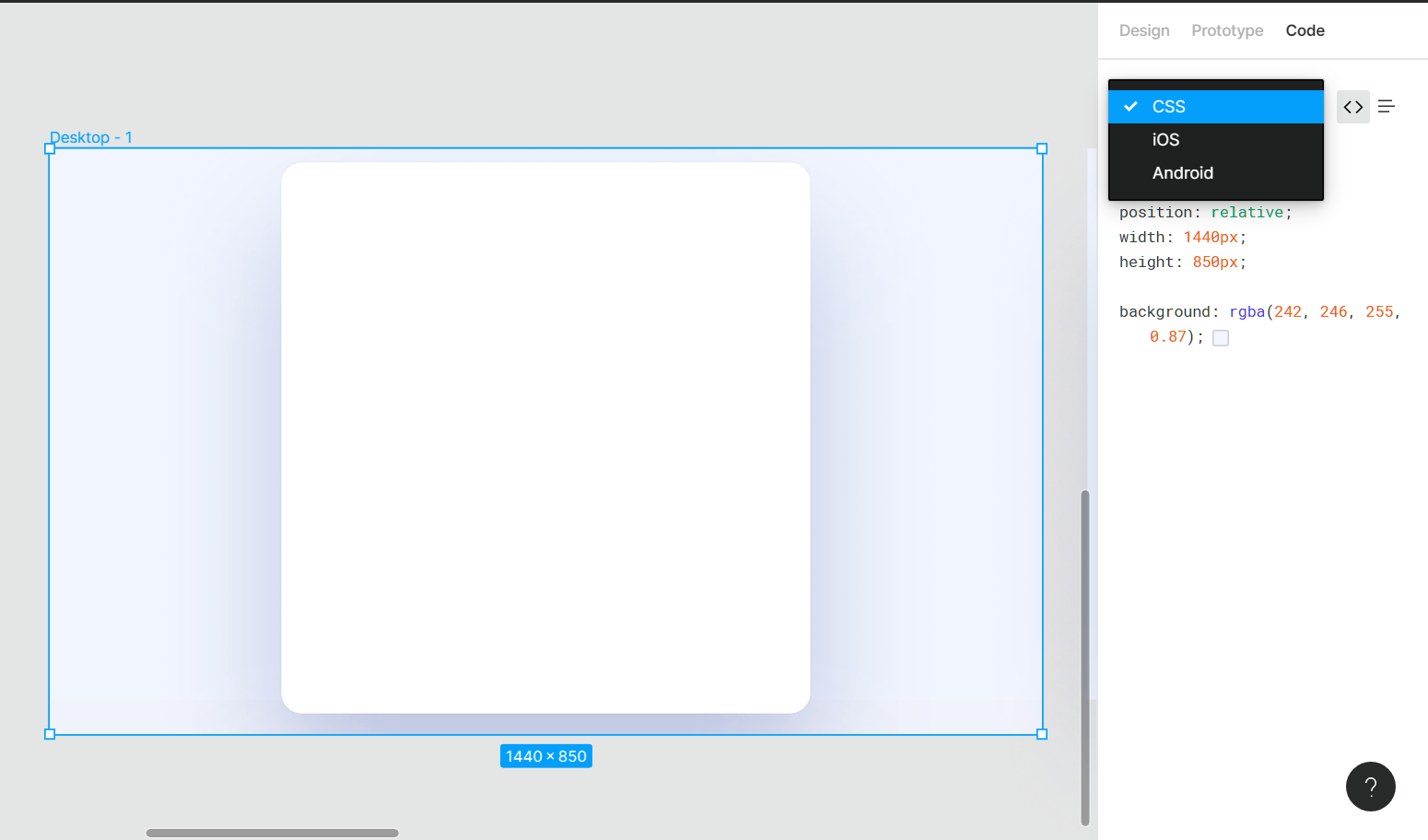
Code vs Table
As mentioned above, Figma has two formatting styles for all the syntaxes available. These are – table and code. The formatting styles make it very easy to export the code. You can simply toggle between them by clicking the icons.

Copy as CSS
Figma also allows you to copy the CSS properties of any elements. This can be done by right-clicking an element, selecting Copy/Paste and then, Copy as CSS.

Export CSS Code
To import CSS code directly from Figma, do the following:
- Select a particular element. Here, we’re selecting the rectangle that has a corner radius as well as a drop shadow effect
- In the Properties panel, click on Code. Copy the CSS code
- Head over to your code editor and paste the CSS code at the appropriate location

CSS Gradient
You can export CSS code for the gradients in a similar manner.
- Select the gradient you’d like to export
- In the Properties panel, select Code
- From here, copy the background property and its contents

Conclusion
Figma is known for its collaboration power. All of your team members can work on the same page, at the same time. And, when you’re working with a developer team member it won’t make any trouble. Your developer friend can copy the design properties and start working with it.
Designing with Data - Plugins to help you design with real content.
Mocking up designs with Lorem Ipsum might not always work, as we later come to realize, the layout starts breaking. The actual copy might ask for more space than what we had initially. Now that we know things don’t work well, changing our content across our design can be time-consuming, and that’s where Plugins help!
Downloads
To follow this tutorial, you can download the source file, which will help you compare your progress.
Plugins
Think of Figma as a modular phone, and plugins as separate modules that help enhance and bring new/specific functionalities. Figma plugins only run in the editor and let you perform tasks within files. There are countless plugins for you to install and work with but here, let’s talk about some of the favorites of many designers.

Unsplash
Unsplash is the best place to find beautiful photography that you can use for both personal and commercial use, and it’s totally free. With this plugin, you can directly search and insert images as fills to the elements you wish to apply these to.

Google Sheets Sync
Google Sheets Sync is a simple plugin that lets you pull data from your spreadsheet to the design elements. This is really helpful as it allows you to manage your own data, which eases updating and making changes to the data.

Content Reel
Consider this as an alternative to Google Sheets Sync if you don’t have any real data; this plugin quickly generates data for you like names, phone numbers, US addresses, emails, URLs, and much more.

Adding Data into your Design
Let’s see how we can add data to our profile settings.
- From the Dashboard, navigate to the Community tab and from the Plugins tab search for Unsplash and install it. Now, search for Content Reel and install it too.

- In your design file, press Cmd + / and look for Unsplash. After you press Enter, a modal should open up

- Select the layer to which you’d like to apply the image to and navigate to Portraits on the Plugin modal. Click on it which will then add an image.

- Search for Content Reel on the menu. Once the modal pops up, select the name text layer and click on the Full Name in the modal.

- Now follow the same process and add all the necessary information to the design! You can also search for specific content by click on the Content Library

Conclusion
Using real data in your work will help you have a better idea of how the interface is going to work, make better decisions, account for edge cases or alignment issues that you might not have thought of. Clients often have a hard time visualizing how a prototype will lead to a final product. By using real data, they have a better idea and context, so the feedback that you get is more accurate.
Prototyping - Quickly create an entire flow for your app design in Figma.
Prototyping is an important process of design. Creating a prototype helps your engineers understand how the interactions and animations should work in the final product. Figma makes it super simple to create prototypes using transitions without downloading a third-party app.
Downloads
To follow this tutorial, you can download the source file, which will help you compare your progress.
Why is it important?
Creating a prototype can help with communicating our ideas without a flaw so that engineers can know exactly what you want. Engineers can understand the complexity of the interactions and foresee difficulties in setting a realistic timeline.
Animation Transitions
Transitions indicate the shift from one action to another. Having detailed transaction eases the user’s understanding of your app. Without transitions, it would not be easy to communicate what is happening to the user.
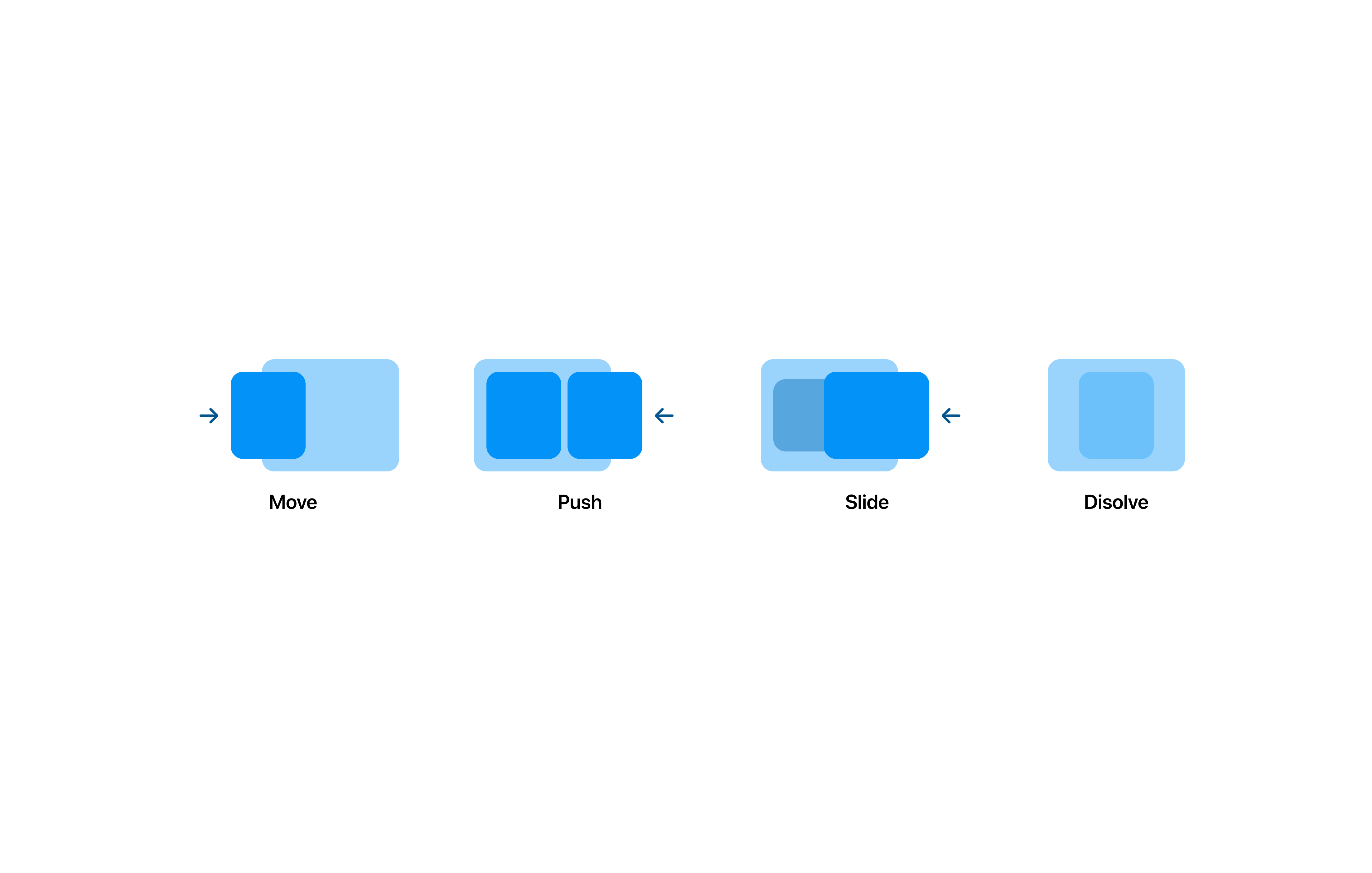
Easing
Easing or Keyframes define the acceleration of a transition happening between two connected frames. This lets you create very smooth interactions that feel more natural.
- Linear
- Ease In
- Ease Out
- Ease In And Out
- Ease In Back
- Ease Out Back
- Ease In and Out Back
Flow Prototyping
Flow prototyping is important as it shows the entire journey that your user experiences. For example, a user logs in on the home page and then, clicks the courses icon which takes him to a list of available courses. What about when the user clicks on the tutorials icon?
It is essential to prototype these experiences so that you can test your app before development starts in order to see the setbacks.

Micro Interactions
Micro-interactions are small or subtle functional animations that happen when an action is performed. Micro-interactions often create a pleasant feeling. These small details incubate a positive user experience in your app.
Smart Animate
Figma’s most amazing feature is Smart Animate. It lets you create delightful and advanced animations/interactions by looking for similar layers and recognizing the differences to animate them. This can help create detailed transitions like parallax scrolling, loading sequences, gestures, and more.
Preview
You can preview your prototype at any moment by pressing the Play button at the top right of the Figma UI or view it on your phone by using the Figma Mirror app. The prototype itself can be shared just like a design file. This is extremely useful for creating an entire experience for your app and show it to the world!

Prototyping
To start prototyping your design:
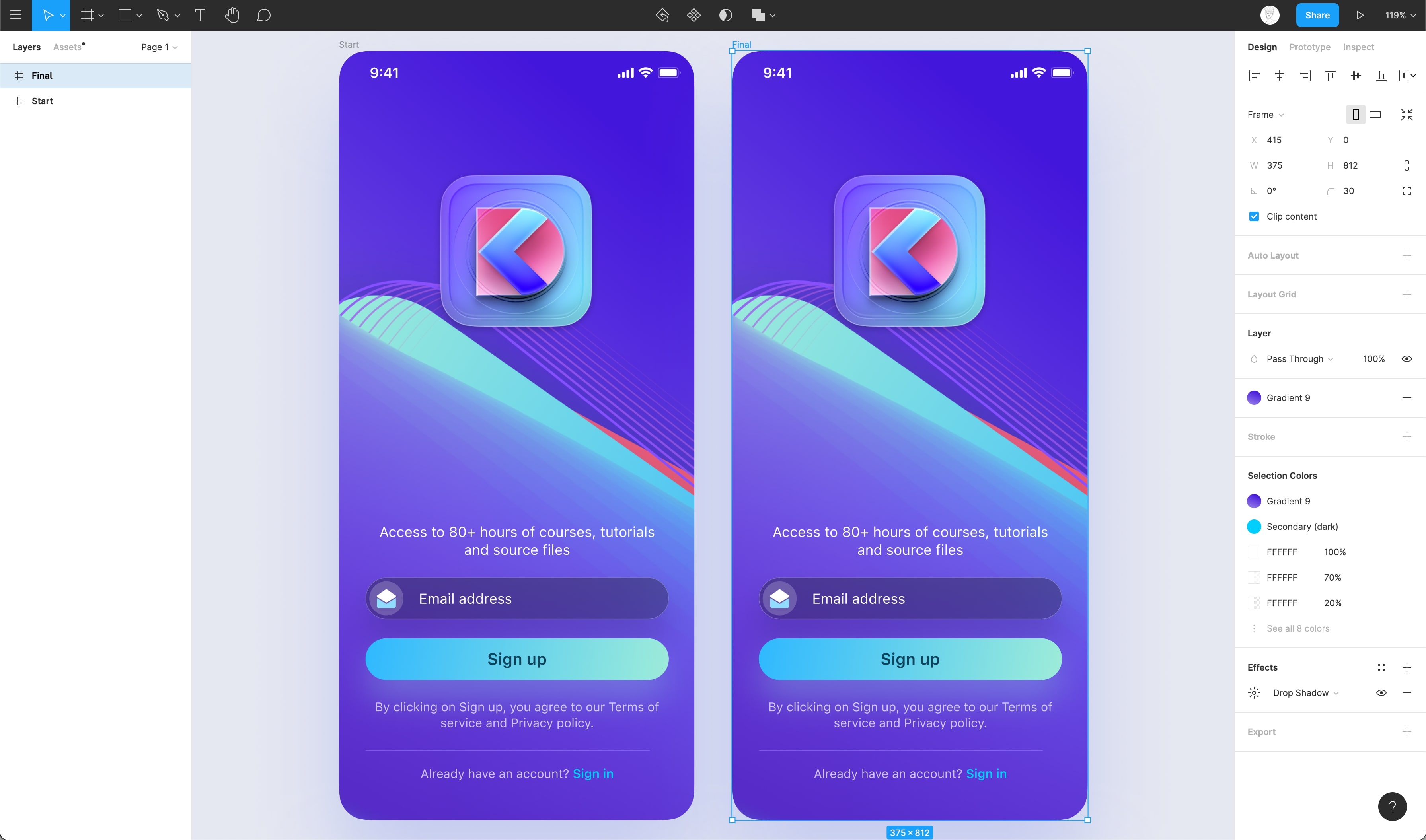
- Let’s start by duplicating the Frame

- On the Start Frame, we’ll move our elements and set the opacity values to 0%, this sets the initial state of our animation
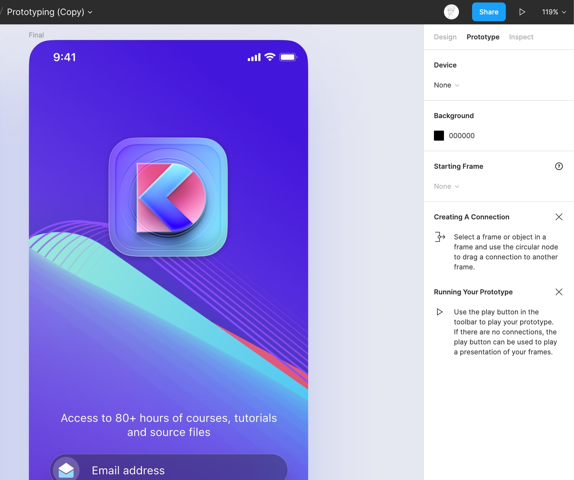
- Navigate to “Prototype” in the Properties panel

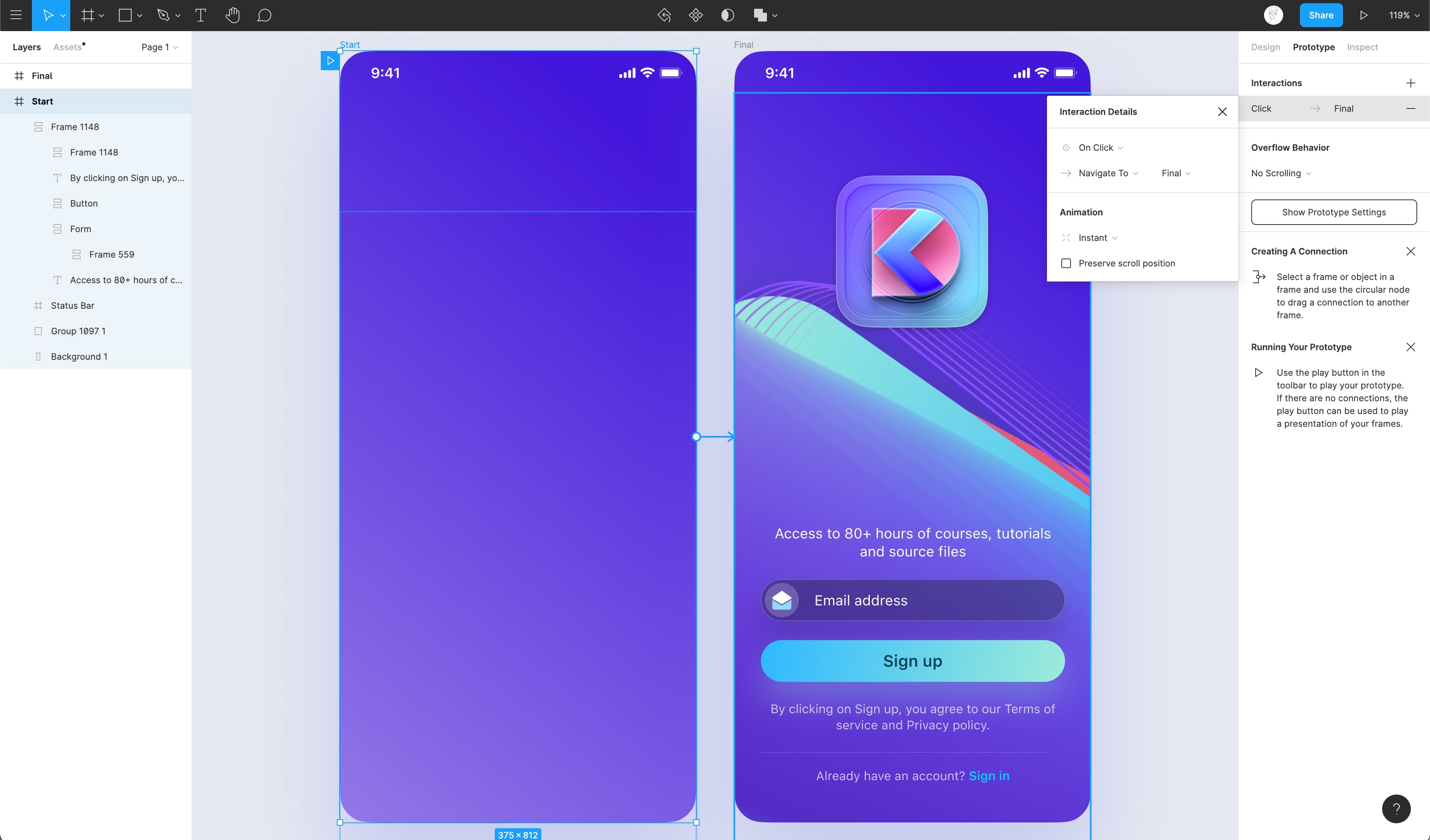
- Drag the anchor point of the frame / layer and connect it to the next frame
- You can also use the “Interaction” dropdown which will be followed up by “Navigate to” dropdown and choose your frame

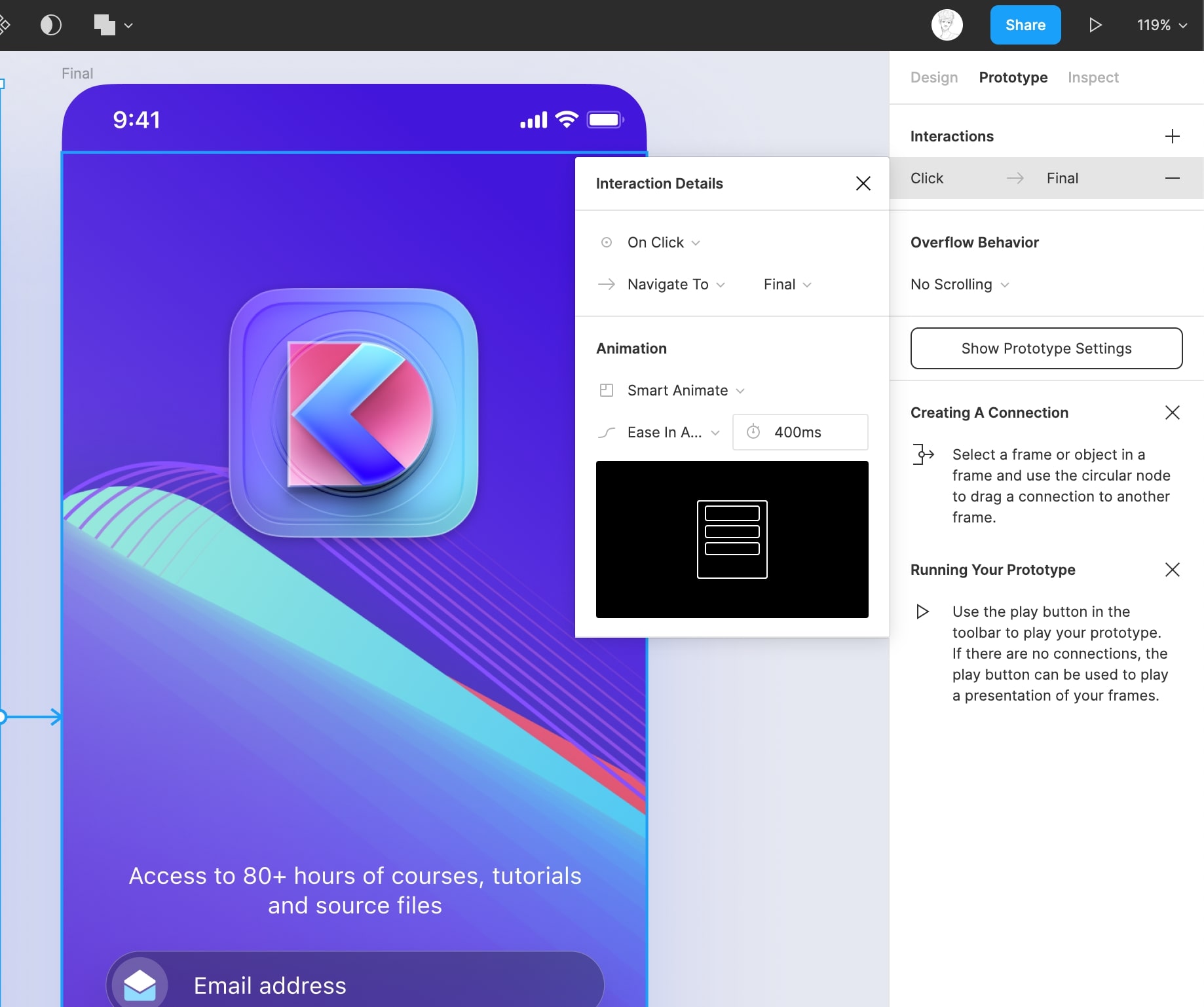
- Set the animation to Smart Animate, and the transition to Ease In And Out. Set transition period to 400ms for smooth animation.

Conclusion
Prototyping with Figma is very simple and easy with features like Smart Animate. We can still achieve a code level prototype using Figma. It all comes to how you execute your idea. You can also check the Prototyping Tools section from the UI Handbook for more information about tools.
Working with version history on Figma.
When multiple people are working on the same file, sometimes it becomes difficult to keep a track of important changes. This is where the version control feature comes in. With version history, you can keep track of all the changes that’ve been made to a design file by viewing earlier versions of the file.
Who can access version History?
Any user can access version control, be they on one of the Starter plans or on a Professional or Figma Organization plan. The only difference is the amount of time. On a Starter plan, you can access up to 30 days of version history while on a Professional or Figma Organization plan, you’ve access to unlimited version history.
Version History
A version is saved when the file hasn’t been edited for 30 minutes. To view versions, you can do the following:
- Make sure nothing is selected so that you can view the file name at the top
- Click on the dropdown icon next to the file name
- Select Show Version History

- A list containing the details of changes as well as the names of whoever made the changes appears on the right, replacing the Properties Panel

Add to Version History
You can add an existing version to version history while editing by doing the following:
- Click on the ‘+’ icon in the top-right in the Version History panel

- A modal opens up. Enter the name as well as the description of the version in the input fields and click the Save button

Hiding Version History
You can head back to editing your current version via two ways:
- Click on the file name again and then, select Hide Version History

- Alternatively, you can click on the ‘Edit Current Version’ button next to the hamburger menu

Duplicate Version
You can duplicate the version by selecting any version and then, clicking on the ‘. . .’ icon. From the dropdown menu, select Duplicate.
Restore Version
Figma also gives you the option to restore your design file to a previous version by selecting a version, clicking on the ‘. . .’ icon and then, select Restore This Version.

Conclusion
Version History feature makes it super easy to control different versions of your design file. Whatever you design or edit you don’t have to worry about loosing any of it though there’s multiple team-mates designing in the same file. You are always in control of your designs.
Multiplayer, Commenting, & Previews - Learn about collaboration & sharing with Figma.
With features like real-time collaboration via commenting, Figma has opened a whole new way of collaborating with designers and developers. Since it’s web-based, everything is in sync and you’re able to share your designs with developers or clients with just a link, it has never been this easier.
Real-time Collaboration
Imagine you bring in 2-10 designers, solving the same problem with a 10 minutes deadline. What you’ll notice is that after a few minutes, some might be blocked. At that point, they will look at others and duplicate the work to branch out and start from others ideas. That’s a powerful way to solve problems.

Sharing
Since Figma is web-based you can share your design/prototype with a link or inviting a specific person via email. This can be useful when you want to share your designs with clients or stakeholders to get feedback or to show the progress you’ve been making!

Handoffs
Figma offers you the ability to invite developers. Inviting them with a “Can View” access shows all the essential options that a developer needs such as specs, Android, iOS, and CSS properties, to view prototypes and the options to export necessary assets.

Live Embeds
You can share Live Embeds by simply going to the Share button and clicking on Public embed. Before doing that, it’s important to allow public access to your file. If done right, it’s going to give you an iFrame HTML code that can be pasted into your Website or even on platforms such as Slack.

Comments
Comments in Figma enable designers to have real-time collaboration right in the design file. Comments can be used to give feedback and respond to said feedback. This makes iteration and editing based on the feedback way more easier.
Viewing Comments
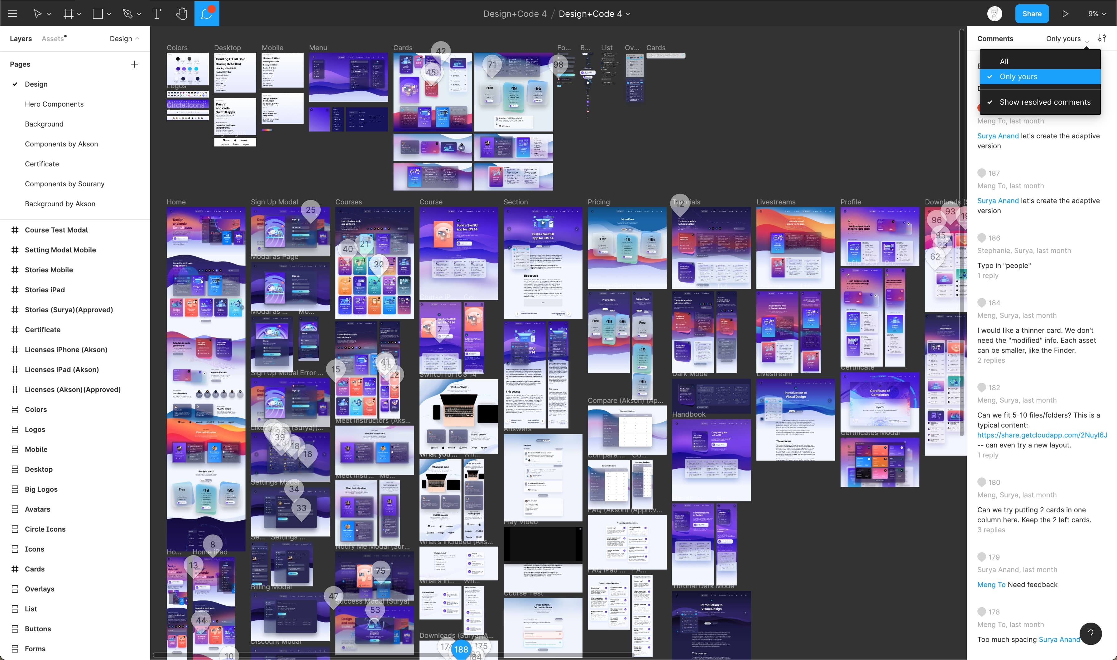
To enter comment mode in Figma, simply click the ‘Add/Show Comments’ ( C on keyboard ) option in the toolbar. Once you click on the ‘Add/Show Comments’ option, you’ll be able to see the comments, both on the canvas and in the Properties panel.

- The comments on the Canvas appear where they’ve been added. You can reply by clicking on the ‘pin’ icon and then typing out your response
- The Properties panel will contain a list of all the comments. Click on a particular comment to see where it is on the canvas
Resolve Comments
When a comment has been taken into consideration or when the changes have been made according to the feedback, you can remove a comment by clicking on the comment in the canvas and then on the checkmark on the right. This will delete the comment from both the canvas as well as the Properties panel.

Filter Comments
Figma gives its users the ability to directly mention a person by their name. Due to the addition of this, you can filter comments based on whether you’d like to see all the comments or whether you’d prefer the comments that mention you. You can apply the filter in the Properties panel.
Link Sharing
- You can access the link sharing settings via the ‘Share’ button on the toolbar

- Once you click on the button, a modal containing all the settings opens up

Link Sharing Settings
Let’s go through all the settings that are available to us.
- A user can directly invite a person by entering their information in the input field at the top
- The next option allows you to choose if you’d like anyone with the link to view the design file or just the people whom you’ve sent an invite to can view it
- Both of the above options allow you to decide whether you’d like to give editing access or if you’d prefer them to simply preview the file instead

Sharing the URL
You can also copy and share the link via the modal.
- Click on the ‘Copy link’ option at the bottom of the modal. This copies the link to the clipboard
- Click ‘Get embed code’ to view the embed code. This opens up a modal that contains the code. Click the Copy button to copy the code to the clipboard
- Lastly, you can directly link a selected frame by simply checking the ‘Link to selected frame’ option

Conclusion
Figma has taken design collaboration to the next level with these features, making it easy for teams to collaborate and work with designers and engineers worldwide without worrying about having them in-person for feedback or other collaborative processes.
