In this section, you will learn how to build a widget from scratch in Flutter. Widgets are tiny UI components in Flutter. They are much like Views in SwiftUI. By building and combining many widgets you will be able to build an entire screen in Flutter. We’ll build one row item from our sidebar.
Downloads
To follow this course, you can download the source file, which will help you compare your progress.
Source Code
You can also view the source code for each section in the course in my GitHub repository.
Getting Started
Open the project we created in the last section. We’ll need to remove the template project so change the main.dart file to look like such.
void main() {
  runApp(MyApp());
}

class MyApp extends StatelessWidget {
  @override
  Widget build(BuildContext context) {
    return Container();
  }
}
Material App
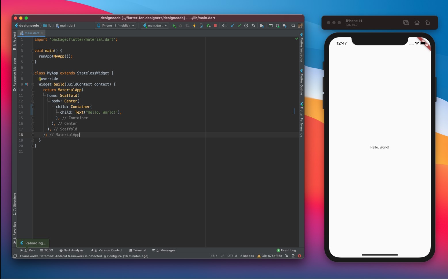
We now have a black screen so to change that, delete the Container widget and replace it with the following
return MaterialApp(
	home: Scaffold(
		body: Center(
			child: Container(
				child: Text("Hello World")
			)
		)
	)
)
These are some of the common widgets you will see in Flutter apps.
- MaterialApp: The MaterialApp widget provides a number of widgets at the root of your app for helping with navigation, localization, debugging tools, and more.
- Scaffold: A Scaffold widget is also another widget that provides many sub-widgets related to the UI of your app like a background color, a navigation bar, etc.
- Center: The Center widget is a layout widget that centers its child in the middle of the parent widget.
- Text: A Text widget displays a text label. The string value should be provided and the text styles can be customized.

Sidebar Item
Creating the sidebar item is just a matter of a few keyboard taps and mouse clicks.
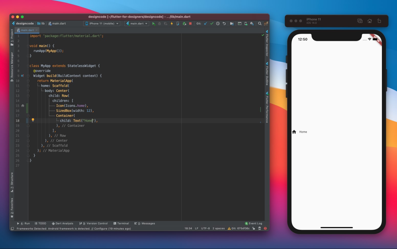
- First, change the Hello World string to Home.
- Next, place your cursor on Container keyword and press Option+Enter and select Wrap with Row in the menu that appears
- Before the Container widget in the new children argument of the Row widget, add the Icon widget for the icon and the SizedBox widget for padding
Row(
	children: [
		Icon(Icons.home),
		SizedBox(width: 12),
		Container(
			child: Text("Home"),
		),
	],
)
Styling the Sidebar Item
To style the sidebar item, we need to add a style property to the Text widget, color the Icon widget, and finally wrap our Icon widget in a Container widget and set the properties of this container.
- For the Text widget, we’ll set it to a font size of 16.0 pixels, a font weight of 800, and a color of #242629.
- We’ll set the color of our Icon widget to white.
- For the Container widget that is wrapped around our Icon widget, we’ll set the width and height to 42.0 pixels, add a padding of 10.0 pixels, add a border radius of 14.0 pixels, and add a linear gradient.
Row(
	children: [
		Container(
			width: 42.0,
			height: 42.0,
			padding: EdgeInsets.all(10.0),
			decoration: BoxDecoration(
				borderRadius: BorderRadius.circular(14.0),
				gradient: LinearGradient(
					begin: Alignment.topLeft,
          end: Alignment.bottomRight,
          colors: [
						Color(0xFF00AEFF),
            Color(0xFF0076FF),
          ],
				),
			),
			child: Icon(
				Icons.home,
				color: Colors.white,
			),
		),
		SizedBox(width: 12),
		Container(
			child: Text(
				"Home",
				style: TextStyle(
					fontSize: 16.0,
					fontWeight: FontWeight.w800,
					color: Color(0xFF242629),
				),
			),
		),
	],
)
Import Assets and Project Files
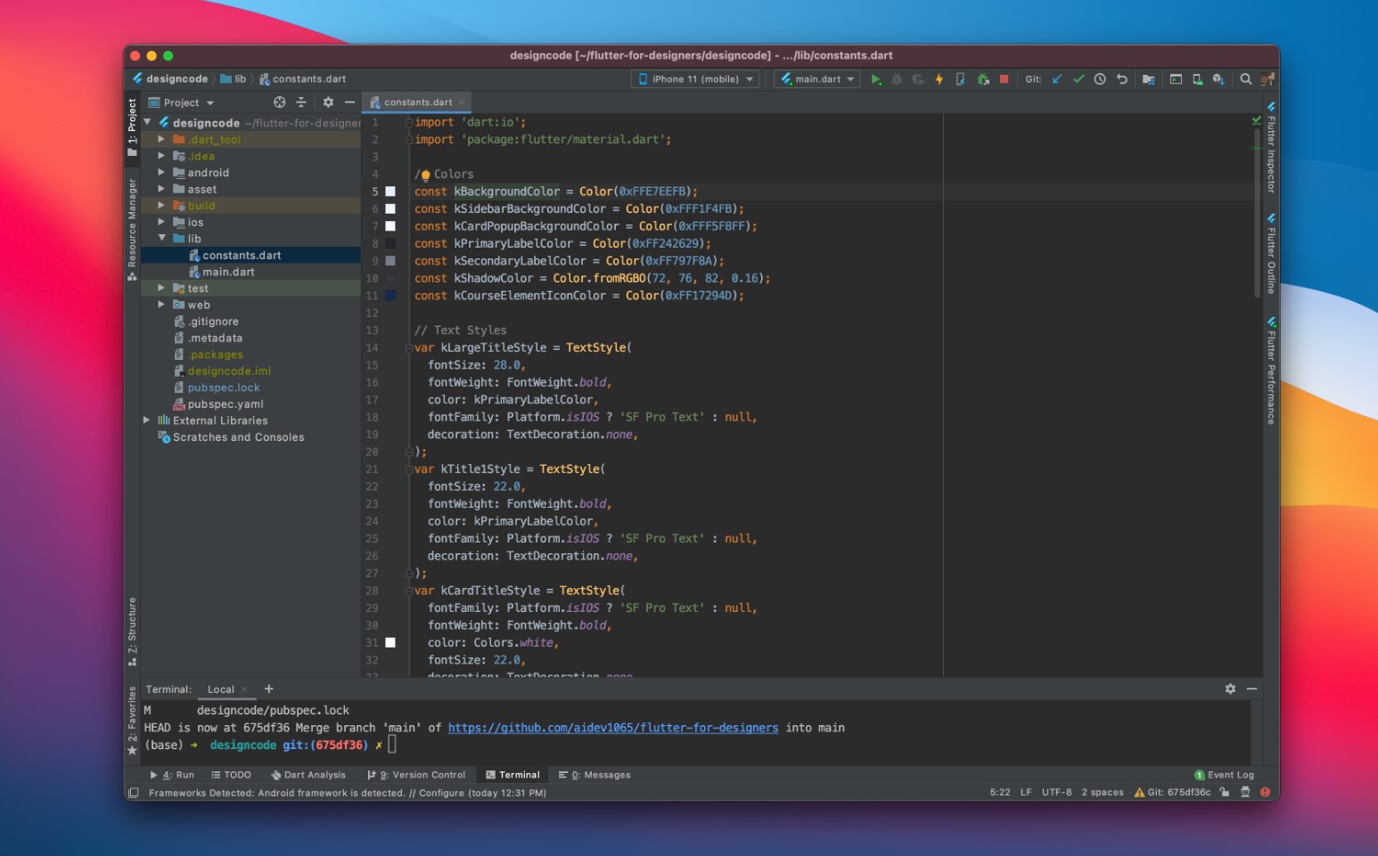
Before moving forward, we need to add the assets and project files. Open the Project Files folder provided at the top. Within the folder, drag and drop the Assets folder at the very top of the file hierarchy. The folder will contain all the images and fonts we will be using inside our application.  Within our Project Files, we also have a Dart file called constants.dart. This file includes all of the colors and text styles we will use in our project. By having a file containing the styling constants we will use, this will save us from creating spaghetti code by routinely entering the same text styles and colors.
Take this file and drop it into the lib folder in the project sidebar to the left. 
