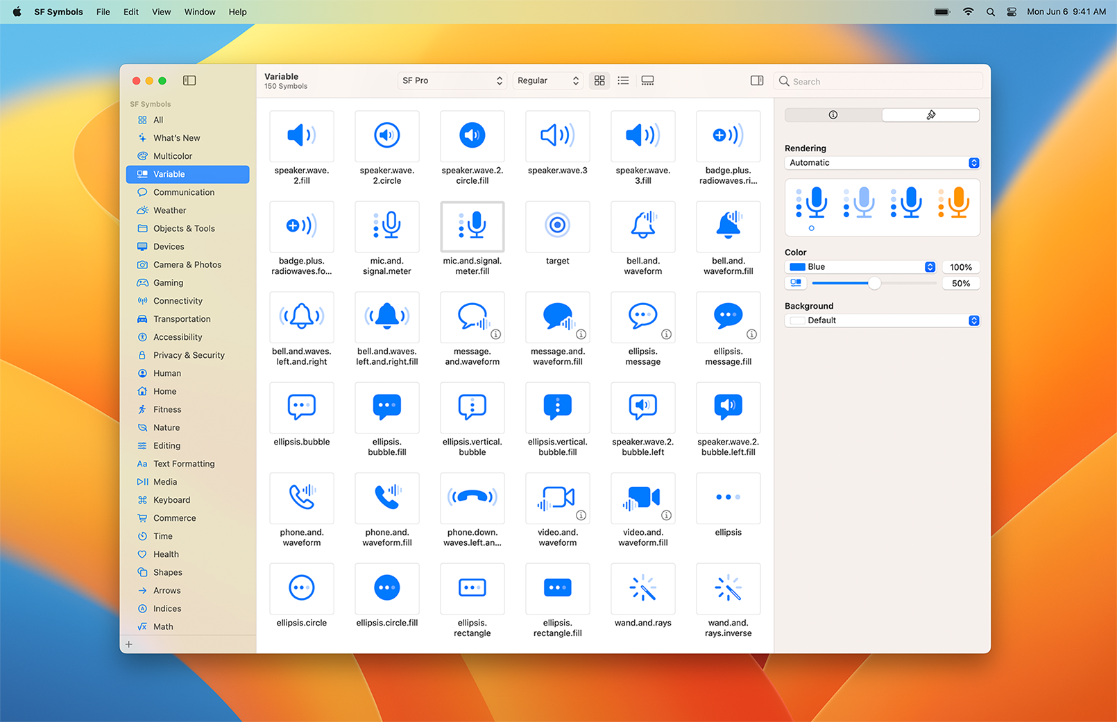
With over 4,400 symbols, SF Symbols is a library of iconography designed to integrate seamlessly with San Francisco, the system font for Apple platforms. Symbols come in nine weights and three scales, and automatically align with text labels. They can be exported and edited using vector graphics editing tools to create custom symbols with shared design characteristics and accessibility features. SF Symbols 4 features over 1000 new symbols, variable color, automatic rendering, and new unified layer annotation.
Downloads
To follow this tutorial, you can download the source file, which will help you compare your progress.
SF Symbols
SF Symbols are highly adaptable and can be configured to a number of weights and sizes. Using them is as simple as copying and then, pasting these to your project. To use these, make sure that you’ve the SF Symbols app installed on your device. 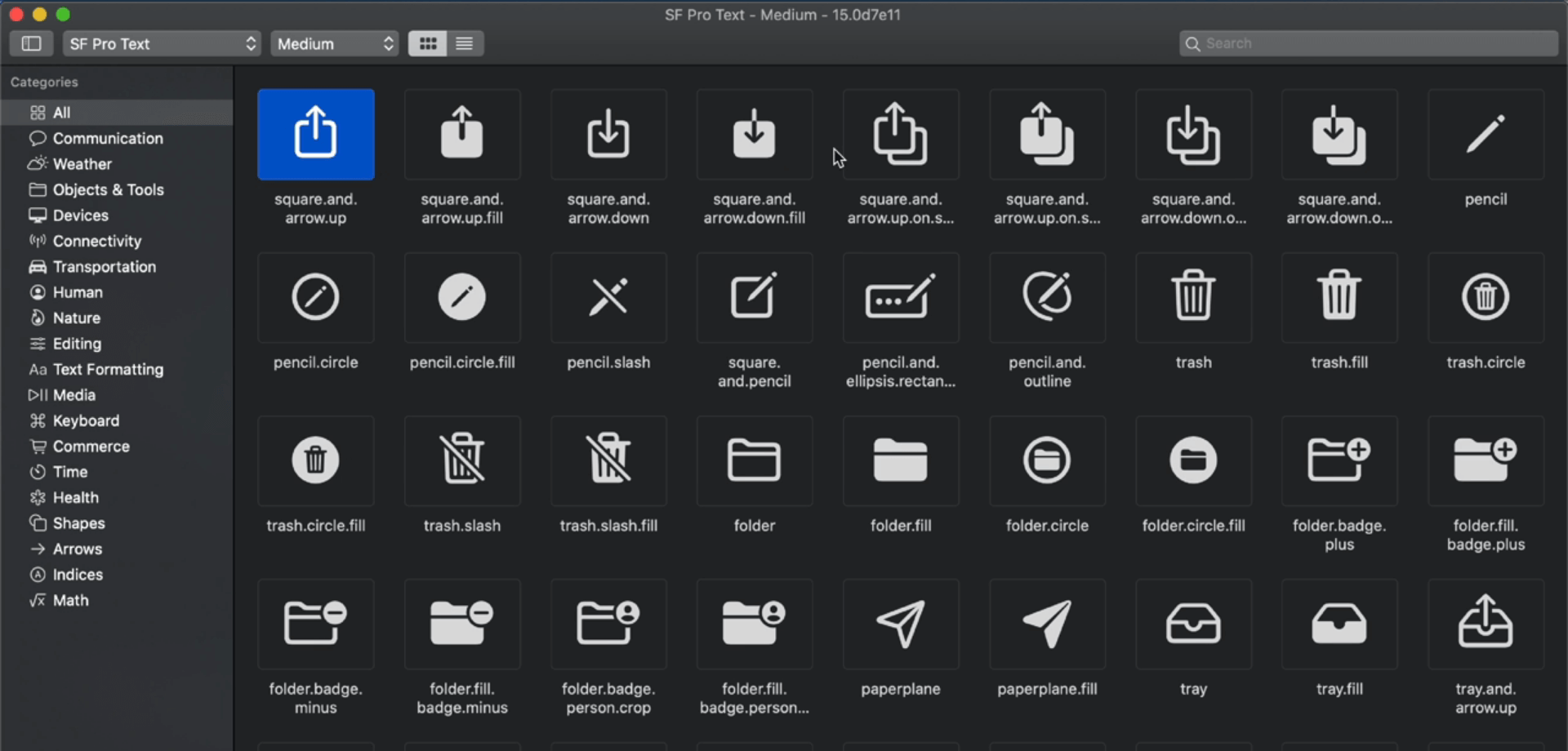
Compatibility
SF Symbols are compatible with iOS 13 and later, macOS 11 and later, watchOS 6 and later, and tvOS 13 and later. 
Weights
SF Symbols are available in various weights as well as scales. This allows you to create designs that are easily adaptable. Some of the weight options include thin, light, bold, heavy, etc. The image below shows the weights available. 
Using SF Symbols
In SwiftUI, you can easily generate icons from SF Symbols using their name. Additionally, you can customize the size (small, medium, large), change the weight and change the icon color. You can also edit the icon by using the font modifier.
Image(systemName: "gear")
	.font(.system(size: 20, weight: .light))
Changing Scale
You can add the imageScale modifier to the SF Symbol, treating it as an image. The imageScale modifier takes in one of the following values – large, medium, small.
Image(systemName: "gear")
	.imageScale(.large)
Multi Color

You can use multicolor SF Symbols. In the app, they appear in the Multicolor category. Or, you can click on the Color icon in the toolbar.
The renderingMode modifier is necessary to show the all the colors.
Image(systemName: "paperplane.circle.fill")
	.renderingMode(.original)
Note: If you use font properties on the icon, you will not be able to use the multicolor option.
Using SF Symbols in the Design Tool
You can even use the SF Symbol icon in your favorite design tool. Using it is as simple as searching for the icon in the SF Symbols app. Then, dragging and dropping it inside the design tool. In the image below, we’re using Sketch but you can use any editor.
Over 1000 new symbols
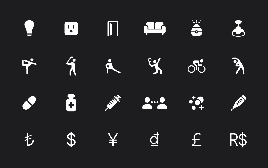
New symbols include representations of home objects, fitness, health, currencies, and many more. Localized symbols include variants across Arabic, Chinese, Devanagari, Hebrew, Japanese, Korean, Latin, and Thai. These new symbols are available in apps running iOS 16, iPadOS 16, macOS 13, tvOS 16, and watchOS 9.

Variable color
Color can now be dynamically applied to system and custom symbols using a percentage value to convey strength or progress over time. An updated inspector with a variable color slider enables previewing across all rendering modes.

Automatic rendering
Symbols are now automatically displayed in a rendering mode that highlights their unique characteristics. Many symbols use hierarchical rendering automatically for added depth and detail without needing to specify a rendering mode.
Unified layer annotation
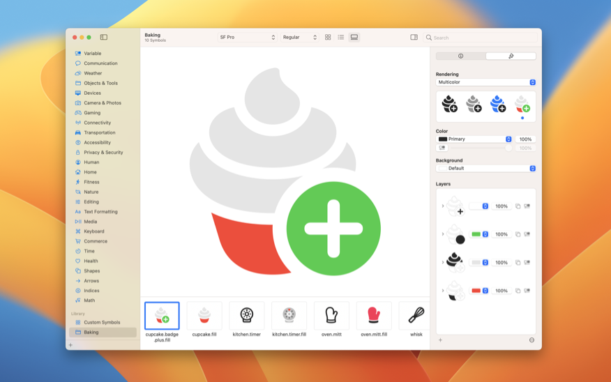
Custom symbols feature a shared layer structure across rendering modes making annotation faster and easier. Layer annotations can be viewed at a glance in the new preview area.
