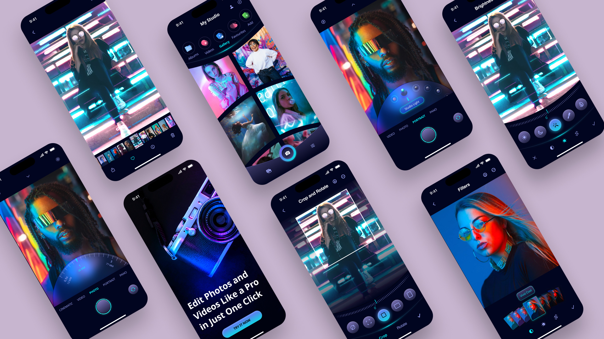
Design an onboarding screen for a camera photo editing app
In this course, we will design this beautiful design, a camera photo editing app from scratch in Figma. It will be exciting because we will build the complete app design.

Getting Started
We’re going to use a flat style with simple two-dimensional elements and glassmorphism in dark mode with vibrant neon colors.

We’ll add more depth to the buttons by adding a gradient color and playing with the inner shadow to have the illusion that there is a hole inside the button and make the icon floats.

We’re going to learn how to create the zoom controller using stroke inspired by a camera.

To make the design more unique, we’re going to create a curved layout and custom tab bar to fit with the design.

UI Kit
Before starting, you will need to get a copy of a UI kit. I will be using this iOS16 UI Kit by Joey Bank from the Figma Community.
This file contains hundreds of components, templates, demos, and everything else needed to help you start designing for iOS. Each component has been created with the latest version of auto-layout, supports component properties, variants, light and dark mode and much more.

Noto Sans Font
We’re going to use the Noto Sans font by Google Fonts which is a collection of high-quality fonts with multiple weight and width in sans, serif, mono and other styles. Google Fonts are free to use, making beautiful types accessible to anyone for any project.

SF Symbols Browser
Download the SF Symbols Browser plugin for Figma. It contains over 4,000 symbols.

Figma File
To follow along, you will need a copy of my Figma file. Click on the (+) to add a new page where we will be designing from scratch.
Onboarding Screen
In this section, we’re going to design our first screen. We only need a beautiful image and wallpaper to make the onboarding stunning and a beautiful gradient button.

We will add our first frame for the Onboarding screen.
- Use iPhone 14 Pro Frame, fill color #02051F, corner radius 50, rename Onboarding
- Add a status bar; X: 0, Y: 0 and a home indicator; X: 0, Y: 810
- Go to the Assets page; select the camera image, rotation 30, X: -507, Y: 256
- Go to the Assets page; select the wallpaper, X: -133, Y: -121, blend mode: color dodge

We will now work on the bottom part of the screen.
- Create a frame of 393×334, align horizontal center and align bottom
- Add linear fill; top color #000210, opacity 0%, bottom color #000210, opacity 100%, horizontal direction
- Add text Edit Photos and Videos Like a Pro in Just One Click, bold, size 40, color white, auto height and text alignment left
- Align horizontal center, spacing of 108 from the home indicator

Let’s finish the first screen with a nice gradient button.
- Write TRY IT NOW, uppercase, bold, size 15, color black, auto width, align left
- Add an auto-layout; fixed width 200, fixed height 44, corner radius 30 and center alignment
- Add linear fill; top color #6573ED, bottom color #14D2E6, horizontal direction
- Add stroke; color white, overlay, inside, width 0.5
- Add inner shadow; X: 3, Y: 3, blur: 6, color #78A8FF
- Align horizontal center, spacing of 32 from the home indicator

We have completed our Onboarding screen. In the next step, we’re going to create the fun part of the design, the mode photo and portrait.
