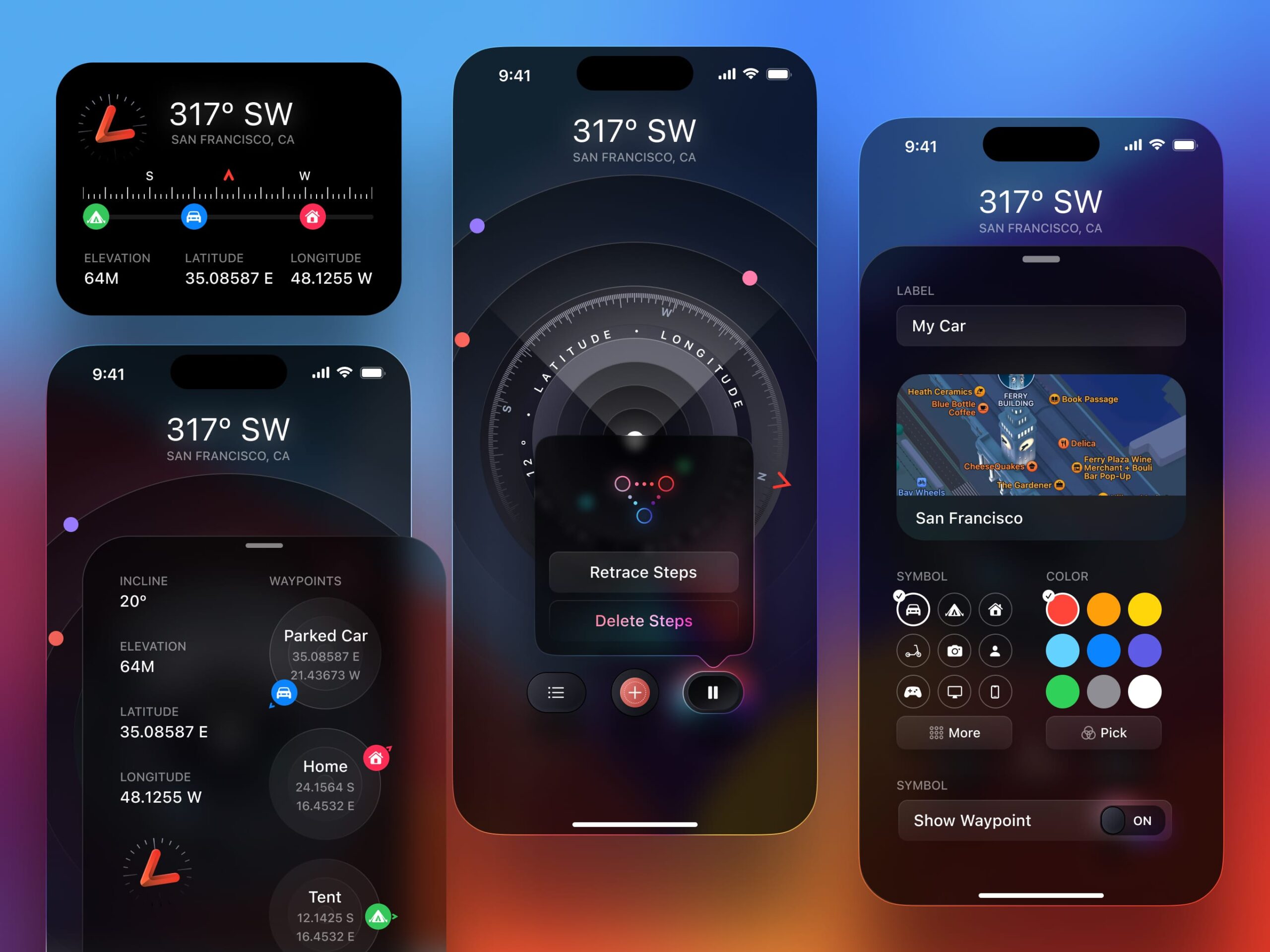
SwiftUI has come a long way in just 4 years. It’s no longer considered an alternative framework but a serious replacement to UIKit and Storyboard. Not only does it save you so much time to learn as a complete beginner but it also allows you to build complex layouts effortlessly across Apple platforms. This year, it’s especially stable and fun to build on Xcode 14, with improved previews, variants, SF Symbols 4 , charts, grid layout and all-around better support for adaptive layout, navigation, animation, fonts and forms.
Downloads
To follow this course, you can download the source file, which will help you compare your progress.
This Course
In this course, we’ll learn the new SwiftUI 4 features as we build multiple iOS apps from scratch. It is mainly focused on the user interface, interactions and animations, which is ideal if you’re a beginner or someone who enjoys building challenging UIs. We will explore unique concepts made specially for this course.

The designs in Figma and Xcode projects will be provided to help you learn.
Requirements
SwiftUI is pretty easy to learn and has a ton of resources made by Apple and the community. Since my teaching style is friendly, focused on visuals, and we’ll code together step-by-step from a designer’s perspective, you can learn with virtually zero experience. However, it is recommended that you are familiar with a computer and have light experience with HTML and CSS. Developing an app for iOS 16 requires a Mac with Ventura or later, and Xcode 14.
What’s new in Xcode 14
Xcode has a lot of quality of life improvements for SwiftUI coders. At last, you won’t need to hit the reload in the Preview and it has Variants! The App Icon now uses a single asset and overall, Xcode 14 is faster, has better autocompletions and you can target specific platforms to reduce size.

What’s New in SwiftUI 4
Whether you’re new to coding or a veteran with many years under your belt, you’ll find that this framework is modern, fast and excels at building both native and custom UIs with a fraction of the time it normally takes on other frameworks. Apple keeps improving it each year with a ton of new features including Charts, Advanced layout control, Navigation API and new components like half sheets and share sheets.
Grid Layout
The new grid system makes it easy to build complex layouts in an intuitive way. Unlike the LazyGrid, the new Grid layout loads every cell at once and you have more control over the size of individual cells and alignment of its child elements.

You can compose interesting layouts with minimal code.
Grid {
    GridRow {
        card.gridCellColumns(2)
    }
    GridRow {
        card
        card
    }
    GridRow {
        card.gridCellColumns(2)
    }
}
Charts
With SwiftUI Charts , you can create rich visuals for your data without relying on a third-party library. Moreover, it’ll look great on other platforms such as watchOS and macOS. This is one of those things that it’s rarely worthwhile to create a custom system due to its complexity.

Chart {
    ForEach(data) { item in
        LineMark(
            x: .value("Category", item.category),
            y: .value("Value", item.value),
            series: .value("Year", "2022")
        )
        .symbol(by: .value("Year", "2022"))
        .interpolationMethod(.catmullRom)
    }
}
There are various styles for the SwiftUI Charts to accommodate any type of data.

SF Symbols 4
SF Symbols 4 is a set of 4,400 icons that can be used freely on Apple platforms. Not only is it recommended to use them in your designs to be consistent with the platform, but the library is bundled with SwiftUI which means that you just need to remember the symbol name. In Version 4, you can use variable color to create progressive icons.
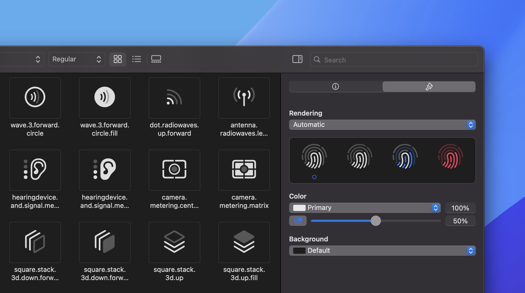
Image(systemName: "touchid", variableValue: 0.5)View That Fits
A new view class named View that fits is available which automatically adjusts its size based on its content. This makes it easy to use components like lists or cards that need different sizes depending on their content. It also works well if you want hide certain parts of your UI when there are no items in a list for example.
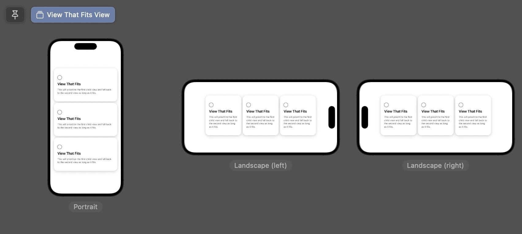
ViewThatFits {
		// Tries to fit 3 cards horizontally
    HStack {
        card.frame(width: 200)
        card.frame(width: 200)
        card.frame(width: 200)
    }
		// Otherwise, fit cards vertically
    VStack {
        card
        card
        card
    }
}
.padding(20)
Custom Layout
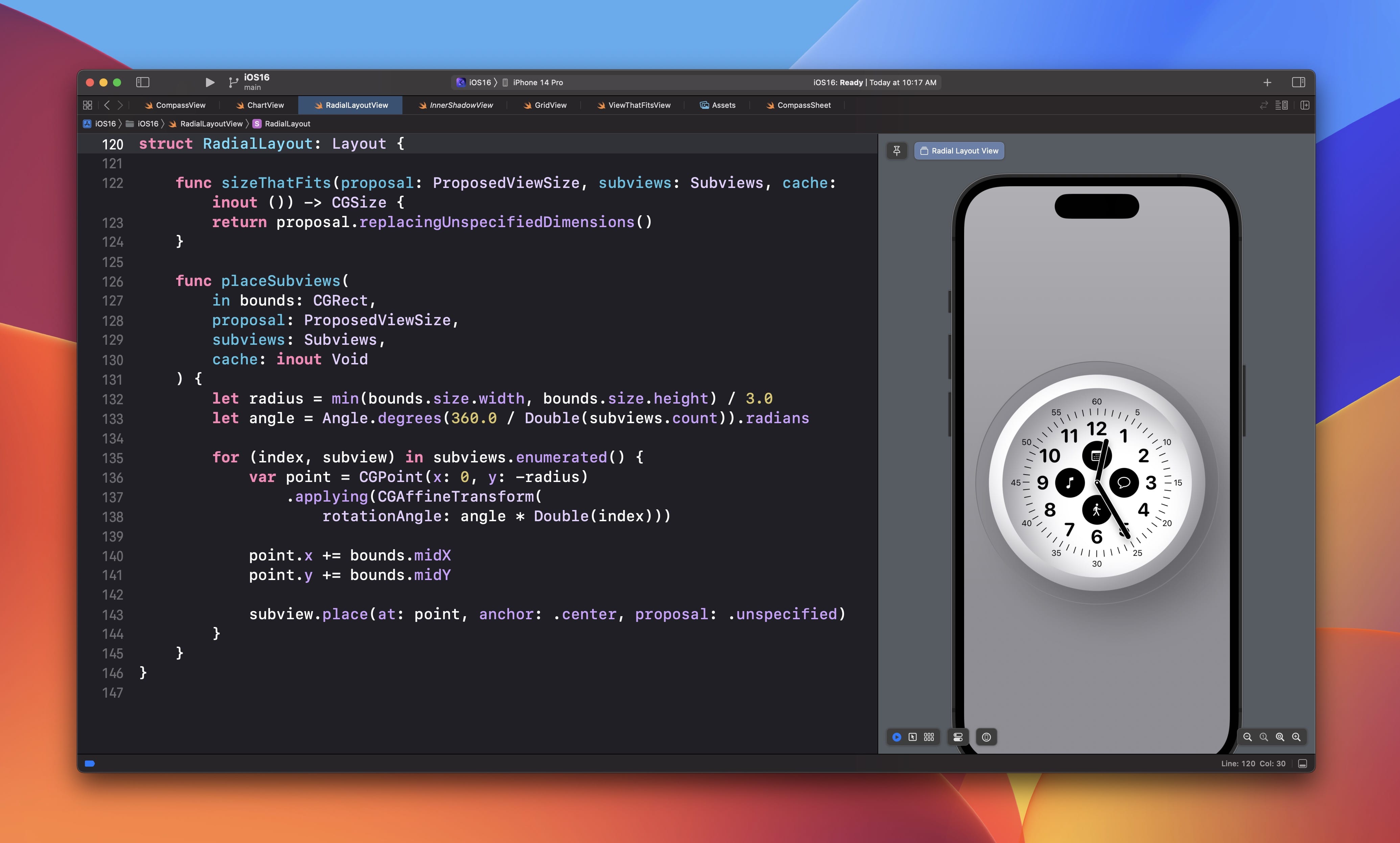
In iOS 16, you can create complex layout behaviours that can arrange the subviews in any way you wish, such as a radial layout using degrees, or a custom HStack where you can customize your own properties.
RadialLayout {
    ForEach(numbers, id: \.self) { item in
        Text("\(item)")
            .font(.system(.title, design: .rounded))
            .bold()
    }
}
struct RadialLayout: Layout {
    func sizeThatFits(proposal: ProposedViewSize, subviews: Subviews, cache: inout ()) -> CGSize {
        // Calculate and return the size of the layout container
    }

    func placeSubviews(
        in bounds: CGRect,
        proposal: ProposedViewSize,
        subviews: Subviews,
        cache: inout Void
    ) {
        // Tell each subview where to appear
    }
}
Gooey Interface
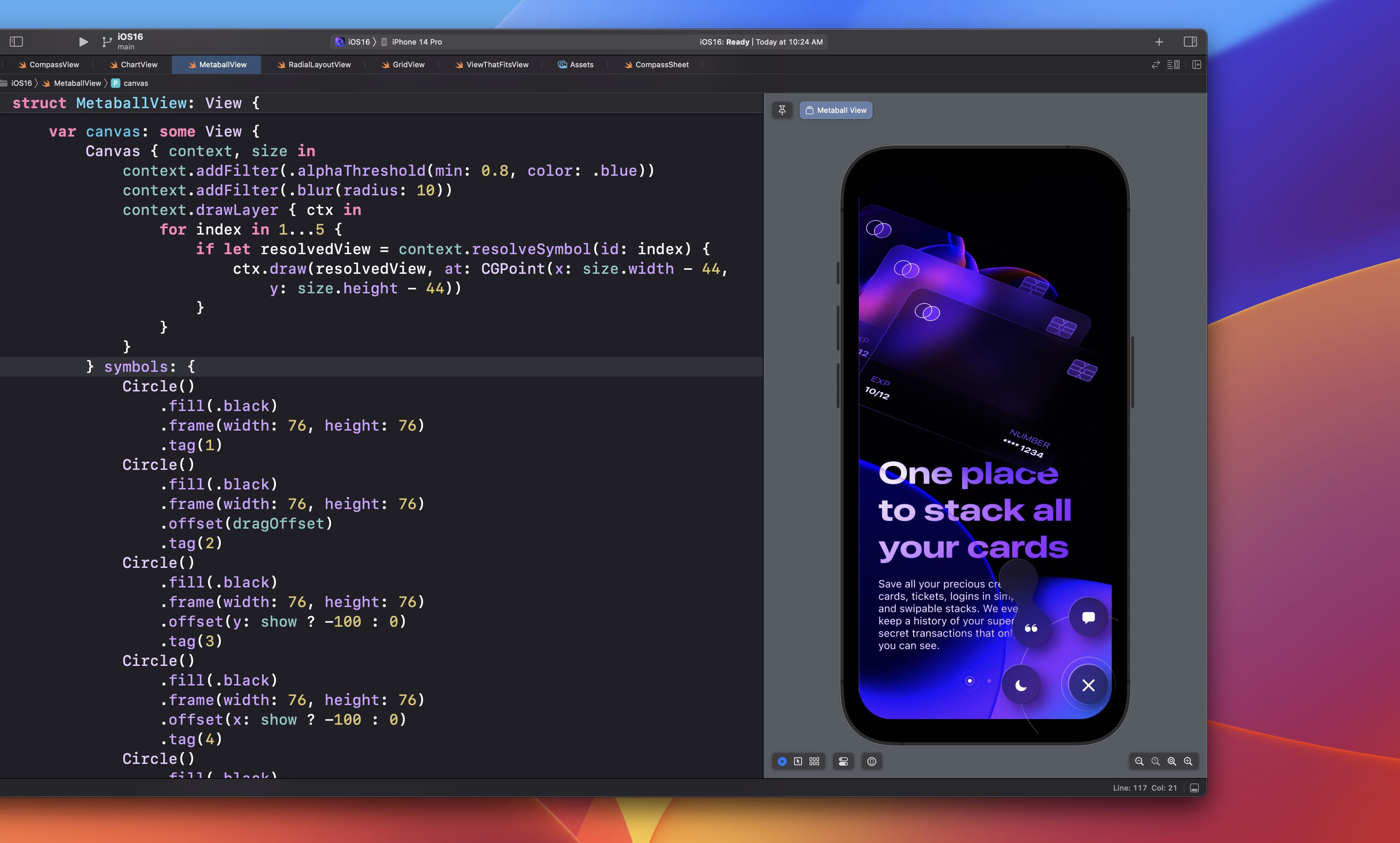
Since the launch of the Dynamic Island found on the iPhone 14, the gooey animation captured the attention of many. Using SwiftUI Canvas with blur, you create pretty cool liquid transitions.
Canvas { context, size in
    context.addFilter(.alphaThreshold(min: 0.8, color: .blue))
    context.addFilter(.blur(radius: 10))
    context.drawLayer { ctx in
        // Draw gooey shapes
    }
} symbols: {
		// Shapes
}
3D Card with Holo Effect
A fun experiment you’ll learn in this course is how to create a holographic card with reflections and 3D parallax as you interact with the card.

Navigation Stack
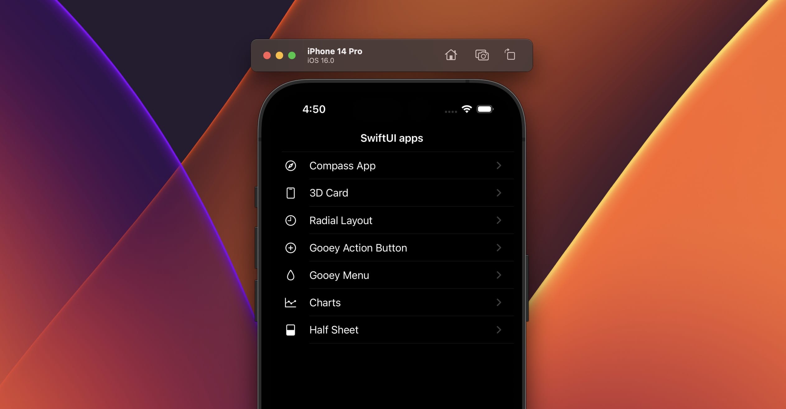
The new Navigation Stack replaces the deprecated Navigation View. It works almost the same way, except it can now programmatically pass values for the destination.
NavigationStack {
    List(navigationItems) { item in
        NavigationLink(value: item) {
            Label(item.title, systemImage: item.icon)
                .foregroundColor(.primary)
        }
    }
    .listStyle(.plain)
    .navigationTitle("SwiftUI apps")
    .navigationBarTitleDisplayMode(.inline)
    .navigationDestination(for: NavigationItem.self) { item in
        switch item.menu {
        case .compass:
            CompassView()
        case .card:
            CardReflectionView()
        case .charts:
            ChartView()
        case .radial:
            RadialLayoutView()
        case .halfsheet:
            HalfSheetView()
        case .gooey:
            GooeyView()
        case .actionbutton:
            ActionButtonView()
        }
    }
}
Half Sheet
The bottom sheet UI that is used on popular apps like Apple Maps and Google Maps can now be implemented natively in SwiftUI using a few lines of code. While on the surface level, this interaction seems easy to implement, in reality it’s actually not trivial because of the drag zones and velocity. Thankfully, you get access to all that power by using the sheet modifier and presentationDetents. The presentationDetents controls the size of the sheet relative to the screen.
Button("Show Sheet") {
    showSheet = true
}
.sheet(isPresented: $showSheet) {
    Text("Content")
        .presentationDetents([.height(200), .medium, .large])
        .presentationDragIndicator(.automatic)
}
.font(.title).bold()
Inner Shadow and Gradient
Creating an inner shadow in iOS 16 doesn’t require a complex workaround that involves masking anymore. You can effortlessly create multiple inner shadows by using the foreground style.

Image(systemName: "aqi.medium")
	.foregroundStyle(
    .blue.gradient.shadow(.inner(color: .white.opacity(0.3), radius: 3, x: 1, y: 1))
	)
In this course, we’ll play a lot with inner shadows, drop shadows and blend modes to create interesting effects.
Multiple Blend Modes
Blending modes have long been around but only recently are designers really starting to utilize its capabilities. Generally, you can use it to elevate the vibrancy of colors and apply interesting effects like Multiply, Overlay, Difference, Saturation, etc. Furthermore, you can combine multiple blending modes to bring even more utility.
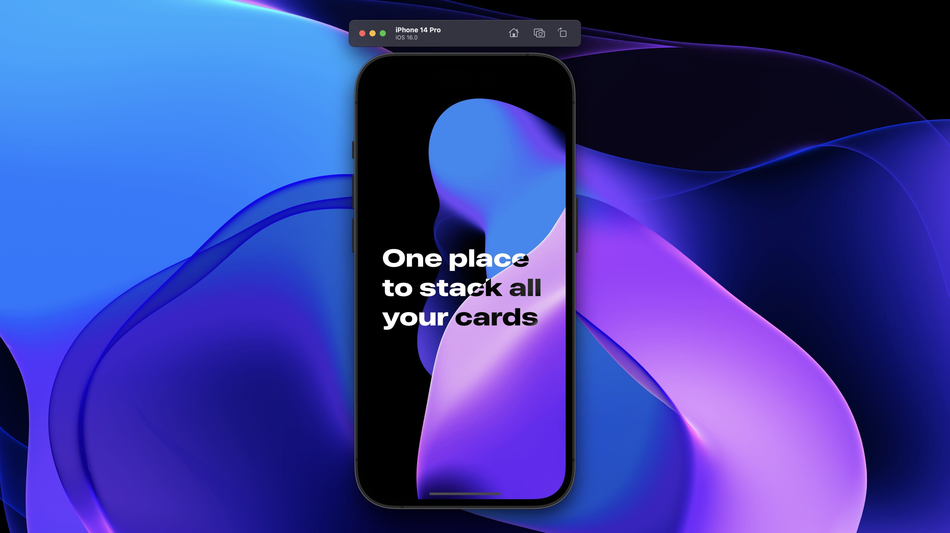 Unlike in Figma, you can’t have multiple Blend Mode modifiers. As a result, you must duplicate the same text each time you want an additional Blend Mode.
ZStack {
    wallpaper

    ZStack {
        text.foregroundColor(.white)
            .blendMode(.difference)
            .overlay(text.blendMode(.hue))
            .overlay(text.foregroundColor(.white).blendMode(.overlay))
            .overlay(text.foregroundColor(.black).blendMode(.overlay))
    }
}
While this seems tedious, having reusable code can make the task far easier and consistent.
var text: some View {
    Text("One place to stack all your cards")
        .font(.system(size: 48, weight: .heavy, width: .expanded))
        .bold()
        .padding(20)
        .frame(width: 390)
}
SF Width Styles
The SF Font family built-in into SwiftUI now supports new width styles: Compressed , Condensed and Expanded . This is available on top of the Regular style. As of now, you need to rely on a Font extension to access the new width styles. Luckily, this is only a few lines of code to include in your project.
extension Font {
    static func system(
        size: CGFloat,
        weight: UIFont.Weight,
        width: UIFont.Width) -> Font {
        return Font(
            UIFont.systemFont(
                ofSize: size,
                weight: weight,
                width: width)
        )
    }
}Text("One place to stack all your cards")
.font(.system(size: 48, weight: .heavy, width: .expanded))
Download SF Fonts
If you’re designing for iOS, it is essential to download the SF Fonts from Apple. There are 4 fonts:
- SF Pro is the main font that is consistent across Apple’s platforms, specifically for iOS, iPadOS and tvOS.
- SF Compact is for watchOS design, optimized to be readable at smaller sizes.
- SF Mono (optional) for evenly-spaced characters, which is useful for showing code.
- New York is a serif typeface, typically for more traditional designs such as Books and News.
Figma Template
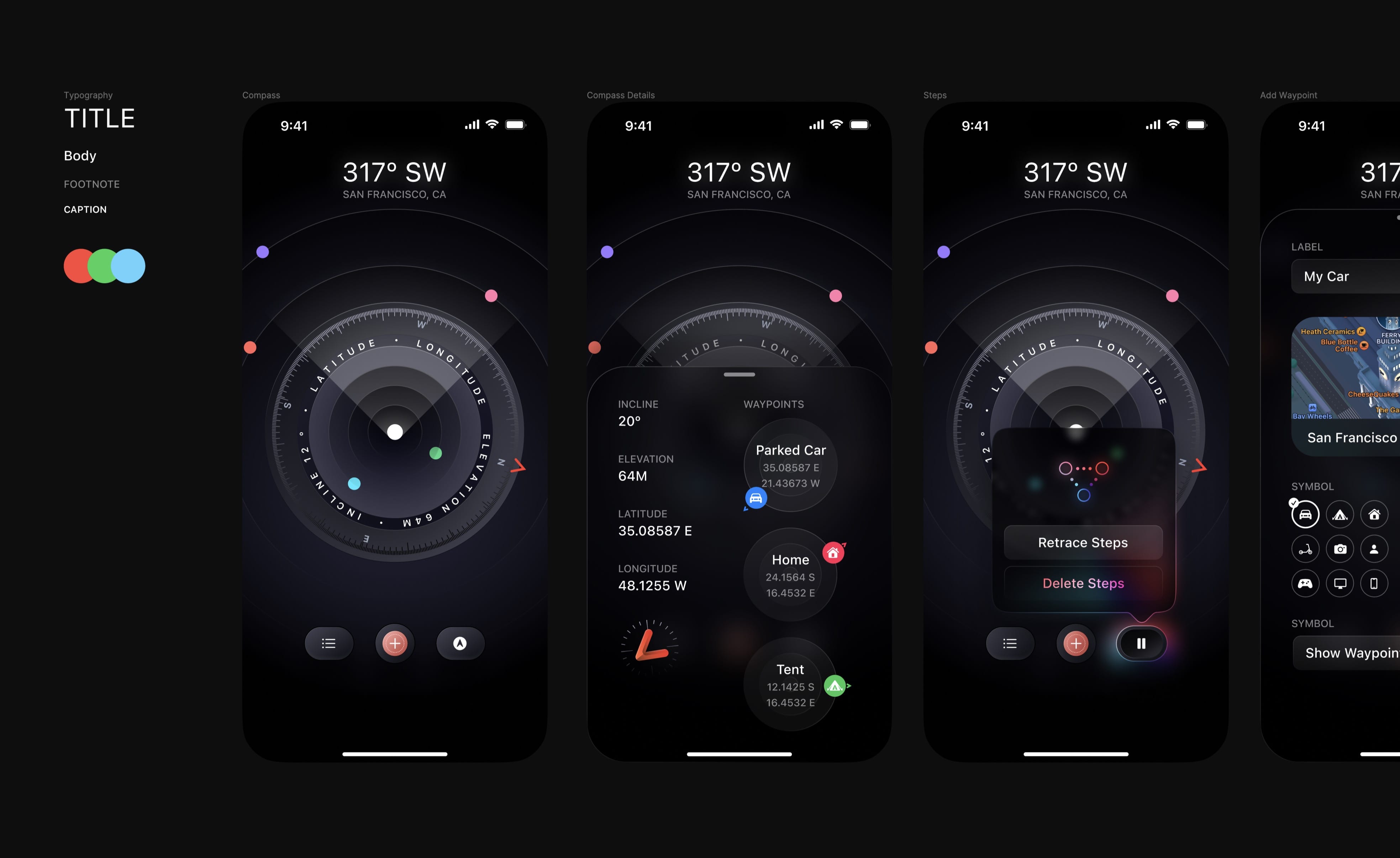
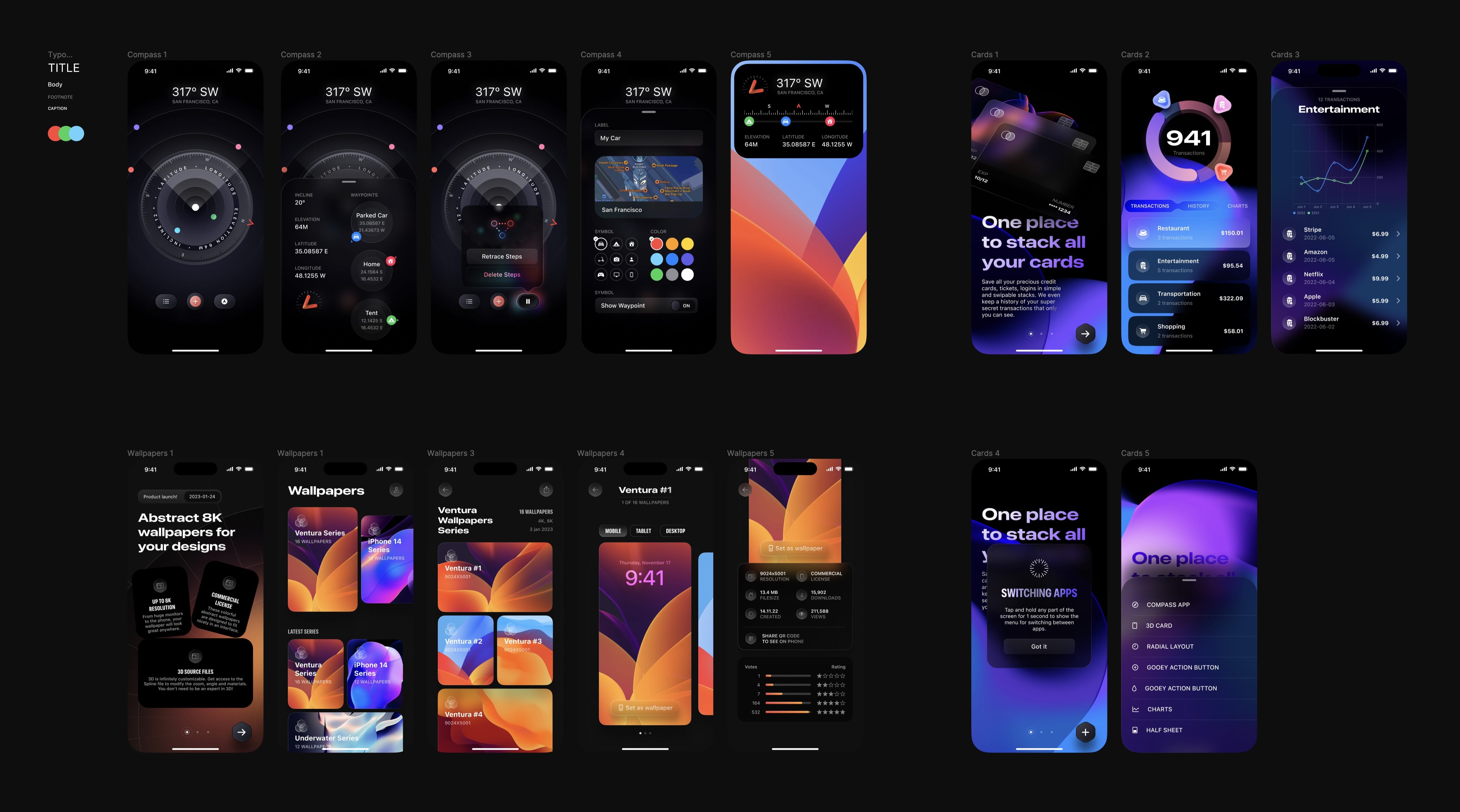
As I was building these apps, I followed the design that I made in Figma . From the Figma file, you’ll be able to inspect the typography, sizes, colors and assets. Note that some screens in Xcode were built directly there.
Download Xcode 14
To create our iOS app, we’ll use Xcode. You can download it and install it directly from the App Store. Unless you’re a seasoned developer, I don’t recommend using the beta version and stick to the public releases.

Create a New Xcode Project
Once Xcode is installed, open the app and you’ll see a welcome screen. Click on Create a New Xcode Project.

In this course, we’ll focus on building for iOS. Select App inside the iOS tab, then click Next.

Time to fill the project details:
- Product Name: this is the name of your app. E.G. News, Reminders, Mail. You don’t need to include App at the end.
- Team: this is useful if you wish to test on your device or publish to the App Store. If you have a developer account with Apple, you can set here, but otherwise you can do this later in Preferences under Accounts Tab with your Apple account. You can set None for now.
- Bundle Identifier: this is your domain name in reverse. It’s a unique ID for all your apps. E.G. com.twitter, com.instagram, com.figma.
- Make sure to select SwiftUI as the interface and language to Swift.

Finally, click Next. Select a place to save your Xcode project, such as Downloads.

Congratulations, you’ve just created your Xcode Project! The first time you land, you’ll see a fully open project with the project files on the left, the code editor in the middle with the Preview next to it and the Inspector in the right. In Xcode 14, the Preview will automatically resume!
 Make sure to have your a device selected in top bar. A good default is the iPhone 14.
Xcode Layout
Before we start, it is helpful to know your way around Xcode. These are the essential parts of working with SwiftUI inside Xcode 14.

NAVIGATOR
The Navigator is where you’ll navigate all the files, commits, issues for your project. By default, you’ll have the Project Navigator tab selected. That’s where you’ll spend most of your time on, so it’s important that you know how to get back to it, especially when Xcode sometimes auto-switches to other tabs when showing issues.
INSPECTOR
Whenever you have something selected in your code or assets, the inspector will give options based on that. The Attributes Inspector tab is the default and most relevant tab most of the time.
PREVIEW
By default, your preview will be interactive. The changes made in your code will be shown in real-time inside your Preview. You can also change to Selectable – the preview will be static and you can see the outlines of the selected elements in your code (Texts, Images, Stacks, etc).
PLAY IN SIMULATOR
In the top left, there is a giant Play button. This allows you to run your app on an iOS simulator which gives you all the extra options that the Preview won’t give you, such as Home Apps, Save Screen, Slow Animations, Status Bar and a whole lot more.
KEYBOARD SHORTCUTS
- Toggle Navigator (⌘ + 0): you can hide the Navigator to maximize your code editor.
- Toggle Inspectors (⌘ + option + 0): the Inspectors are useful for editing your UI without writing code, but later on, you’ll mostly do everything in code as it’s faster and more efficient. That’s why it’s useful to hide the Inspectors when they’re not needed.
- Resume Preview ( ⌘ + option + P ): the Preview needs to be resumed at start, or when there is a more structural code change outside of your body UI. This shortcut will help save those precious seconds.
- Run ( ⌘ + R ): run your app in the iOS Simulator. When running, you will have access to the logs, issues and performance graphs.
- Stop ( ⌘ + . ): stop running the app. The app will remain in the Simulator, but you’ll no longer get logs, issues, etc in real-time.
- Build (⌘ + B): Xcode checks your code in real-time for errors and warnings. This prevents coding in the blind or tracing back too many steps. When the errors don’t seem to disappear after a fix, a quick way to check if your code is fine is to Build.
- Clean ( ⌘ + Shift + K ): a useful command when Xcode starts acting or doesn’t seem to sync well with the changes you make. After a clean, it is recommended to Build again. If Xcode keeps acting, a good ol’ Quit and Reopen can help, or as a last resort, a computer restart.
- Library ( ⌘ + Shift + L ): a quick way to add views, modifiers, images and colours is to use the Library. It’s also a great way to explore all UI elements and modifiers that are possible in SwiftUI.

Project Settings and Deployment Target
To go to Project Settings, click on the root item in the Navigator. The first thing you’ll want to change is the Display Name, which will show under your App Icon. This can differ from your Project Name.

Second, make sure that your deployment target is set to iOS 16. Otherwise, you’d need to create additional conditions that use the new iOS 16 features. This may be set by default eventually, but if it’s not, you should change it.
Import Assets
To download the assets for this course, go to the bottom of any page and click the download link. Once you have downloaded the assets, go to the Assets section in the left Navigator and drag and drop the downloaded Assets folder into the Assets section of Xcode. If you want to learn how to import the App Icon, Color Sets, and Image assets manually, follow the optional steps provided.

Export App Icon (optional)
The first thing you want to set up is the App Icon. In Xcode 14, you only need a single image for your App Icon! Xcode will do all the scaling for you. In Figma, make sure to create an image that is 1024 x 1024 and export it to 1x in PNG.

Import to Xcode (optional)
In Xcode, go to the Assets from the left Navigator. Select AppIcon and drag & drop the image that you exported.

Accent Color (optional)
Setting your custom colours in Xcode is the best way to set your colour styles for your design. It allows you to customize for Dark Mode and use HEX values. Starting with your Accent Color, set Appearances to Any, Dark. Then select each color and set content to sRGB or Display P3 and Input Method to 8-bit Hexadecimal. Now you can paste the HEX value from your design tool: # 6234D5 for Any, # 8449FC for Dark.

Custom Color Sets (optional)
Right-click AccentColor and select New Color Set. Rename it to Background and set your desired colors: # F2F6FF for Any, # 25254B for Dark. Select and click on New Folder from Selection . Rename to Colors . Here, you can add more colors.

Image Assets (optional)
For image assets, you can just drag and drop the folders from Finder to Xcode. By default, images will be set at 1x, scaling up as needed. You can also set images to be at 2x or 3x to make it easier to resize in code.
For the Wallpapers, let’s move the images to 3x. Since we’re targeting the phone, the default size of the wallpapers will be large enough.

More resources to get started on SwiftUI
- You can watch SwiftUI WWDC videos using the Developer app from Apple. You can do a search on SwiftUI and watch the topics that interest you.
- Download the Fruta app to explore and learn how Apple made their sample app and some of the best practices for organizing your app.
- SwiftUI by example by Paul Hudson is an excellent place to find short tutorials on key techniques for SwiftUI. Anytime you get errors or want to learn more about a topic, you’ll want to do a Google search.
- One of the best way to learn iOS design and design apps is to download the templates and libraries provided by Apple: https://developer.apple.com/design/resources/
